#!/usr/bin/env python
# coding: utf-8
#
# Geospatial Data Science Applications: GEOG 4/590
# Feb 21, 2022
# Lecture 8: Visualization
#  #
# Johnny Ryan: jryan4@uoregon.edu
#
# ## Content of this lecture
#
# * Plotting with `matplotlib`
#
#
# * Mapping with `cartopy`
#
#
# * Interactive plotting with `folium`
# ## `matplotlib`
#
#
# * The **standard** library for producing visualizations in Python
#
#
# * Extremely comprehensive functionality
#
#
# * Many different plot types and options to customize
# ### Basic
#
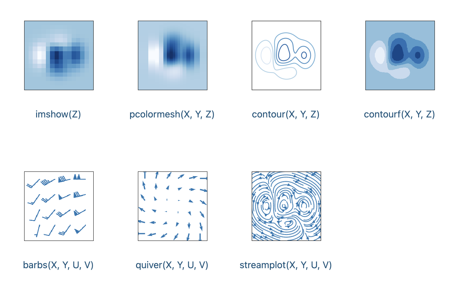
# 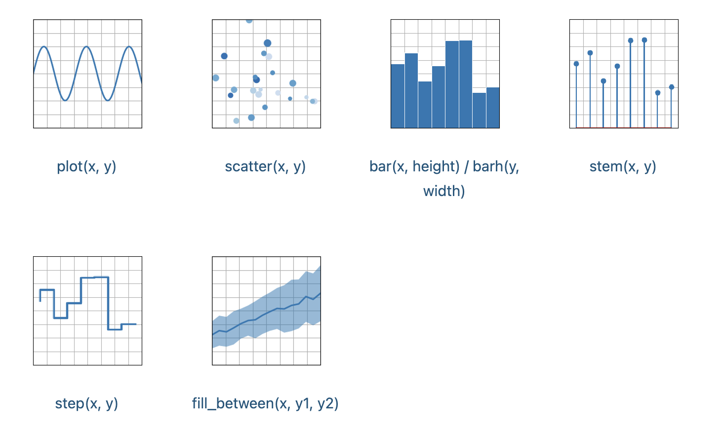 # ### Arrays and fields
#
#
# ### Arrays and fields
#
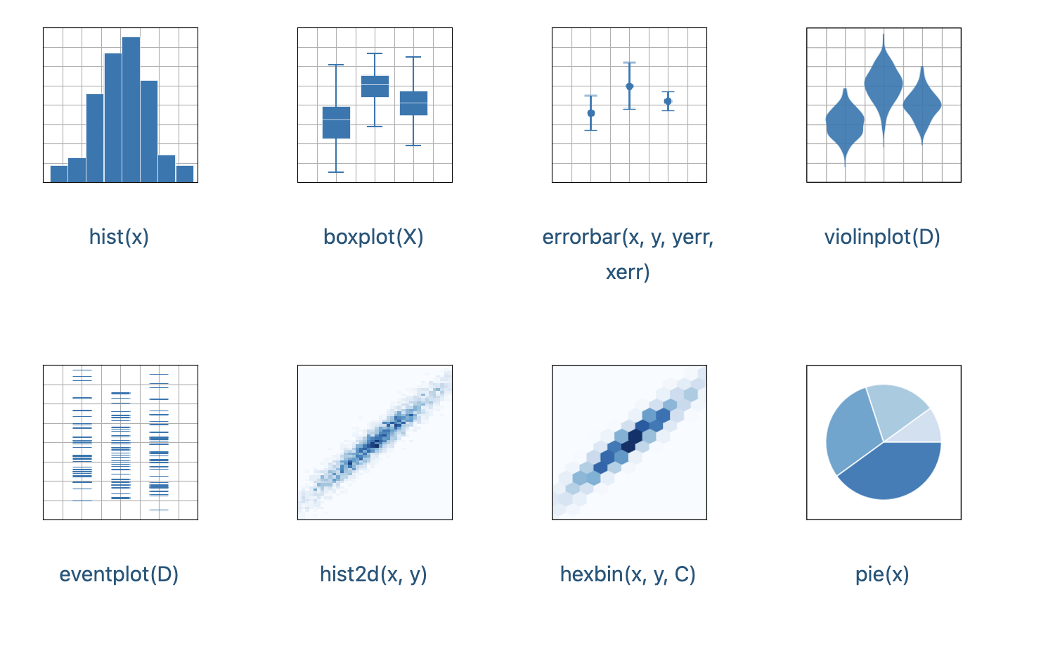
#  # ### Statistics
#
#
# ### Statistics
#
#  # In[2]:
# Import packages
import matplotlib.pyplot as plt
import numpy as np
# ## Coding styles
#
# There are essentially **two** ways to use `matplotlib`:
#
#
# * 1) **Explicitly create** Figures and Axes, and call methods on them (the **"object-oriented (OO) style"**)
#
#
# * 2) **Rely** on **pyplot** to **automatically** create and manage the Figures and Axes and use pyplot functions for plotting
#
#
# **Pyplot** style can be very convenient for **quick interactive** work
#
#
# We recommend using the **OO style** for complicated plots that are intended to be reused as part of a larger project
# ### Simple plot in `matplotlib` using "object-oriented (OO) style"
# In[2]:
# Make data
x = np.linspace(0, 10, 100)
y = 4 + 2 * np.sin(2 * x)
# Create a figure containing a single axes
fig, ax = plt.subplots(figsize=(5,3)) # Set the figure size in inches
# Plot data
ax.plot(x, y, linewidth=2.0) # Set linewidth in pixels
plt.show()
# ### Simple plot in `matplotlib` using "pyplot style"
# In[4]:
# Make data
x = np.linspace(0, 10, 100)
y = 4 + 2 * np.sin(2 * x)
# Plot data
plt.figure(figsize=(5, 3))
plt.plot(x, y, linewidth=2.0) # Set linewidth in pixels
plt.show()
#
# In[2]:
# Import packages
import matplotlib.pyplot as plt
import numpy as np
# ## Coding styles
#
# There are essentially **two** ways to use `matplotlib`:
#
#
# * 1) **Explicitly create** Figures and Axes, and call methods on them (the **"object-oriented (OO) style"**)
#
#
# * 2) **Rely** on **pyplot** to **automatically** create and manage the Figures and Axes and use pyplot functions for plotting
#
#
# **Pyplot** style can be very convenient for **quick interactive** work
#
#
# We recommend using the **OO style** for complicated plots that are intended to be reused as part of a larger project
# ### Simple plot in `matplotlib` using "object-oriented (OO) style"
# In[2]:
# Make data
x = np.linspace(0, 10, 100)
y = 4 + 2 * np.sin(2 * x)
# Create a figure containing a single axes
fig, ax = plt.subplots(figsize=(5,3)) # Set the figure size in inches
# Plot data
ax.plot(x, y, linewidth=2.0) # Set linewidth in pixels
plt.show()
# ### Simple plot in `matplotlib` using "pyplot style"
# In[4]:
# Make data
x = np.linspace(0, 10, 100)
y = 4 + 2 * np.sin(2 * x)
# Plot data
plt.figure(figsize=(5, 3))
plt.plot(x, y, linewidth=2.0) # Set linewidth in pixels
plt.show()
#  # ### Colors and line styles
# In[4]:
# Create a figure containing a single axes
fig, ax = plt.subplots(figsize=(5,3)) # Set the figure size in inches
# Plot data
ax.plot(x, y, linewidth=3.0, color='darkblue')
ax.plot(x, y+3, linewidth=2.0, color='red', linestyle='--')
plt.show()
# ### Axes labels and legends
# In[5]:
# Create a figure containing a single axes
fig, ax = plt.subplots(figsize=(5,3)) # Set the figure size in inches
# Plot data
ax.plot(x, y, linewidth=3.0, color='darkblue', label='data1')
ax.plot(x, y+3, linewidth=2.0, color='red', linestyle='--', label='data2')
# Plot legend
ax.legend(fontsize=14)
# Set axes labels
ax.set_xlabel('Distance (km)', fontsize=14)
ax.set_ylabel('Elevation (m)', fontsize=14)
plt.show()
# In[6]:
# Create a figure containing a single axes
fig, ax = plt.subplots(figsize=(5,3)) # Set the figure size in inches
# Plot data
ax.plot(x, y, linewidth=3.0, color='darkblue', label='data1')
ax.plot(x, y+3, linewidth=2.0, color='red', linestyle='--', label='data2')
# Plot legend
ax.legend(fontsize=14)
# Set axes labels
ax.set_xlabel('Distance (km)', fontsize=14)
ax.set_ylabel('Elevation (m)', fontsize=14)
# Set grid style
ax.grid(linestyle='--', linewidth=1.5)
plt.show()
# In[7]:
# Create a figure containing a single axes
fig, ax = plt.subplots(figsize=(5,3)) # Set the figure size in inches
# Plot data
ax.plot(x, y, linewidth=3.0, color='darkblue', label='data1')
ax.set_xlabel('Distance (km)', fontsize=14) # Set axes labels
ax.set_ylabel('Elevation (m)', fontsize=14) # Set axes labels
ax.set_ylim(2, 6) # Set axes scale
ax.set_xticks(np.arange(0, 21, 1)) # Set tick labels
ax.yaxis.set_tick_params(labelsize=18) # Set tick label size
ax.grid(False) # Hide grid lines
plt.show()
# ### Produce a figure with two axes
# In[8]:
# Create a figure containing two axes
fig, (ax1, ax2) = plt.subplots(ncols=2, nrows=1, figsize=(10,3))
# Plot data
ax1.plot(x, y, linewidth=2.0)
ax2.plot(x, y, linewidth=2.0)
plt.show()
# ## Constrained layout
#
# * Automatically adjusts subplots, legends and colorbars etc. so that they **fit in the figure window** while still **preserving**, as best they can, the **logical layout** requested by the user.
# In[9]:
# Create a figure containing two axes
fig, (ax1, ax2) = plt.subplots(ncols=2, nrows=1, figsize=(10,3),
layout='constrained', sharey=True)
# Plot data
ax1.plot(x, y, linewidth=2.0)
ax2.plot(x, y, linewidth=2.0)
plt.show()
# ### More information
#
# https://matplotlib.org/stable/tutorials/index.html
# ## `cartopy`
#
# * Package designed for geospatial data processing in order to **produce maps** and other geospatial data analyses
#
#
# * Built using the powerful `PROJ`, `numpy` and `shapely` libraries and includes a programmatic interface built on top of `matplotlib` for the creation of publication quality maps.
# In[10]:
# Import packages
import cartopy.crs as ccrs
import matplotlib.pyplot as plt
# ### Simple map of world coastlines
# In[11]:
# Create figure with no axes
fig = plt.figure(figsize=(10, 10))
# Define a GeoAxes instance with PlateCarree projection
ax = plt.axes(projection=ccrs.PlateCarree())
# Add coastlines to axes
ax.coastlines()
plt.show()
# ### Add point data to map
# In[12]:
# Coordinates of Seattle and London
seattle_lon, seattle_lat, london_lon, london_lat = -122, 47, 0, 52
# In[13]:
fig = plt.figure(figsize=(10, 10)) # Create figure with no axes
ax = plt.axes(projection=ccrs.PlateCarree())
ax.set_extent([-130, 10, 30, 60], ccrs.Geodetic()) # Set extent
# Plot data
plt.plot([seattle_lon, london_lon], [seattle_lat, london_lat], color='red',
linewidth=2, transform=ccrs.Geodetic())
plt.plot([seattle_lon, london_lon], [seattle_lat, london_lat], color='blue',
linewidth=2, transform=ccrs.PlateCarree())
# Add coastlines to axes
ax.coastlines()
# ### Add gridded data to map
# In[73]:
# Import packages
import xarray as xr
# Define filepath
filepath = '/Users/jryan4/Dropbox (University of Oregon)/Teaching/geospatial-data-science/data/lecture8/'
# Read data
tp = xr.open_dataset(filepath + 'era_2020_tp.nc')
# In[53]:
tp['tp'].mean()
# In[15]:
# Create figure with no axes
fig = plt.figure(figsize=(10, 10))
# Define a GeoAxes instance with PlateCarree projection
ax = plt.axes(projection=ccrs.PlateCarree())
ax.set_global()
ax.coastlines()
ax.contourf(tp['longitude'], tp['latitude'], np.mean(tp['tp'], axis=0),
cmap='Blues')
plt.show()
# ### Change projection systems
# In[16]:
# Create figure with no axes
fig = plt.figure(figsize=(8, 8))
# Define a GeoAxes instance with LambertConformal projection
ax = plt.axes(projection=ccrs.LambertConformal())
ax.set_global()
ax.coastlines()
ax.contourf(tp['longitude'], tp['latitude'], np.mean(tp['tp'], axis=0),
cmap='Blues')
plt.show()
# ### Change projection and define data transform
# In[17]:
data_crs = ccrs.PlateCarree() # Specify data coordinate system
fig = plt.figure(figsize=(8, 8)) # Create figure with no axes
# Define a GeoAxes instance with PlateCarree projection
ax = plt.axes(projection=ccrs.LambertConformal())
ax.set_global()
ax.coastlines()
ax.contourf(tp['longitude'], tp['latitude'], np.mean(tp['tp'], axis=0),
transform=data_crs, cmap='Blues')
plt.show()
# ### Set map extent
# In[18]:
# Create figure with no axes
fig = plt.figure(figsize=(8, 8))
ax = plt.axes(projection=ccrs.LambertConformal())
ax.set_global()
ax.coastlines()
# Set extent
ax.set_extent([-120, -70, 25, 48], crs=ccrs.PlateCarree())
ax.contourf(tp['longitude'], tp['latitude'], np.mean(tp['tp'], axis=0),
transform=data_crs, cmap='Blues')
plt.show()
# ## `folium`
#
# * Sometimes interactive, web-based displays of geospatial data are more useful/powerful than static figures
#
#
# * `folium` is a web mapping framework based on `Leaflet` that allows us to produce interactive maps
#
# In[19]:
# Import package
import folium
# ### Basics
# In[20]:
# Open a map at specific loction and zoom
m = folium.Map(location=[45.5236, -122.6750], zoom_start=11)
m
# ### Tiles
#
# * The default tiles are **OpenStreetMap**, but others tiles (e.g. **Stamen Terrain**, **Stamen Toner**) are built in. Some of them require an API key.
# In[21]:
m = folium.Map(location=[45.372, -121.6972], zoom_start=12, tiles="Stamen Terrain")
m
# ### Adding markers with labels
# In[22]:
m = folium.Map(location=[45.372, -121.6972], zoom_start=12, tiles="Stamen Terrain")
folium.Marker([45.3288, -121.6625],
popup="Mt. Hood Meadows").add_to(m)
folium.Marker([45.3311, -121.7113],
popup="Timberline Lodge",
icon=folium.Icon(color="red", icon="info-sign")).add_to(m)
m
# ### Chloropleth maps
# In[67]:
get_ipython().system('pip install regionmask')
# In[6]:
# Import packages
import geopandas as gpd
import regionmask
# Define filepath
filepath = '/Users/jryan4/Dropbox (University of Oregon)/Teaching/geospatial-data-science/data/lecture8/'
# Read shapefile
states = gpd.read_file(filepath + 'us_mainland_states.shp')
states.crs
# In[119]:
# Convert coordinate system
states_wgs84 = states.to_crs('EPSG:4326')
states_wgs84.crs
# ### Plot
#
# * `geopandas` provides a high-level interface to the `matplotlib` library for making maps
# In[121]:
states_wgs84.plot()
# ### Plot simple chloropleth map
# In[122]:
states_wgs84.plot(column='ALAND')
# ## Saving figures
#
# The recommended way to save plots for use outside of Jupyter notebooks is to use matplotlib's `plt.savefig()`
# In[10]:
# Create a figure containing a single axes
fig, ax = plt.subplots(figsize=(5,3)) # Set the figure size in inches
ax.plot(x, y, linewidth=3.0, color='darkblue')
ax.plot(x, y+3, linewidth=2.0, color='red', linestyle='--')
fig.savefig(filepath + 'plot.png', dpi=300, pad_inches=0.05,
facecolor='white')
# In[ ]:
# ### Colors and line styles
# In[4]:
# Create a figure containing a single axes
fig, ax = plt.subplots(figsize=(5,3)) # Set the figure size in inches
# Plot data
ax.plot(x, y, linewidth=3.0, color='darkblue')
ax.plot(x, y+3, linewidth=2.0, color='red', linestyle='--')
plt.show()
# ### Axes labels and legends
# In[5]:
# Create a figure containing a single axes
fig, ax = plt.subplots(figsize=(5,3)) # Set the figure size in inches
# Plot data
ax.plot(x, y, linewidth=3.0, color='darkblue', label='data1')
ax.plot(x, y+3, linewidth=2.0, color='red', linestyle='--', label='data2')
# Plot legend
ax.legend(fontsize=14)
# Set axes labels
ax.set_xlabel('Distance (km)', fontsize=14)
ax.set_ylabel('Elevation (m)', fontsize=14)
plt.show()
# In[6]:
# Create a figure containing a single axes
fig, ax = plt.subplots(figsize=(5,3)) # Set the figure size in inches
# Plot data
ax.plot(x, y, linewidth=3.0, color='darkblue', label='data1')
ax.plot(x, y+3, linewidth=2.0, color='red', linestyle='--', label='data2')
# Plot legend
ax.legend(fontsize=14)
# Set axes labels
ax.set_xlabel('Distance (km)', fontsize=14)
ax.set_ylabel('Elevation (m)', fontsize=14)
# Set grid style
ax.grid(linestyle='--', linewidth=1.5)
plt.show()
# In[7]:
# Create a figure containing a single axes
fig, ax = plt.subplots(figsize=(5,3)) # Set the figure size in inches
# Plot data
ax.plot(x, y, linewidth=3.0, color='darkblue', label='data1')
ax.set_xlabel('Distance (km)', fontsize=14) # Set axes labels
ax.set_ylabel('Elevation (m)', fontsize=14) # Set axes labels
ax.set_ylim(2, 6) # Set axes scale
ax.set_xticks(np.arange(0, 21, 1)) # Set tick labels
ax.yaxis.set_tick_params(labelsize=18) # Set tick label size
ax.grid(False) # Hide grid lines
plt.show()
# ### Produce a figure with two axes
# In[8]:
# Create a figure containing two axes
fig, (ax1, ax2) = plt.subplots(ncols=2, nrows=1, figsize=(10,3))
# Plot data
ax1.plot(x, y, linewidth=2.0)
ax2.plot(x, y, linewidth=2.0)
plt.show()
# ## Constrained layout
#
# * Automatically adjusts subplots, legends and colorbars etc. so that they **fit in the figure window** while still **preserving**, as best they can, the **logical layout** requested by the user.
# In[9]:
# Create a figure containing two axes
fig, (ax1, ax2) = plt.subplots(ncols=2, nrows=1, figsize=(10,3),
layout='constrained', sharey=True)
# Plot data
ax1.plot(x, y, linewidth=2.0)
ax2.plot(x, y, linewidth=2.0)
plt.show()
# ### More information
#
# https://matplotlib.org/stable/tutorials/index.html
# ## `cartopy`
#
# * Package designed for geospatial data processing in order to **produce maps** and other geospatial data analyses
#
#
# * Built using the powerful `PROJ`, `numpy` and `shapely` libraries and includes a programmatic interface built on top of `matplotlib` for the creation of publication quality maps.
# In[10]:
# Import packages
import cartopy.crs as ccrs
import matplotlib.pyplot as plt
# ### Simple map of world coastlines
# In[11]:
# Create figure with no axes
fig = plt.figure(figsize=(10, 10))
# Define a GeoAxes instance with PlateCarree projection
ax = plt.axes(projection=ccrs.PlateCarree())
# Add coastlines to axes
ax.coastlines()
plt.show()
# ### Add point data to map
# In[12]:
# Coordinates of Seattle and London
seattle_lon, seattle_lat, london_lon, london_lat = -122, 47, 0, 52
# In[13]:
fig = plt.figure(figsize=(10, 10)) # Create figure with no axes
ax = plt.axes(projection=ccrs.PlateCarree())
ax.set_extent([-130, 10, 30, 60], ccrs.Geodetic()) # Set extent
# Plot data
plt.plot([seattle_lon, london_lon], [seattle_lat, london_lat], color='red',
linewidth=2, transform=ccrs.Geodetic())
plt.plot([seattle_lon, london_lon], [seattle_lat, london_lat], color='blue',
linewidth=2, transform=ccrs.PlateCarree())
# Add coastlines to axes
ax.coastlines()
# ### Add gridded data to map
# In[73]:
# Import packages
import xarray as xr
# Define filepath
filepath = '/Users/jryan4/Dropbox (University of Oregon)/Teaching/geospatial-data-science/data/lecture8/'
# Read data
tp = xr.open_dataset(filepath + 'era_2020_tp.nc')
# In[53]:
tp['tp'].mean()
# In[15]:
# Create figure with no axes
fig = plt.figure(figsize=(10, 10))
# Define a GeoAxes instance with PlateCarree projection
ax = plt.axes(projection=ccrs.PlateCarree())
ax.set_global()
ax.coastlines()
ax.contourf(tp['longitude'], tp['latitude'], np.mean(tp['tp'], axis=0),
cmap='Blues')
plt.show()
# ### Change projection systems
# In[16]:
# Create figure with no axes
fig = plt.figure(figsize=(8, 8))
# Define a GeoAxes instance with LambertConformal projection
ax = plt.axes(projection=ccrs.LambertConformal())
ax.set_global()
ax.coastlines()
ax.contourf(tp['longitude'], tp['latitude'], np.mean(tp['tp'], axis=0),
cmap='Blues')
plt.show()
# ### Change projection and define data transform
# In[17]:
data_crs = ccrs.PlateCarree() # Specify data coordinate system
fig = plt.figure(figsize=(8, 8)) # Create figure with no axes
# Define a GeoAxes instance with PlateCarree projection
ax = plt.axes(projection=ccrs.LambertConformal())
ax.set_global()
ax.coastlines()
ax.contourf(tp['longitude'], tp['latitude'], np.mean(tp['tp'], axis=0),
transform=data_crs, cmap='Blues')
plt.show()
# ### Set map extent
# In[18]:
# Create figure with no axes
fig = plt.figure(figsize=(8, 8))
ax = plt.axes(projection=ccrs.LambertConformal())
ax.set_global()
ax.coastlines()
# Set extent
ax.set_extent([-120, -70, 25, 48], crs=ccrs.PlateCarree())
ax.contourf(tp['longitude'], tp['latitude'], np.mean(tp['tp'], axis=0),
transform=data_crs, cmap='Blues')
plt.show()
# ## `folium`
#
# * Sometimes interactive, web-based displays of geospatial data are more useful/powerful than static figures
#
#
# * `folium` is a web mapping framework based on `Leaflet` that allows us to produce interactive maps
#
# In[19]:
# Import package
import folium
# ### Basics
# In[20]:
# Open a map at specific loction and zoom
m = folium.Map(location=[45.5236, -122.6750], zoom_start=11)
m
# ### Tiles
#
# * The default tiles are **OpenStreetMap**, but others tiles (e.g. **Stamen Terrain**, **Stamen Toner**) are built in. Some of them require an API key.
# In[21]:
m = folium.Map(location=[45.372, -121.6972], zoom_start=12, tiles="Stamen Terrain")
m
# ### Adding markers with labels
# In[22]:
m = folium.Map(location=[45.372, -121.6972], zoom_start=12, tiles="Stamen Terrain")
folium.Marker([45.3288, -121.6625],
popup="Mt. Hood Meadows").add_to(m)
folium.Marker([45.3311, -121.7113],
popup="Timberline Lodge",
icon=folium.Icon(color="red", icon="info-sign")).add_to(m)
m
# ### Chloropleth maps
# In[67]:
get_ipython().system('pip install regionmask')
# In[6]:
# Import packages
import geopandas as gpd
import regionmask
# Define filepath
filepath = '/Users/jryan4/Dropbox (University of Oregon)/Teaching/geospatial-data-science/data/lecture8/'
# Read shapefile
states = gpd.read_file(filepath + 'us_mainland_states.shp')
states.crs
# In[119]:
# Convert coordinate system
states_wgs84 = states.to_crs('EPSG:4326')
states_wgs84.crs
# ### Plot
#
# * `geopandas` provides a high-level interface to the `matplotlib` library for making maps
# In[121]:
states_wgs84.plot()
# ### Plot simple chloropleth map
# In[122]:
states_wgs84.plot(column='ALAND')
# ## Saving figures
#
# The recommended way to save plots for use outside of Jupyter notebooks is to use matplotlib's `plt.savefig()`
# In[10]:
# Create a figure containing a single axes
fig, ax = plt.subplots(figsize=(5,3)) # Set the figure size in inches
ax.plot(x, y, linewidth=3.0, color='darkblue')
ax.plot(x, y+3, linewidth=2.0, color='red', linestyle='--')
fig.savefig(filepath + 'plot.png', dpi=300, pad_inches=0.05,
facecolor='white')
# In[ ]: