#!/usr/bin/env python
# coding: utf-8
# # Layout and Styling of Jupyter widgets
#
# This notebook presents how to layout and style Jupyter interactive widgets to build rich and *reactive* widget-based applications.
# ## The `layout` attribute.
#
# Jupyter interactive widgets have a `layout` attribute exposing a number of CSS properties that impact how widgets are laid out.
#
# ### Exposed CSS properties
#
#
# The following properties map to the values of the CSS properties of the same name (underscores being replaced with dashes), applied to the top DOM elements of the corresponding widget.
#
#
#
# #### Sizes
#
# - `height`
# - `width`
# - `max_height`
# - `max_width`
# - `min_height`
# - `min_width`
#
# #### Display
#
# - `visibility`
# - `display`
# - `overflow`
# - `overflow_x` (deprecated in `7.5`, use `overflow` instead)
# - `overflow_y` (deprecated in `7.5`, use `overflow` instead)
#
# #### Box model
#
# - `border`
# - `margin`
# - `padding`
#
# #### Positioning
#
# - `top`
# - `left`
# - `bottom`
# - `right`
#
# #### Flexbox
#
# - `order`
# - `flex_flow`
# - `align_items`
# - `flex`
# - `align_self`
# - `align_content`
# - `justify_content`
#
# #### Grid layout
#
# - `grid_auto_columns`
# - `grid_auto_flow`
# - `grid_auto_rows`
# - `grid_gap`
# - `grid_template`
#
# - `grid_row`
# - `grid_column`
#
# ### Shorthand CSS properties
#
# You may have noticed that certain CSS properties such as `margin-[top/right/bottom/left]` seem to be missing. The same holds for `padding-[top/right/bottom/left]` etc.
#
# In fact, you can atomically specify `[top/right/bottom/left]` margins via the `margin` attribute alone by passing the string `'100px 150px 100px 80px'` for a respectively `top`, `right`, `bottom` and `left` margins of `100`, `150`, `100` and `80` pixels.
#
# Similarly, the `flex` attribute can hold values for `flex-grow`, `flex-shrink` and `flex-basis`. The `border` attribute is a shorthand property for `border-width`, `border-style (required)`, and `border-color`.
# ### Simple examples
# The following example shows how to resize a `Button` so that its views have a height of `80px` and a width of `50%` of the available space. It also includes an example of setting a CSS property that requires multiple values (a border, in thise case):
# In[ ]:
from ipywidgets import Button, Layout
b = Button(description='(50% width, 80px height) button',
layout=Layout(width='50%', height='80px', border='2px dotted blue'))
b
# The `layout` property can be shared between multiple widgets and assigned directly.
# In[ ]:
Button(description='Another button with the same layout', layout=b.layout)
# ### Description
# You may have noticed that long descriptions are truncated. This is because the description length is, by default, fixed.
# In[ ]:
from ipywidgets import IntSlider
IntSlider(description='A too long description')
# If you need more flexibility to lay out widgets and descriptions, you can use Label widgets directly.
# In[ ]:
from ipywidgets import HBox, Label
HBox([Label('A too long description'), IntSlider()])
# You can change the length of the description to fit the description text. However, this will make the widget itself shorter. You can change both by adjusting the description width and the widget width using the widget's style.
# In[ ]:
style = {'description_width': 'initial'}
IntSlider(description='A too long description', style=style)
# ### Natural sizes, and arrangements using HBox and VBox
#
# Most of the core-widgets have default heights and widths that tile well together. This allows simple layouts based on the `HBox` and `VBox` helper functions to align naturally:
# In[ ]:
from ipywidgets import Button, HBox, VBox
words = ['correct', 'horse', 'battery', 'staple']
items = [Button(description=w) for w in words]
left_box = VBox([items[0], items[1]])
right_box = VBox([items[2], items[3]])
HBox([left_box, right_box])
# ### LaTeX
# Widgets such as sliders and text inputs have a description attribute that can render Latex Equations. The `Label` widget also renders Latex equations.
# In[ ]:
from ipywidgets import IntSlider, Label
# In[ ]:
IntSlider(description=r'\(\int_0^t f\)')
# In[ ]:
Label(value=r'\(e=mc^2\)')
# ### Number formatting
#
# Sliders have a readout field which can be formatted using Python's [Format Specification Mini-Language](https://docs.python.org/3/library/string.html#format-specification-mini-language). If the space available for the readout is too narrow for the string representation of the slider value, a different styling is applied to show that not all digits are visible.
# ## The Flexbox layout
#
# The `HBox` and `VBox` classes above are special cases of the `Box` widget.
#
# The `Box` widget enables the entire CSS flexbox spec as well as the Grid layout spec, enabling rich reactive layouts in the Jupyter notebook. It aims at providing an efficient way to lay out, align and distribute space among items in a container.
#
# Again, the whole flexbox spec is exposed via the `layout` attribute of the container widget (`Box`) and the contained items. One may share the same `layout` attribute among all the contained items.
#
# ### Acknowledgement
#
# The following flexbox tutorial on the flexbox layout follows the lines of the article [A Complete Guide to Flexbox](https://css-tricks.com/snippets/css/a-guide-to-flexbox/) by Chris Coyier, and uses text and various images from the article [with permission](https://css-tricks.com/license/).
#
# ### Basics and terminology
#
# Since flexbox is a whole module and not a single property, it involves a lot of things including its whole set of properties. Some of them are meant to be set on the container (parent element, known as "flex container") whereas the others are meant to be set on the children (known as "flex items").
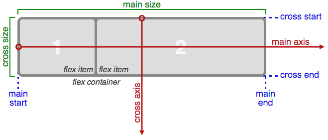
# If regular layout is based on both block and inline flow directions, the flex layout is based on "flex-flow directions". Please have a look at this figure from the specification, explaining the main idea behind the flex layout.
#
# 
#
# Basically, items will be laid out following either the `main axis` (from `main-start` to `main-end`) or the `cross axis` (from `cross-start` to `cross-end`).
#
# - `main axis` - The main axis of a flex container is the primary axis along which flex items are laid out. Beware, it is not necessarily horizontal; it depends on the flex-direction property (see below).
# - `main-start | main-end` - The flex items are placed within the container starting from main-start and going to main-end.
# - `main size` - A flex item's width or height, whichever is in the main dimension, is the item's main size. The flex item's main size property is either the ‘width’ or ‘height’ property, whichever is in the main dimension.
# cross axis - The axis perpendicular to the main axis is called the cross axis. Its direction depends on the main axis direction.
# - `cross-start | cross-end` - Flex lines are filled with items and placed into the container starting on the cross-start side of the flex container and going toward the cross-end side.
# - `cross size` - The width or height of a flex item, whichever is in the cross dimension, is the item's cross size. The cross size property is whichever of ‘width’ or ‘height’ that is in the cross dimension.
#
# ### Properties of the parent
#
# 
#
#
# #### display
#
# `display` can be `flex` or `inline-flex`. This defines a flex container (block or inline).
#
# #### flex-flow
#
# `flex-flow` is a shorthand for the `flex-direction` and `flex-wrap` properties, which together define the flex container's main and cross axes. Default is `row nowrap`.
#
# - `flex-direction` (column-reverse | column | row | row-reverse )
#
# This establishes the main-axis, thus defining the direction flex items are placed in the flex container. Flexbox is (aside from optional wrapping) a single-direction layout concept. Think of flex items as primarily laying out either in horizontal rows or vertical columns.
# 
#
# - `flex-wrap` (nowrap | wrap | wrap-reverse)
#
# By default, flex items will all try to fit onto one line. You can change that and allow the items to wrap as needed with this property. Direction also plays a role here, determining the direction new lines are stacked in.
# 
#
# #### justify-content
#
# `justify-content` can be one of `flex-start`, `flex-end`, `center`, `space-between`, `space-around`. This defines the alignment along the main axis. It helps distribute extra free space left over when either all the flex items on a line are inflexible, or are flexible but have reached their maximum size. It also exerts some control over the alignment of items when they overflow the line.
# 
#
# #### align-items
#
# `align-items` can be one of `flex-start`, `flex-end`, `center`, `baseline`, `stretch`. This defines the default behaviour for how flex items are laid out along the cross axis on the current line. Think of it as the justify-content version for the cross-axis (perpendicular to the main-axis).
# 
#
# #### align-content
# `align-content` can be one of `flex-start`, `flex-end`, `center`, `baseline`, `stretch`. This aligns a flex container's lines within when there is extra space in the cross-axis, similar to how justify-content aligns individual items within the main-axis.
# 
#
# **Note**: this property has no effect when there is only one line of flex items.
#
# ### Properties of the items
#
# 
#
# The flexbox-related CSS properties of the items have no impact if the parent element is not a flexbox container (i.e. has a `display` attribute equal to `flex` or `inline-flex`).
#
# #### order
# By default, flex items are laid out in the source order. However, the `order` property controls the order in which they appear in the flex container.
#  #
# #### flex
# `flex` is shorthand for three properties, `flex-grow`, `flex-shrink` and `flex-basis` combined. The second and third parameters (`flex-shrink` and `flex-basis`) are optional. Default is `0 1 auto`.
#
# - `flex-grow`
#
# This defines the ability for a flex item to grow if necessary. It accepts a unitless value that serves as a proportion. It dictates what amount of the available space inside the flex container the item should take up.
#
# If all items have flex-grow set to 1, the remaining space in the container will be distributed equally to all children. If one of the children a value of 2, the remaining space would take up twice as much space as the others (or it will try to, at least).
# 
#
# - `flex-shrink`
#
# This defines the ability for a flex item to shrink if necessary.
#
# - `flex-basis`
#
# This defines the default size of an element before the remaining space is distributed. It can be a length (e.g. `20%`, `5rem`, etc.) or a keyword. The `auto` keyword means *"look at my width or height property"*.
#
# #### align-self
#
# `align-self` allows the default alignment (or the one specified by align-items) to be overridden for individual flex items.
#
# 
#
# ### The VBox and HBox helpers
#
# The `VBox` and `HBox` helper classes provide simple defaults to arrange child widgets in vertical and horizontal boxes. They are roughly equivalent to:
#
# ```Python
# def VBox(*pargs, **kwargs):
# """Displays multiple widgets vertically using the flexible box model."""
# box = Box(*pargs, **kwargs)
# box.layout.display = 'flex'
# box.layout.flex_flow = 'column'
# box.layout.align_items = 'stretch'
# return box
#
# def HBox(*pargs, **kwargs):
# """Displays multiple widgets horizontally using the flexible box model."""
# box = Box(*pargs, **kwargs)
# box.layout.display = 'flex'
# box.layout.align_items = 'stretch'
# return box
# ```
#
#
# ### Examples
# **Four buttons in a VBox. Items stretch to the maximum width, in a vertical box taking `50%` of the available space.**
# In[ ]:
from ipywidgets import Layout, Button, Box
items_layout = Layout( width='auto') # override the default width of the button to 'auto' to let the button grow
box_layout = Layout(display='flex',
flex_flow='column',
align_items='stretch',
border='solid',
width='50%')
words = ['correct', 'horse', 'battery', 'staple']
items = [Button(description=word, layout=items_layout, button_style='danger') for word in words]
box = Box(children=items, layout=box_layout)
box
# **Three buttons in an HBox. Items flex proportionally to their weight.**
# In[ ]:
from ipywidgets import Layout, Button, Box, VBox
# Items flex proportionally to the weight and the left over space around the text
items_auto = [
Button(description='weight=1; auto', layout=Layout(flex='1 1 auto', width='auto'), button_style='danger'),
Button(description='weight=3; auto', layout=Layout(flex='3 1 auto', width='auto'), button_style='danger'),
Button(description='weight=1; auto', layout=Layout(flex='1 1 auto', width='auto'), button_style='danger'),
]
# Items flex proportionally to the weight
items_0 = [
Button(description='weight=1; 0%', layout=Layout(flex='1 1 0%', width='auto'), button_style='danger'),
Button(description='weight=3; 0%', layout=Layout(flex='3 1 0%', width='auto'), button_style='danger'),
Button(description='weight=1; 0%', layout=Layout(flex='1 1 0%', width='auto'), button_style='danger'),
]
box_layout = Layout(display='flex',
flex_flow='row',
align_items='stretch',
width='70%')
box_auto = Box(children=items_auto, layout=box_layout)
box_0 = Box(children=items_0, layout=box_layout)
VBox([box_auto, box_0])
# **A more advanced example: a reactive form.**
#
# The form is a `VBox` of width '50%'. Each row in the VBox is an HBox, that justifies the content with space between..
# In[ ]:
from ipywidgets import Layout, Button, Box, FloatText, Textarea, Dropdown, Label, IntSlider
form_item_layout = Layout(
display='flex',
flex_flow='row',
justify_content='space-between'
)
form_items = [
Box([Label(value='Age of the captain'), IntSlider(min=40, max=60)], layout=form_item_layout),
Box([Label(value='Egg style'),
Dropdown(options=['Scrambled', 'Sunny side up', 'Over easy'])], layout=form_item_layout),
Box([Label(value='Ship size'),
FloatText()], layout=form_item_layout),
Box([Label(value='Information'),
Textarea()], layout=form_item_layout)
]
form = Box(form_items, layout=Layout(
display='flex',
flex_flow='column',
border='solid 2px',
align_items='stretch',
width='50%'
))
form
# **A more advanced example: a carousel.**
# In[ ]:
from ipywidgets import Layout, Button, Box, Label
item_layout = Layout(height='100px', min_width='40px')
items = [Button(layout=item_layout, description=str(i), button_style='warning') for i in range(40)]
box_layout = Layout(overflow_x='scroll',
border='3px solid black',
width='500px',
height='',
flex_flow='row',
display='flex')
carousel = Box(children=items, layout=box_layout)
VBox([Label('Scroll horizontally:'), carousel])
# #### *Compatibility note*
#
# The `overflow_x` and `overflow_y` options are deprecated in ipywidgets `7.5`. Instead, use the shorthand property `overflow='scroll hidden'`. The first part specificies overflow in `x`, the second the overflow in `y`.
# ## A widget for exploring layout options
#
# The widgets below was written by ipywidgets user [Doug Redden (@DougRzz)](https://github.com/DougRzz). If you want to look through the source code to see how it works, take a look at this [notebook he contributed](cssJupyterWidgetStyling-UI.ipynb).
#
# Use the dropdowns and sliders in the widget to change the layout of the box containing the five colored buttons. Many of the CSS layout optoins described above are available, and the Python code to generate a `Layout` object reflecting the settings is in a `TextArea` in the widget.
# In[ ]:
from layout_preview import layout
layout
# ## Predefined styles
#
# If you wish the styling of widgets to make use of colors and styles defined by the environment (to be consistent with e.g. a notebook theme), some widgets enable choosing in a list of pre-defined styles.
#
# For example, the `Button` widget has a `button_style` attribute that may take 5 different values:
#
# - `'primary'`
# - `'success'`
# - `'info'`
# - `'warning'`
# - `'danger'`
#
# besides the default empty string ''.
# In[ ]:
from ipywidgets import Button
Button(description='Danger Button', button_style='danger')
# ## The `style` attribute
#
# While the `layout` attribute only exposes layout-related CSS properties for the top-level DOM element of widgets, the
# `style` attribute is used to expose non-layout related styling attributes of widgets.
#
# However, the properties of the `style` attribute are specific to each widget type.
# In[ ]:
b1 = Button(description='Custom color')
b1.style.button_color = 'lightgreen'
b1
# You can get a list of the style attributes for a widget with the `keys` property.
# In[ ]:
b1.style.keys
# Just like the `layout` attribute, widget styles can be assigned to other widgets.
# In[ ]:
b2 = Button()
b2.style = b1.style
b2
# Widget styling attributes are specific to each widget type.
# In[ ]:
s1 = IntSlider(description='Blue handle')
s1.style.handle_color = 'lightblue'
s1
# There is a [list of all style keys](Table%20of%20widget%20keys%20and%20style%20keys.ipynb#Style-keys).
# ## The Grid layout
#
# The `GridBox` class is a special case of the `Box` widget.
#
# The `Box` widget enables the entire CSS flexbox spec, enabling rich reactive layouts in the Jupyter notebook. It aims at providing an efficient way to lay out, align and distribute space among items in a container.
#
# Again, the whole grid layout spec is exposed via the `layout` attribute of the container widget (`Box`) and the contained items. One may share the same `layout` attribute among all the contained items.
#
# The following flexbox tutorial on the flexbox layout follows the lines of the article [A Complete Guide to Grid](https://css-tricks.com/snippets/css/complete-guide-grid/) by Chris House, and uses text and various images from the article [with permission](https://css-tricks.com/license/).
#
# ### Basics and browser support
#
# To get started you have to define a container element as a grid with display: grid, set the column and row sizes with grid-template-rows, grid-template-columns, and grid_template_areas, and then place its child elements into the grid with grid-column and grid-row. Similarly to flexbox, the source order of the grid items doesn't matter. Your CSS can place them in any order, which makes it super easy to rearrange your grid with media queries. Imagine defining the layout of your entire page, and then completely rearranging it to accommodate a different screen width all with only a couple lines of CSS. Grid is one of the most powerful CSS modules ever introduced.
#
# As of March 2017, most browsers shipped native, unprefixed support for CSS Grid: Chrome (including on Android), Firefox, Safari (including on iOS), and Opera. Internet Explorer 10 and 11 on the other hand support it, but it's an old implementation with an outdated syntax. The time to build with grid is now!
#
# ### Important terminology
#
# Before diving into the concepts of Grid it's important to understand the terminology. Since the terms involved here are all kinda conceptually similar, it's easy to confuse them with one another if you don't first memorize their meanings defined by the Grid specification. But don't worry, there aren't many of them.
#
# **Grid Container**
#
# The element on which `display: grid` is applied. It's the direct parent of all the grid items. In this example container is the grid container.
#
# ```html
#
# ```
#
# **Grid Item**
#
# The children (e.g. direct descendants) of the grid container. Here the item elements are grid items, but sub-item isn't.
#
# ```html
#
# ```
#
# **Grid Line**
#
# The dividing lines that make up the structure of the grid. They can be either vertical ("column grid lines") or horizontal ("row grid lines") and reside on either side of a row or column. Here the yellow line is an example of a column grid line.
#
# 
#
# **Grid Track**
#
# The space between two adjacent grid lines. You can think of them like the columns or rows of the grid. Here's the grid track between the second and third row grid lines.
#
# 
#
# **Grid Cell**
#
# The space between two adjacent row and two adjacent column grid lines. It's a single "unit" of the grid. Here's the grid cell between row grid lines 1 and 2, and column grid lines 2 and 3.
#
# 
#
# **Grid Area**
#
# The total space surrounded by four grid lines. A grid area may be comprised of any number of grid cells. Here's the grid area between row grid lines 1 and 3, and column grid lines 1 and 3.
#
# 
#
# ### Properties of the parent
#
# **grid-template-rows, grid-template-colums**
#
# Defines the columns and rows of the grid with a space-separated list of values. The values represent the track size, and the space between them represents the grid line.
#
# Values:
#
# - `` - can be a length, a percentage, or a fraction of the free space in the grid (using the `fr` unit)
# - `` - an arbitrary name of your choosing
#
# **grid-template-areas**
#
# Defines a grid template by referencing the names of the grid areas which are specified with the grid-area property. Repeating the name of a grid area causes the content to span those cells. A period signifies an empty cell. The syntax itself provides a visualization of the structure of the grid.
#
# Values:
#
# - `` - the name of a grid area specified with `grid-area`
# - `.` - a period signifies an empty grid cell
# - `none` - no grid areas are defined
#
# **grid-gap**
#
# A shorthand for `grid-row-gap` and `grid-column-gap`
#
# Values:
#
# - ``, `` - length values
#
# where `grid-row-gap` and `grid-column-gap` specify the sizes of the grid lines. You can think of it like setting the width of the gutters between the columns / rows.
#
# - `` - a length value
#
# *Note: The `grid-` prefix will be removed and `grid-gap` renamed to `gap`. The unprefixed property is already supported in Chrome 68+, Safari 11.2 Release 50+ and Opera 54+.*
#
# **align-items**
#
# Aligns grid items along the block (column) axis (as opposed to justify-items which aligns along the inline (row) axis). This value applies to all grid items inside the container.
#
# Values:
#
# - `start` - aligns items to be flush with the start edge of their cell
# - `end` - aligns items to be flush with the end edge of their cell
# - `center` - aligns items in the center of their cell
# - `stretch` - fills the whole height of the cell (this is the default)
#
# **justify-items**
#
# Aligns grid items along the inline (row) axis (as opposed to `align-items` which aligns along the block (column) axis). This value applies to all grid items inside the container.
#
# Values:
#
# - `start` - aligns items to be flush with the start edge of their cell
# - `end` - aligns items to be flush with the end edge of their cell
# - `center` - aligns items in the center of their cell
# - `stretch` - fills the whole width of the cell (this is the default)
#
# **align-content**
#
# Sometimes the total size of your grid might be less than the size of its grid container. This could happen if all of your grid items are sized with non-flexible units like `px`. In this case you can set the alignment of the grid within the grid container. This property aligns the grid along the block (column) axis (as opposed to justify-content which aligns the grid along the inline (row) axis).
#
# Values:
#
# - `start` - aligns the grid to be flush with the start edge of the grid container
# - `end` - aligns the grid to be flush with the end edge of the grid container
# - `center` - aligns the grid in the center of the grid container
# - `stretch` - resizes the grid items to allow the grid to fill the full height of the grid container
# - `space-around` - places an even amount of space between each grid item, with half-sized spaces on the far ends
# - `space-between` - places an even amount of space between each grid item, with no space at the far ends
# - `space-evenly` - places an even amount of space between each grid item, including the far ends
#
# **justify-content**
#
# Sometimes the total size of your grid might be less than the size of its grid container. This could happen if all of your grid items are sized with non-flexible units like `px`. In this case you can set the alignment of the grid within the grid container. This property aligns the grid along the inline (row) axis (as opposed to align-content which aligns the grid along the block (column) axis).
#
# Values:
#
# - `start` - aligns the grid to be flush with the start edge of the grid container
# - `end` - aligns the grid to be flush with the end edge of the grid container
# - `center` - aligns the grid in the center of the grid container
# - `stretch` - resizes the grid items to allow the grid to fill the full width of the grid container
# - `space-around` - places an even amount of space between each grid item, with half-sized spaces on the far ends
# - `space-between` - places an even amount of space between each grid item, with no space at the far ends
# - `space-evenly` - places an even amount of space between each grid item, including the far ends
#
# **grid-auto-columns, grid-auto-rows**
#
# Specifies the size of any auto-generated grid tracks (aka implicit grid tracks). Implicit tracks get created when there are more grid items than cells in the grid or when a grid item is placed outside of the explicit grid. (see The Difference Between Explicit and Implicit Grids)
#
# Values:
#
# - `` - can be a length, a percentage, or a fraction of the free space in the grid (using the `fr` unit)
#
# ### Properties of the items
#
# *Note: `float`, `display: inline-block`, `display: table-cell`, `vertical-align` and `column-??` properties have no effect on a grid item.*
#
# **grid-column, grid-row**
#
# Determines a grid item's location within the grid by referring to specific grid lines. `grid-column-start`/`grid-row-start` is the line where the item begins, and `grid-column-end`/`grid-row-end` is the line where the item ends.
#
# Values:
#
# - `` - can be a number to refer to a numbered grid line, or a name to refer to a named grid line
# - `span ` - the item will span across the provided number of grid tracks
# - `span ` - the item will span across until it hits the next line with the provided name
# - `auto` - indicates auto-placement, an automatic span, or a default span of one
#
# ```css
# .item {
# grid-column: | | span | span | auto /
# | | span | span | auto
# grid-row: | | span | span | auto /
# | | span | span | auto
# }
# ```
#
# Examples:
#
# ```css
# .item-a {
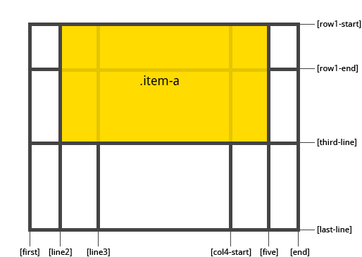
# grid-column: 2 / five;
# grid-row: row1-start / 3;
# }
# ```
#
# 
#
# ```css
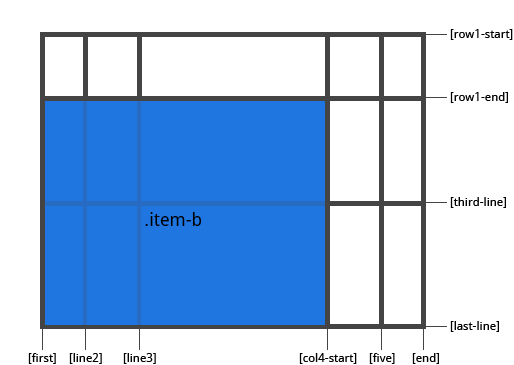
# .item-b {
# grid-column: 1 / span col4-start;
# grid-row: 2 / span 2;
# }
# ```
#
# 
#
# If no `grid-column` / `grid-row` is declared, the item will span 1 track by default.
#
# Items can overlap each other. You can use `z-index` to control their stacking order.
#
# **grid-area**
#
# Gives an item a name so that it can be referenced by a template created with the `grid-template-areas` property. Alternatively, this property can be used as an even shorter shorthand for `grid-row-start` + `grid-column-start` + `grid-row-end` + `grid-column-end`.
#
# Values:
#
# - `` - a name of your choosing
# - ` / / / ` - can be numbers or named lines
#
# ```css
# .item {
# grid-area: | / / / ;
# }
# ```
#
# Examples:
#
# As a way to assign a name to the item:
#
# ```css
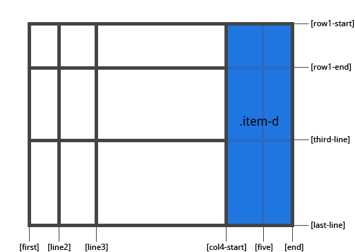
# .item-d {
# grid-area: header
# }
# ```
#
# As the short-shorthand for `grid-row-start` + `grid-column-start` + `grid-row-end` + `grid-column-end`:
#
# ```css
# .item-d {
# grid-area: 1 / col4-start / last-line / 6
# }
# ```
#
# 
#
# **justify-self**
#
# Aligns a grid item inside a cell along the inline (row) axis (as opposed to `align-self` which aligns along the block (column) axis). This value applies to a grid item inside a single cell.
#
# Values:
#
# - `start` - aligns the grid item to be flush with the start edge of the cell
# - `end` - aligns the grid item to be flush with the end edge of the cell
# - `center` - aligns the grid item in the center of the cell
# - `stretch` - fills the whole width of the cell (this is the default)
#
# ```css
# .item {
# justify-self: start | end | center | stretch;
# }
# ```
#
# Examples:
#
# ```css
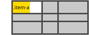
# .item-a {
# justify-self: start;
# }
# ```
#
# 
#
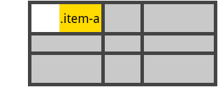
# ```css
# .item-a {
# justify-self: end;
# }
# ```
#
# 
#
# ```css
# .item-a {
# justify-self: center;
# }
# ```
#
# 
#
# ```css
# .item-a {
# justify-self: stretch;
# }
# ```
#
# 
#
# To set alignment for *all* the items in a grid, this behavior can also be set on the grid container via the `justify-items` property.
# In[ ]:
from ipywidgets import Button, GridBox, Layout, ButtonStyle
# Placing items by name:
# In[ ]:
header = Button(description='Header',
layout=Layout(width='auto', grid_area='header'),
style=ButtonStyle(button_color='lightblue'))
main = Button(description='Main',
layout=Layout(width='auto', grid_area='main'),
style=ButtonStyle(button_color='moccasin'))
sidebar = Button(description='Sidebar',
layout=Layout(width='auto', grid_area='sidebar'),
style=ButtonStyle(button_color='salmon'))
footer = Button(description='Footer',
layout=Layout(width='auto', grid_area='footer'),
style=ButtonStyle(button_color='olive'))
GridBox(children=[header, main, sidebar, footer],
layout=Layout(
width='50%',
grid_template_rows='auto auto auto',
grid_template_columns='25% 25% 25% 25%',
grid_template_areas='''
"header header header header"
"main main . sidebar "
"footer footer footer footer"
''')
)
# Setting up row and column template and gap
# In[ ]:
GridBox(children=[Button(layout=Layout(width='auto', height='auto'),
style=ButtonStyle(button_color='darkseagreen')) for i in range(9)
],
layout=Layout(
width='50%',
grid_template_columns='100px 50px 100px',
grid_template_rows='80px auto 80px',
grid_gap='5px 10px')
)
# In[ ]:
#
# #### flex
# `flex` is shorthand for three properties, `flex-grow`, `flex-shrink` and `flex-basis` combined. The second and third parameters (`flex-shrink` and `flex-basis`) are optional. Default is `0 1 auto`.
#
# - `flex-grow`
#
# This defines the ability for a flex item to grow if necessary. It accepts a unitless value that serves as a proportion. It dictates what amount of the available space inside the flex container the item should take up.
#
# If all items have flex-grow set to 1, the remaining space in the container will be distributed equally to all children. If one of the children a value of 2, the remaining space would take up twice as much space as the others (or it will try to, at least).
# 
#
# - `flex-shrink`
#
# This defines the ability for a flex item to shrink if necessary.
#
# - `flex-basis`
#
# This defines the default size of an element before the remaining space is distributed. It can be a length (e.g. `20%`, `5rem`, etc.) or a keyword. The `auto` keyword means *"look at my width or height property"*.
#
# #### align-self
#
# `align-self` allows the default alignment (or the one specified by align-items) to be overridden for individual flex items.
#
# 
#
# ### The VBox and HBox helpers
#
# The `VBox` and `HBox` helper classes provide simple defaults to arrange child widgets in vertical and horizontal boxes. They are roughly equivalent to:
#
# ```Python
# def VBox(*pargs, **kwargs):
# """Displays multiple widgets vertically using the flexible box model."""
# box = Box(*pargs, **kwargs)
# box.layout.display = 'flex'
# box.layout.flex_flow = 'column'
# box.layout.align_items = 'stretch'
# return box
#
# def HBox(*pargs, **kwargs):
# """Displays multiple widgets horizontally using the flexible box model."""
# box = Box(*pargs, **kwargs)
# box.layout.display = 'flex'
# box.layout.align_items = 'stretch'
# return box
# ```
#
#
# ### Examples
# **Four buttons in a VBox. Items stretch to the maximum width, in a vertical box taking `50%` of the available space.**
# In[ ]:
from ipywidgets import Layout, Button, Box
items_layout = Layout( width='auto') # override the default width of the button to 'auto' to let the button grow
box_layout = Layout(display='flex',
flex_flow='column',
align_items='stretch',
border='solid',
width='50%')
words = ['correct', 'horse', 'battery', 'staple']
items = [Button(description=word, layout=items_layout, button_style='danger') for word in words]
box = Box(children=items, layout=box_layout)
box
# **Three buttons in an HBox. Items flex proportionally to their weight.**
# In[ ]:
from ipywidgets import Layout, Button, Box, VBox
# Items flex proportionally to the weight and the left over space around the text
items_auto = [
Button(description='weight=1; auto', layout=Layout(flex='1 1 auto', width='auto'), button_style='danger'),
Button(description='weight=3; auto', layout=Layout(flex='3 1 auto', width='auto'), button_style='danger'),
Button(description='weight=1; auto', layout=Layout(flex='1 1 auto', width='auto'), button_style='danger'),
]
# Items flex proportionally to the weight
items_0 = [
Button(description='weight=1; 0%', layout=Layout(flex='1 1 0%', width='auto'), button_style='danger'),
Button(description='weight=3; 0%', layout=Layout(flex='3 1 0%', width='auto'), button_style='danger'),
Button(description='weight=1; 0%', layout=Layout(flex='1 1 0%', width='auto'), button_style='danger'),
]
box_layout = Layout(display='flex',
flex_flow='row',
align_items='stretch',
width='70%')
box_auto = Box(children=items_auto, layout=box_layout)
box_0 = Box(children=items_0, layout=box_layout)
VBox([box_auto, box_0])
# **A more advanced example: a reactive form.**
#
# The form is a `VBox` of width '50%'. Each row in the VBox is an HBox, that justifies the content with space between..
# In[ ]:
from ipywidgets import Layout, Button, Box, FloatText, Textarea, Dropdown, Label, IntSlider
form_item_layout = Layout(
display='flex',
flex_flow='row',
justify_content='space-between'
)
form_items = [
Box([Label(value='Age of the captain'), IntSlider(min=40, max=60)], layout=form_item_layout),
Box([Label(value='Egg style'),
Dropdown(options=['Scrambled', 'Sunny side up', 'Over easy'])], layout=form_item_layout),
Box([Label(value='Ship size'),
FloatText()], layout=form_item_layout),
Box([Label(value='Information'),
Textarea()], layout=form_item_layout)
]
form = Box(form_items, layout=Layout(
display='flex',
flex_flow='column',
border='solid 2px',
align_items='stretch',
width='50%'
))
form
# **A more advanced example: a carousel.**
# In[ ]:
from ipywidgets import Layout, Button, Box, Label
item_layout = Layout(height='100px', min_width='40px')
items = [Button(layout=item_layout, description=str(i), button_style='warning') for i in range(40)]
box_layout = Layout(overflow_x='scroll',
border='3px solid black',
width='500px',
height='',
flex_flow='row',
display='flex')
carousel = Box(children=items, layout=box_layout)
VBox([Label('Scroll horizontally:'), carousel])
# #### *Compatibility note*
#
# The `overflow_x` and `overflow_y` options are deprecated in ipywidgets `7.5`. Instead, use the shorthand property `overflow='scroll hidden'`. The first part specificies overflow in `x`, the second the overflow in `y`.
# ## A widget for exploring layout options
#
# The widgets below was written by ipywidgets user [Doug Redden (@DougRzz)](https://github.com/DougRzz). If you want to look through the source code to see how it works, take a look at this [notebook he contributed](cssJupyterWidgetStyling-UI.ipynb).
#
# Use the dropdowns and sliders in the widget to change the layout of the box containing the five colored buttons. Many of the CSS layout optoins described above are available, and the Python code to generate a `Layout` object reflecting the settings is in a `TextArea` in the widget.
# In[ ]:
from layout_preview import layout
layout
# ## Predefined styles
#
# If you wish the styling of widgets to make use of colors and styles defined by the environment (to be consistent with e.g. a notebook theme), some widgets enable choosing in a list of pre-defined styles.
#
# For example, the `Button` widget has a `button_style` attribute that may take 5 different values:
#
# - `'primary'`
# - `'success'`
# - `'info'`
# - `'warning'`
# - `'danger'`
#
# besides the default empty string ''.
# In[ ]:
from ipywidgets import Button
Button(description='Danger Button', button_style='danger')
# ## The `style` attribute
#
# While the `layout` attribute only exposes layout-related CSS properties for the top-level DOM element of widgets, the
# `style` attribute is used to expose non-layout related styling attributes of widgets.
#
# However, the properties of the `style` attribute are specific to each widget type.
# In[ ]:
b1 = Button(description='Custom color')
b1.style.button_color = 'lightgreen'
b1
# You can get a list of the style attributes for a widget with the `keys` property.
# In[ ]:
b1.style.keys
# Just like the `layout` attribute, widget styles can be assigned to other widgets.
# In[ ]:
b2 = Button()
b2.style = b1.style
b2
# Widget styling attributes are specific to each widget type.
# In[ ]:
s1 = IntSlider(description='Blue handle')
s1.style.handle_color = 'lightblue'
s1
# There is a [list of all style keys](Table%20of%20widget%20keys%20and%20style%20keys.ipynb#Style-keys).
# ## The Grid layout
#
# The `GridBox` class is a special case of the `Box` widget.
#
# The `Box` widget enables the entire CSS flexbox spec, enabling rich reactive layouts in the Jupyter notebook. It aims at providing an efficient way to lay out, align and distribute space among items in a container.
#
# Again, the whole grid layout spec is exposed via the `layout` attribute of the container widget (`Box`) and the contained items. One may share the same `layout` attribute among all the contained items.
#
# The following flexbox tutorial on the flexbox layout follows the lines of the article [A Complete Guide to Grid](https://css-tricks.com/snippets/css/complete-guide-grid/) by Chris House, and uses text and various images from the article [with permission](https://css-tricks.com/license/).
#
# ### Basics and browser support
#
# To get started you have to define a container element as a grid with display: grid, set the column and row sizes with grid-template-rows, grid-template-columns, and grid_template_areas, and then place its child elements into the grid with grid-column and grid-row. Similarly to flexbox, the source order of the grid items doesn't matter. Your CSS can place them in any order, which makes it super easy to rearrange your grid with media queries. Imagine defining the layout of your entire page, and then completely rearranging it to accommodate a different screen width all with only a couple lines of CSS. Grid is one of the most powerful CSS modules ever introduced.
#
# As of March 2017, most browsers shipped native, unprefixed support for CSS Grid: Chrome (including on Android), Firefox, Safari (including on iOS), and Opera. Internet Explorer 10 and 11 on the other hand support it, but it's an old implementation with an outdated syntax. The time to build with grid is now!
#
# ### Important terminology
#
# Before diving into the concepts of Grid it's important to understand the terminology. Since the terms involved here are all kinda conceptually similar, it's easy to confuse them with one another if you don't first memorize their meanings defined by the Grid specification. But don't worry, there aren't many of them.
#
# **Grid Container**
#
# The element on which `display: grid` is applied. It's the direct parent of all the grid items. In this example container is the grid container.
#
# ```html
#
# ```
#
# **Grid Item**
#
# The children (e.g. direct descendants) of the grid container. Here the item elements are grid items, but sub-item isn't.
#
# ```html
#
# ```
#
# **Grid Line**
#
# The dividing lines that make up the structure of the grid. They can be either vertical ("column grid lines") or horizontal ("row grid lines") and reside on either side of a row or column. Here the yellow line is an example of a column grid line.
#
# 
#
# **Grid Track**
#
# The space between two adjacent grid lines. You can think of them like the columns or rows of the grid. Here's the grid track between the second and third row grid lines.
#
# 
#
# **Grid Cell**
#
# The space between two adjacent row and two adjacent column grid lines. It's a single "unit" of the grid. Here's the grid cell between row grid lines 1 and 2, and column grid lines 2 and 3.
#
# 
#
# **Grid Area**
#
# The total space surrounded by four grid lines. A grid area may be comprised of any number of grid cells. Here's the grid area between row grid lines 1 and 3, and column grid lines 1 and 3.
#
# 
#
# ### Properties of the parent
#
# **grid-template-rows, grid-template-colums**
#
# Defines the columns and rows of the grid with a space-separated list of values. The values represent the track size, and the space between them represents the grid line.
#
# Values:
#
# - `` - can be a length, a percentage, or a fraction of the free space in the grid (using the `fr` unit)
# - `` - an arbitrary name of your choosing
#
# **grid-template-areas**
#
# Defines a grid template by referencing the names of the grid areas which are specified with the grid-area property. Repeating the name of a grid area causes the content to span those cells. A period signifies an empty cell. The syntax itself provides a visualization of the structure of the grid.
#
# Values:
#
# - `` - the name of a grid area specified with `grid-area`
# - `.` - a period signifies an empty grid cell
# - `none` - no grid areas are defined
#
# **grid-gap**
#
# A shorthand for `grid-row-gap` and `grid-column-gap`
#
# Values:
#
# - ``, `` - length values
#
# where `grid-row-gap` and `grid-column-gap` specify the sizes of the grid lines. You can think of it like setting the width of the gutters between the columns / rows.
#
# - `` - a length value
#
# *Note: The `grid-` prefix will be removed and `grid-gap` renamed to `gap`. The unprefixed property is already supported in Chrome 68+, Safari 11.2 Release 50+ and Opera 54+.*
#
# **align-items**
#
# Aligns grid items along the block (column) axis (as opposed to justify-items which aligns along the inline (row) axis). This value applies to all grid items inside the container.
#
# Values:
#
# - `start` - aligns items to be flush with the start edge of their cell
# - `end` - aligns items to be flush with the end edge of their cell
# - `center` - aligns items in the center of their cell
# - `stretch` - fills the whole height of the cell (this is the default)
#
# **justify-items**
#
# Aligns grid items along the inline (row) axis (as opposed to `align-items` which aligns along the block (column) axis). This value applies to all grid items inside the container.
#
# Values:
#
# - `start` - aligns items to be flush with the start edge of their cell
# - `end` - aligns items to be flush with the end edge of their cell
# - `center` - aligns items in the center of their cell
# - `stretch` - fills the whole width of the cell (this is the default)
#
# **align-content**
#
# Sometimes the total size of your grid might be less than the size of its grid container. This could happen if all of your grid items are sized with non-flexible units like `px`. In this case you can set the alignment of the grid within the grid container. This property aligns the grid along the block (column) axis (as opposed to justify-content which aligns the grid along the inline (row) axis).
#
# Values:
#
# - `start` - aligns the grid to be flush with the start edge of the grid container
# - `end` - aligns the grid to be flush with the end edge of the grid container
# - `center` - aligns the grid in the center of the grid container
# - `stretch` - resizes the grid items to allow the grid to fill the full height of the grid container
# - `space-around` - places an even amount of space between each grid item, with half-sized spaces on the far ends
# - `space-between` - places an even amount of space between each grid item, with no space at the far ends
# - `space-evenly` - places an even amount of space between each grid item, including the far ends
#
# **justify-content**
#
# Sometimes the total size of your grid might be less than the size of its grid container. This could happen if all of your grid items are sized with non-flexible units like `px`. In this case you can set the alignment of the grid within the grid container. This property aligns the grid along the inline (row) axis (as opposed to align-content which aligns the grid along the block (column) axis).
#
# Values:
#
# - `start` - aligns the grid to be flush with the start edge of the grid container
# - `end` - aligns the grid to be flush with the end edge of the grid container
# - `center` - aligns the grid in the center of the grid container
# - `stretch` - resizes the grid items to allow the grid to fill the full width of the grid container
# - `space-around` - places an even amount of space between each grid item, with half-sized spaces on the far ends
# - `space-between` - places an even amount of space between each grid item, with no space at the far ends
# - `space-evenly` - places an even amount of space between each grid item, including the far ends
#
# **grid-auto-columns, grid-auto-rows**
#
# Specifies the size of any auto-generated grid tracks (aka implicit grid tracks). Implicit tracks get created when there are more grid items than cells in the grid or when a grid item is placed outside of the explicit grid. (see The Difference Between Explicit and Implicit Grids)
#
# Values:
#
# - `` - can be a length, a percentage, or a fraction of the free space in the grid (using the `fr` unit)
#
# ### Properties of the items
#
# *Note: `float`, `display: inline-block`, `display: table-cell`, `vertical-align` and `column-??` properties have no effect on a grid item.*
#
# **grid-column, grid-row**
#
# Determines a grid item's location within the grid by referring to specific grid lines. `grid-column-start`/`grid-row-start` is the line where the item begins, and `grid-column-end`/`grid-row-end` is the line where the item ends.
#
# Values:
#
# - `` - can be a number to refer to a numbered grid line, or a name to refer to a named grid line
# - `span ` - the item will span across the provided number of grid tracks
# - `span ` - the item will span across until it hits the next line with the provided name
# - `auto` - indicates auto-placement, an automatic span, or a default span of one
#
# ```css
# .item {
# grid-column: | | span | span | auto /
# | | span | span | auto
# grid-row: | | span | span | auto /
# | | span | span | auto
# }
# ```
#
# Examples:
#
# ```css
# .item-a {
# grid-column: 2 / five;
# grid-row: row1-start / 3;
# }
# ```
#
# 
#
# ```css
# .item-b {
# grid-column: 1 / span col4-start;
# grid-row: 2 / span 2;
# }
# ```
#
# 
#
# If no `grid-column` / `grid-row` is declared, the item will span 1 track by default.
#
# Items can overlap each other. You can use `z-index` to control their stacking order.
#
# **grid-area**
#
# Gives an item a name so that it can be referenced by a template created with the `grid-template-areas` property. Alternatively, this property can be used as an even shorter shorthand for `grid-row-start` + `grid-column-start` + `grid-row-end` + `grid-column-end`.
#
# Values:
#
# - `` - a name of your choosing
# - ` / / / ` - can be numbers or named lines
#
# ```css
# .item {
# grid-area: | / / / ;
# }
# ```
#
# Examples:
#
# As a way to assign a name to the item:
#
# ```css
# .item-d {
# grid-area: header
# }
# ```
#
# As the short-shorthand for `grid-row-start` + `grid-column-start` + `grid-row-end` + `grid-column-end`:
#
# ```css
# .item-d {
# grid-area: 1 / col4-start / last-line / 6
# }
# ```
#
# 
#
# **justify-self**
#
# Aligns a grid item inside a cell along the inline (row) axis (as opposed to `align-self` which aligns along the block (column) axis). This value applies to a grid item inside a single cell.
#
# Values:
#
# - `start` - aligns the grid item to be flush with the start edge of the cell
# - `end` - aligns the grid item to be flush with the end edge of the cell
# - `center` - aligns the grid item in the center of the cell
# - `stretch` - fills the whole width of the cell (this is the default)
#
# ```css
# .item {
# justify-self: start | end | center | stretch;
# }
# ```
#
# Examples:
#
# ```css
# .item-a {
# justify-self: start;
# }
# ```
#
# 
#
# ```css
# .item-a {
# justify-self: end;
# }
# ```
#
# 
#
# ```css
# .item-a {
# justify-self: center;
# }
# ```
#
# 
#
# ```css
# .item-a {
# justify-self: stretch;
# }
# ```
#
# 
#
# To set alignment for *all* the items in a grid, this behavior can also be set on the grid container via the `justify-items` property.
# In[ ]:
from ipywidgets import Button, GridBox, Layout, ButtonStyle
# Placing items by name:
# In[ ]:
header = Button(description='Header',
layout=Layout(width='auto', grid_area='header'),
style=ButtonStyle(button_color='lightblue'))
main = Button(description='Main',
layout=Layout(width='auto', grid_area='main'),
style=ButtonStyle(button_color='moccasin'))
sidebar = Button(description='Sidebar',
layout=Layout(width='auto', grid_area='sidebar'),
style=ButtonStyle(button_color='salmon'))
footer = Button(description='Footer',
layout=Layout(width='auto', grid_area='footer'),
style=ButtonStyle(button_color='olive'))
GridBox(children=[header, main, sidebar, footer],
layout=Layout(
width='50%',
grid_template_rows='auto auto auto',
grid_template_columns='25% 25% 25% 25%',
grid_template_areas='''
"header header header header"
"main main . sidebar "
"footer footer footer footer"
''')
)
# Setting up row and column template and gap
# In[ ]:
GridBox(children=[Button(layout=Layout(width='auto', height='auto'),
style=ButtonStyle(button_color='darkseagreen')) for i in range(9)
],
layout=Layout(
width='50%',
grid_template_columns='100px 50px 100px',
grid_template_rows='80px auto 80px',
grid_gap='5px 10px')
)
# In[ ]: