#!/usr/bin/env python
# coding: utf-8
# #### New to Plotly?
# Plotly's Python library is free and open source! [Get started](https://plotly.com/python/getting-started/) by downloading the client and [reading the primer](https://plotly.com/python/getting-started/).
# You can set up Plotly to work in [online](https://plotly.com/python/getting-started/#initialization-for-online-plotting) or [offline](https://plotly.com/python/getting-started/#initialization-for-offline-plotting) mode, or in [jupyter notebooks](https://plotly.com/python/getting-started/#start-plotting-online).
# We also have a quick-reference [cheatsheet](https://images.plot.ly/plotly-documentation/images/python_cheat_sheet.pdf) (new!) to help you get started!
# ##### Gauge Chart Outline
#
# We will use `donut` charts with custom colors to create a `semi-circular` gauge meter, such that lower half of the chart is invisible(same color as background).
#
# This `semi-circular` meter will be overlapped on a base `donut` chart to create the `analog range` of the meter. We will have to rotate the base chart to align the range marks in the edges of meter's section, because by default `Plotly` places them at the center of a pie section.
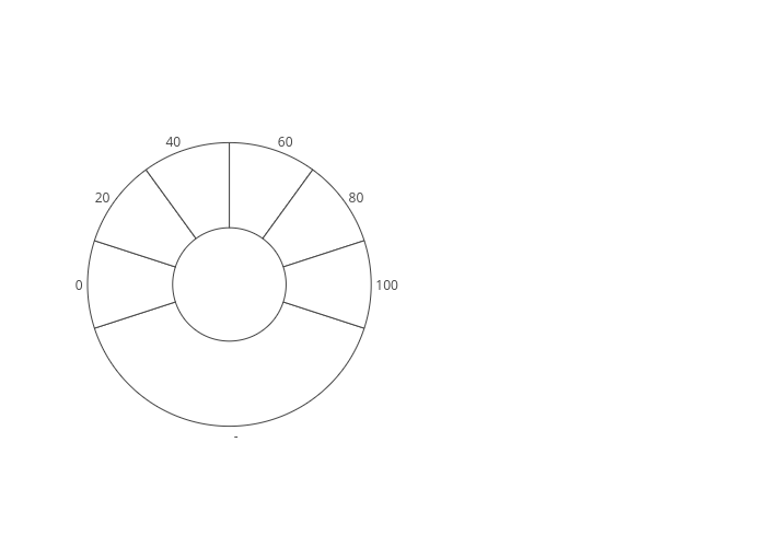
# ##### Base Chart (rotated)
#
# To make a `gauge meter` with 5 equally sized sections, we will create 6 sections in the base chart. So that center(position of label) aligns with the edges of each section.
# In[1]:
import plotly.plotly as py
import plotly.graph_objs as go
base_chart = {
"values": [40, 10, 10, 10, 10, 10, 10],
"labels": ["-", "0", "20", "40", "60", "80", "100"],
"domain": {"x": [0, .48]},
"marker": {
"colors": [
'rgb(255, 255, 255)',
'rgb(255, 255, 255)',
'rgb(255, 255, 255)',
'rgb(255, 255, 255)',
'rgb(255, 255, 255)',
'rgb(255, 255, 255)',
'rgb(255, 255, 255)'
],
"line": {
"width": 1
}
},
"name": "Gauge",
"hole": .4,
"type": "pie",
"direction": "clockwise",
"rotation": 108,
"showlegend": False,
"hoverinfo": "none",
"textinfo": "label",
"textposition": "outside"
}
# Outline of the generated `base chart` will look like the one below.
#
#
#
#
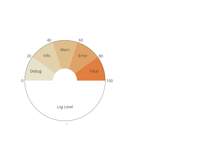
# ##### Meter Chart
#
# Now we will superimpose our `semi-circular` meter on top of this.
# For that, we will also use 6 sections, but one of them will be invisible to form the lower half (colored same as the background).
# In[2]:
meter_chart = {
"values": [50, 10, 10, 10, 10, 10],
"labels": ["Log Level", "Debug", "Info", "Warn", "Error", "Fatal"],
"marker": {
'colors': [
'rgb(255, 255, 255)',
'rgb(232,226,202)',
'rgb(226,210,172)',
'rgb(223,189,139)',
'rgb(223,162,103)',
'rgb(226,126,64)'
]
},
"domain": {"x": [0, 0.48]},
"name": "Gauge",
"hole": .3,
"type": "pie",
"direction": "clockwise",
"rotation": 90,
"showlegend": False,
"textinfo": "label",
"textposition": "inside",
"hoverinfo": "none"
}
# You can see that the first section's value is equal to the sum of other sections.
# We are using `rotation` and `direction` parameters to start the sections from 3 o'clock `[rotation=90]` instead of the default value of 12 o'clock `[rotation=0]`.
# After imposing on the base chart, it'll look like this.
#
#
#
#
# ##### Dial
#
# Now we need a `dial` to show the current position in the meter at a particular time.
# `Plotly's` [path shape](https://plotly.com/python/reference/#layout-shapes-path) can be used for this. A nice explanation of SVG path is available [here](https://developer.mozilla.org/en-US/docs/Web/SVG/Tutorial/Paths) by Mozilla.
# We can use a `filled triangle` to create our `Dial`.
# ```python
# ...
# 'shapes': [
# {
# 'type': 'path',
# 'path': 'M 0.235 0.5 L 0.24 0.62 L 0.245 0.5 Z',
# 'fillcolor': 'rgba(44, 160, 101, 0.5)',
# 'line': {
# 'width': 0.5
# },
# 'xref': 'paper',
# 'yref': 'paper'
# }
# ]
# ...
# ```
# For the `filled-triangle`, the first point `(0.235, 0.5)` is left to the center of meter `(0.24, 0.5)`, the second point `(0.24 0.62)` is representing the current position on the `semi-circle` and the third point `(0.245, 0.5)` is just right to the center.
# `M` represents the `'Move'` command that moves cursor to a particular point, `L` is the `'Line To'` command and `Z` represents the `'Close Path'` command. This way, this path string makes a triangle with those three points.
# In[3]:
layout = {
'xaxis': {
'showticklabels': False,
'showgrid': False,
'zeroline': False,
},
'yaxis': {
'showticklabels': False,
'showgrid': False,
'zeroline': False,
},
'shapes': [
{
'type': 'path',
'path': 'M 0.235 0.5 L 0.24 0.65 L 0.245 0.5 Z',
'fillcolor': 'rgba(44, 160, 101, 0.5)',
'line': {
'width': 0.5
},
'xref': 'paper',
'yref': 'paper'
}
],
'annotations': [
{
'xref': 'paper',
'yref': 'paper',
'x': 0.23,
'y': 0.45,
'text': '50',
'showarrow': False
}
]
}
# we don't want the boundary now
base_chart['marker']['line']['width'] = 0
fig = {"data": [base_chart, meter_chart],
"layout": layout}
py.iplot(fig, filename='gauge-meter-chart')
# #### Reference
# See https://plotly.com/python/reference/ for more information and chart attribute options!
# In[4]:
from IPython.display import display, HTML
display(HTML(''))
display(HTML(''))
get_ipython().system(' pip install git+https://github.com/plotly/publisher.git --upgrade')
import publisher
publisher.publish(
'semicircular-gauge.ipynb', 'python/gauge-charts/', 'Python Gauge Chart | plotly',
'How to make guage meter charts in Python with Plotly. ',
name = 'Gauge Charts',
title = 'Python Gauge Chart | plotly',
thumbnail='thumbnail/gauge.jpg', language='python',
has_thumbnail='true', display_as='basic', order=11,
ipynb='~notebook_demo/11')
# In[ ]:
 #
#
#
#  #
#
#
#