#!/usr/bin/env python
# coding: utf-8
# Author: Saeed Amen (@thalesians) - Managing Director & Co-founder of [the Thalesians](http://www.thalesians.com)
# ## Introduction
# With the UK general election in early May 2015, we thought it would be a fun exercise to demonstrate how you can investigate market price action over historial elections. We shall be using Python, together with Plotly for plotting. Plotly is a free web-based platform for making graphs. You can keep graphs private, make them public, and run Plotly on your [Chart Studio Enterprise on your own servers](https://plotly.com/product/enterprise/). You can find more details [here](https://plotly.com/python/getting-started/).
# ## Getting market data with Bloomberg
# To get market data, we shall be using Bloomberg. As a starting point, we have used bbg_py from [Brian Smith's TIA project](https://github.com/bpsmith/tia/tree/master/tia/bbg), which allows you to access Bloomberg via COM (older method), modifying it to make it compatible for Python 3.4. Whilst, we shall note use it to access historical daily data, there are functions which enable us to download intraday data. This method is only compatible with 32 bit versions of Python and assumes you are running the code on a Bloomberg terminal (it won't work without a valid Bloomberg licence).
#
# In my opinion a better way to access Bloomberg via Python, is via the official Bloomberg open source Python Open Source Graphing Library, however, at time of writing the official version is not yet compatible with Python 3.4. Fil Mackay has created a Python 3.4 compatible version of this [here](https://github.com/filmackay/blpapi-py), which I have used successfully. Whilst it takes slightly more time to configure (and compile using Windows SDK 7.1), it has the benefit of being compatible with 64 bit Python, which I have found invaluable in my analysis (have a read of [this](http://ta.speot.is/2012/04/09/visual-studio-2010-sp1-windows-sdk-7-1-install-order/) in case of failed installations of Windows SDK 7.1).
#
# Quandl can be used as an alternative data source, if you don't have access to a Bloomberg terminal, which I have also included in the code.
# ## Breaking down the steps in Python
# Our project will consist of several parts:
# - bbg_com - low level interaction with BBG COM object (adapted for Python 3.4) (which we are simply calling)
# - datadownloader - wrapper for BBG COM, Quandl and CSV access to data
# - eventplot - reusuable functions for interacting with Plotly and creating event studies
# - ukelection - kicks off the whole script process
# ### Downloading the market data
# As with any sort of financial market analysis, the first step is obtaining market data. We create the DataDownloader class, which acts a wrapper for Bloomberg, Quandl and CSV market data. We write a single function "download_time_series" for this. We could of course extend this for other data sources such as Yahoo Finance. Our output will be Pandas based dataframes. We want to make this code generic, so the tickers are not hard coded.
# In[1]:
# for time series manipulation
import pandas
class DataDownloader:
def download_time_series(self, vendor_ticker, pretty_ticker, start_date, source, csv_file = None):
if source == 'Quandl':
import Quandl
# Quandl requires API key for large number of daily downloads
# https://www.quandl.com/help/api
spot = Quandl.get(vendor_ticker) # Bank of England's database on Quandl
spot = pandas.DataFrame(data=spot['Value'], index=spot.index)
spot.columns = [pretty_ticker]
elif source == 'Bloomberg':
from bbg_com import HistoricalDataRequest
req = HistoricalDataRequest([vendor_ticker], ['PX_LAST'], start = start_date)
req.execute()
spot = req.response_as_single()
spot.columns = [pretty_ticker]
elif source == 'CSV':
dateparse = lambda x: pandas.datetime.strptime(x, '%Y-%m-%d')
# in case you want to use a source other than Bloomberg/Quandl
spot = pandas.read_csv(csv_file, index_col=0, parse_dates=0, date_parser=dateparse)
return spot
# ### Generic functions for event study and Plotly plotting
# We now focus our efforts on the EventPlot class. Here we shall do our basic analysis. We shall aslo create functions for creating plotly traces and layouts that we shall reuse a number of times. The analysis we shall conduct is fairly simple. Given a time series of spot, and a number of dates, we shall create an event study around these times for that asset. We also include the "Mean" move over all the various dates.
# In[2]:
# for dates
import datetime
# time series manipulation
import pandas
# for plotting data
import plotly
from plotly.graph_objs import *
class EventPlot:
def event_study(self, spot, dates, pre, post, mean_label = 'Mean'):
# event_study - calculates the asset price moves over windows around event days
#
# spot = price of asset to study
# dates = event days to anchor our event study
# pre = days before the event day to start our study
# post = days after the event day to start our study
#
data_frame = pandas.DataFrame()
# for each date grab spot data the days before and after
for i in range(0, len(dates)):
mid_index = spot.index.searchsorted(dates[i])
start_index = mid_index + pre
finish_index = mid_index + post + 1
x = (spot.ix[start_index:finish_index])[spot.columns.values[0]]
data_frame[dates[i]] = x.values
data_frame.index = range(pre, post + 1)
data_frame = data_frame / data_frame.shift(1) - 1 # returns
# add the mean on to the end
data_frame[mean_label] = data_frame.mean(axis=1)
data_frame = 100.0 * (1.0 + data_frame).cumprod() # index
data_frame.ix[pre,:] = 100
return data_frame
# We write a function to convert dates represented in a string format to Python format.
# In[3]:
def parse_dates(self, str_dates):
# parse_dates - parses string dates into Python format
#
# str_dates = dates to be parsed in the format of day/month/year
#
dates = []
for d in str_dates:
dates.append(datetime.datetime.strptime(d, '%d/%m/%Y'))
return dates
EventPlot.parse_dates = parse_dates
# Our next focus is on the Plotly functions which create a layout. This enables us to specify axes labels, the width and height of the final plot and so on. We could of course add further properties into it.
# In[4]:
def create_layout(self, title, xaxis, yaxis, width = -1, height = -1):
# create_layout - populates a layout object
# title = title of the plot
# xaxis = xaxis label
# yaxis = yaxis label
# width (optional) = width of plot
# height (optional) = height of plot
#
layout = Layout(
title = title,
xaxis = plotly.graph_objs.XAxis(
title = xaxis,
showgrid = False
),
yaxis = plotly.graph_objs.YAxis(
title= yaxis,
showline = False
)
)
if width > 0 and height > 0:
layout['width'] = width
layout['height'] = height
return layout
EventPlot.create_layout = create_layout
# Earlier, in the DataDownloader class, our output was Pandas based dataframes. Our convert_df_plotly function will convert these each series from Pandas dataframe into plotly traces. Along the way, we shall add various properties such as markers with varying levels of opacity, graduated coloring of lines (which uses colorlover) and so on.
# In[5]:
def convert_df_plotly(self, dataframe, axis_no = 1, color_def = ['default'],
special_line = 'Mean', showlegend = True, addmarker = False, gradcolor = None):
# convert_df_plotly - converts a Pandas data frame to Plotly format for line plots
# dataframe = data frame due to be converted
# axis_no = axis for plot to be drawn (default = 1)
# special_line = make lines named this extra thick
# color_def = color scheme to be used (default = ['default']), colour will alternate in the list
# showlegend = True or False to show legend of this line on plot
# addmarker = True or False to add markers
# gradcolor = Create a graduated color scheme for the lines
#
# Also see http://nbviewer.ipython.org/gist/nipunreddevil/7734529 for converting dataframe to traces
# Also see http://moderndata.plot.ly/color-scales-in-ipython-notebook/
x = dataframe.index.values
traces = []
# will be used for market opacity for the markers
increments = 0.95 / float(len(dataframe.columns))
if gradcolor is not None:
try:
import colorlover as cl
color_def = cl.scales[str(len(dataframe.columns))]['seq'][gradcolor]
except:
print('Check colorlover installation...')
i = 0
for key in dataframe:
scatter = plotly.graph_objs.Scatter(
x = x,
y = dataframe[key].values,
name = key,
xaxis = 'x' + str(axis_no),
yaxis = 'y' + str(axis_no),
showlegend = showlegend)
# only apply color/marker properties if not "default"
if color_def[i % len(color_def)] != "default":
if special_line in str(key):
# special case for lines labelled "mean"
# make line thicker
scatter['mode'] = 'lines'
scatter['line'] = plotly.graph_objs.Line(
color = color_def[i % len(color_def)],
width = 2
)
else:
line_width = 1
# set properties for the markers which change opacity
# for markers make lines thinner
if addmarker:
opacity = 0.05 + (increments * i)
scatter['mode'] = 'markers+lines'
scatter['marker'] = plotly.graph_objs.Marker(
color=color_def[i % len(color_def)], # marker color
opacity = opacity,
size = 5)
line_width = 0.2
else:
scatter['mode'] = 'lines'
scatter['line'] = plotly.graph_objs.Line(
color = color_def[i % len(color_def)],
width = line_width)
i = i + 1
traces.append(scatter)
return traces
EventPlot.convert_df_plotly = convert_df_plotly
# ### UK election analysis
# We've now created several generic functions for downloading data, doing an event study and also for helping us out with plotting via Plotly. We now start work on the ukelection.py script, for pulling it all together. As a very first step we need to provide credentials for Plotly (you can get your own Plotly key and username [here](https://plotly.com/python/getting-started/)).
# In[6]:
# for time series/maths
import pandas
# for plotting data
import plotly
import plotly.plotly as py
from plotly.graph_objs import *
def ukelection():
# Learn about API authentication here: https://plotly.com/python/getting-started
# Find your api_key here: https://plotly.com/settings/api
plotly_username = "thalesians"
plotly_api_key = "XXXXXXXXX"
plotly.tools.set_credentials_file(username=plotly_username, api_key=plotly_api_key)
# Let's download our market data that we need (GBP/USD spot data) using the DataDownloader class. As a default, I've opted to use Bloomberg data. You can try other currency pairs or markets (for example FTSE), to compare results for the event study. Note that obviously each data vendor will have a different ticker in their system for what could well be the same asset. With FX, care must be taken to know which close the vendor is snapping. As a default we have opted for BGN, which for GBP/USD is the NY close value.
# In[7]:
ticker = 'GBPUSD' # will use in plot titles later (and for creating Plotly URL)
##### download market GBP/USD data from Quandl, Bloomberg or CSV file
source = "Bloomberg"
# source = "Quandl"
# source = "CSV"
csv_file = None
event_plot = EventPlot()
data_downloader = DataDownloader()
start_date = event_plot.parse_dates(['01/01/1975'])
if source == 'Quandl':
vendor_ticker = "BOE/XUDLUSS"
elif source == 'Bloomberg':
vendor_ticker = 'GBPUSD BGN Curncy'
elif source == 'CSV':
vendor_ticker = 'GBPUSD'
csv_file = 'D:/GBPUSD.csv'
spot = data_downloader.download_time_series(vendor_ticker, ticker, start_date[0], source, csv_file = csv_file)
# The most important part of the study is getting the historical UK election dates! We can obtain these from Wikipedia. We then convert into Python format. We need to make sure we filter the UK election dates, for where we have spot data available.
# In[8]:
labour_wins = ['28/02/1974', '10/10/1974', '01/05/1997', '07/06/2001', '05/05/2005']
conservative_wins = ['03/05/1979', '09/06/1983', '11/06/1987', '09/04/1992', '06/05/2010']
# convert to more easily readable format
labour_wins_d = event_plot.parse_dates(labour_wins)
conservative_wins_d = event_plot.parse_dates(conservative_wins)
# only takes those elections where we have data
labour_wins_d = [d for d in labour_wins_d if d > spot.index[0].to_pydatetime()]
conservative_wins_d = [d for d in conservative_wins_d if d > spot.index[0].to_pydatetime()]
spot.index.name = 'Date'
# We then call our event study function in EventPlot on our spot data, which compromises of the 20 days before up till the 20 days after the UK general election. We shall plot these lines later.
# In[9]:
# number of days before and after for our event study
pre = -20
post = 20
# calculate spot path during Labour wins
labour_wins_spot = event_plot.event_study(spot, labour_wins_d, pre, post, mean_label = 'Labour Mean')
# calculate spot path during Conservative wins
conservative_wins_spot = event_plot.event_study(spot, conservative_wins_d, pre, post, mean_label = 'Conservative Mean')
# Define our xaxis and yaxis labels, as well as our source, which we shall later include in the title.
# In[10]:
##### Create separate plots of price action during Labour and Conservative wins
xaxis = 'Days'
yaxis = 'Index'
source_label = "Source: @thalesians/BBG/Wikipedia"
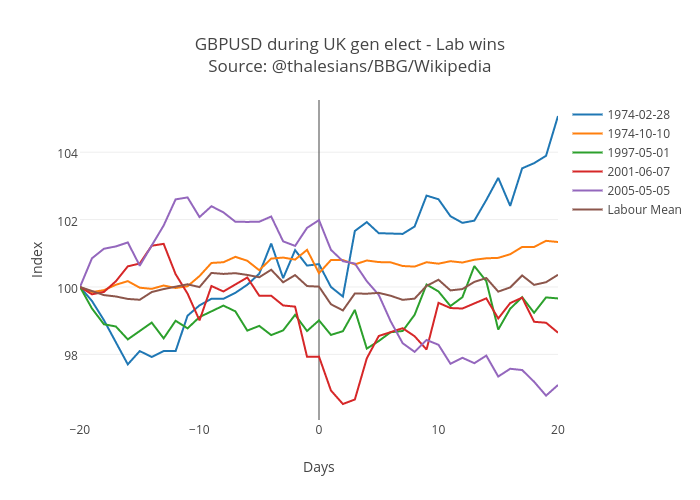
# We're finally ready for our first plot! We shall plot GBP/USD moves over Labour election wins, using the default palette and then we shall embed it into the sheet, using the URL given to us from the Plotly website.
# In[11]:
###### Plot market reaction during Labour UK election wins
###### Using default color scheme
title = ticker + ' during UK gen elect - Lab wins' + ' ' + source_label
fig = Figure(data=event_plot.convert_df_plotly(labour_wins_spot),
layout=event_plot.create_layout(title, xaxis, yaxis)
)
py.iplot(fig, filename='labour-wins-' + ticker)
# The "iplot" function will send it to Plotly's server (provided we have all the dependencies installed).
# Alternatively, we could embed the HTML as an image, which we have taken from the Plotly website. Note this approach will yield a static image which is fetched from Plotly's servers. It also possible to write the image to disk. Later we shall show the embed function.
#
#
#
#
#
# We next plot GBP/USD over Conservative wins. In this instance, however, we have a graduated 'Blues' color scheme, given obviously that blue is the color of the Conserative party in the UK!
# In[12]:
###### Plot market reaction during Conservative UK election wins
###### Using varying shades of blue for each line (helped by colorlover library)
title = ticker + ' during UK gen elect - Con wins ' + ' ' + source_label
# also apply graduated color scheme of blues (from light to dark)
# see http://moderndata.plot.ly/color-scales-in-ipython-notebook/ for details on colorlover package
# which allows you to set scales
fig = Figure(data=event_plot.convert_df_plotly(conservative_wins_spot, gradcolor='Blues', addmarker=False),
layout=event_plot.create_layout(title, xaxis, yaxis),
)
plot_url = py.iplot(fig, filename='conservative-wins-' + ticker)
# Embed the chart into the document using "embed". This essentially embeds the JavaScript code, necessary to make it interactive.
# In[13]:
import plotly.tools as tls
tls.embed("https://plotly.com/~thalesians/245")
# Our final plot, will consist of three subplots, Labour wins, Conservative wins, and average moves for both. We also add a grid and a grey background for each plot.
# In[14]:
##### Plot market reaction during Conservative UK election wins
##### create a plot consisting of 3 subplots (from left to right)
##### 1. Labour wins, 2. Conservative wins, 3. Conservative/Labour mean move
# create a dataframe which grabs the mean from the respective Lab & Con election wins
mean_wins_spot = pandas.DataFrame()
mean_wins_spot['Labour Mean'] = labour_wins_spot['Labour Mean']
mean_wins_spot['Conservative Mean'] = conservative_wins_spot['Conservative Mean']
fig = plotly.tools.make_subplots(rows=1, cols=3)
# apply different color scheme (red = Lab, blue = Con)
# also add markets, which will have varying levels of opacity
fig['data'] += Data(
event_plot.convert_df_plotly(conservative_wins_spot, axis_no=1,
color_def=['blue'], addmarker=True) +
event_plot.convert_df_plotly(labour_wins_spot, axis_no=2,
color_def=['red'], addmarker=True) +
event_plot.convert_df_plotly(mean_wins_spot, axis_no=3,
color_def=['red', 'blue'], addmarker=True, showlegend = False)
)
fig['layout'].update(title=ticker + ' during UK gen elects by winning party ' + ' ' + source_label)
# use the scheme from https://plotly.com/python/bubble-charts-tutorial/
# can use dict approach, rather than specifying each separately
axis_style = dict(
gridcolor='#FFFFFF', # white grid lines
ticks='outside', # draw ticks outside axes
ticklen=8, # tick length
tickwidth=1.5 # and width
)
# create the various axes for the three separate charts
fig['layout'].update(xaxis1=plotly.graph_objs.XAxis(axis_style, title=xaxis))
fig['layout'].update(yaxis1=plotly.graph_objs.YAxis(axis_style, title=yaxis))
fig['layout'].update(xaxis2=plotly.graph_objs.XAxis(axis_style, title=xaxis))
fig['layout'].update(yaxis2=plotly.graph_objs.YAxis(axis_style))
fig['layout'].update(xaxis3=plotly.graph_objs.XAxis(axis_style, title=xaxis))
fig['layout'].update(yaxis3=plotly.graph_objs.YAxis(axis_style))
fig['layout'].update(plot_bgcolor='#EFECEA') # set plot background to grey
plot_url = py.iplot(fig, filename='labour-conservative-wins-'+ ticker + '-subplot')
# This time we use "embed", which grab the plot from Plotly's server, we did earlier (given we have already uploaded it).
# In[15]:
import plotly.tools as tls
tls.embed("https://plotly.com/~thalesians/246")
# That's about it! I hope the code I've written proves fruitful for creating some very cool Plotly plots and also for doing some very timely analysis ahead of the UK general election! Hoping this will be first of many blogs on using Plotly data.
# The analysis in this blog is based on a report I wrote for Thalesians, a quant finance thinktank. If you are interested in getting access to the full copy of the report (Thalesians: My kingdom for a vote - The definitive quant guide to UK general elections), feel free to e-mail me at saeed@thalesians.com or tweet me @thalesians
# ## Want to hear more about global macro and UK election developments?
# If you're interested in FX and the UK general election, come to our Thalesians panel in London on April 29th 2015 at 7.30pm in Canary Wharf, which will feature, Eric Burroughs (Reuters - FX Buzz Editor), Mark Cudmore (Bloomberg - First Word EM Strategist), Jordan Rochester (Nomura - FX strategist), Jeremy Wilkinson-Smith (Independent FX trader) and myself as the moderator. Tickets are available [here](http://www.meetup.com/thalesians/events/221147156/)
# ## Biography
# Saeed Amen is the managing director and co-founder of the Thalesians. He has a decade of experience creating and successfully running systematic trading models at Lehman Brothers, Nomura and now at the Thalesians. Independently, he runs a systematic trading model with proprietary capital. He is the author of Trading Thalesians – What the ancient world can teach us about trading today (Palgrave Macmillan). He graduated with a first class honours master’s degree from Imperial College in Mathematics & Computer Science. He is also a fan of Python and has written an extensive library for financial market backtesting called PyThalesians.
#
#
# Follow the Thalesians on Twitter @thalesians and get my book on Amazon [here](http://www.amazon.co.uk/Trading-Thalesians-Saeed-Amen/dp/113739952X)
# All the code here is available to download from the [Thalesians GitHub page](https://github.com/thalesians/pythalesians)
# In[1]:
from IPython.display import display, HTML
display(HTML(''))
display(HTML(''))
get_ipython().system(' pip install publisher --upgrade')
import publisher
publisher.publish(
'ukelectionbbg.ipynb', 'ipython-notebooks/ukelectionbbg/', 'Plotting GBP/USD price action around UK general elections',
'Create interactive graphs with market data, IPython Notebook and Plotly', name='Plot MP Action in GBP/USD around UK General Elections')
# In[ ]:
 #
#
#
#