#!/usr/bin/env python
# coding: utf-8
# #### New to Plotly?
# Plotly's Python library is free and open source! [Get started](https://plotly.com/python/getting-started/) by downloading the client and [reading the primer](https://plotly.com/python/getting-started/).
# You can set up Plotly to work in [online](https://plotly.com/python/getting-started/#initialization-for-online-plotting) or [offline](https://plotly.com/python/getting-started/#initialization-for-offline-plotting) mode, or in [jupyter notebooks](https://plotly.com/python/getting-started/#start-plotting-online).
# We also have a quick-reference [cheatsheet](https://images.plot.ly/plotly-documentation/images/python_cheat_sheet.pdf) (new!) to help you get started!
# #### Version Check
# Plotly's python package is updated frequently. Run `pip install plotly --upgrade` to use the latest version.
# In[1]:
import plotly
plotly.__version__
# #### What is BigQuery?
# It's a service by Google, which enables analysis of massive datasets. You can use the traditional SQL-like language to query the data. You can host your own data on BigQuery to use the super fast performance at scale.
# #### Google BigQuery Public Datasets
#
# There are [a few datasets](https://cloud.google.com/bigquery/public-data/) stored in BigQuery, available for general public to use. Some of the publicly available datasets are:
# - Hacker News (stories and comments)
# - USA Baby Names
# - GitHub activity data
# - USA disease surveillance
# We will use the [Hacker News](https://cloud.google.com/bigquery/public-data/hacker-news) dataset for our analysis.
# #### Imports
# In[1]:
import plotly.plotly as py
import plotly.graph_objs as go
import plotly.figure_factory as ff
import pandas as pd
from pandas.io import gbq # to communicate with Google BigQuery
# #### Prerequisites
#
# You need to have the following libraries:
# * [python-gflags](http://code.google.com/p/python-gflags/)
# * httplib2
# * google-api-python-client
#
# #### Create Project
#
# A project can be created on the [Google Developer Console](https://console.developers.google.com/iam-admin/projects).
#
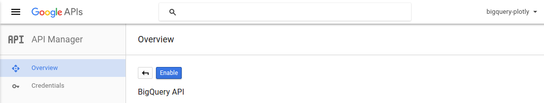
# #### Enable BigQuery API
#
# You need to activate the BigQuery API for the project.
# 
# You will have find the `Project ID` for your project to get the queries working.
#
# 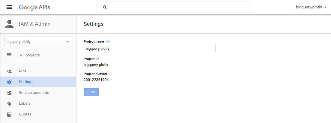
# project_id = 'bigquery-plotly'
# ### Top 10 Most Active Users on Hacker News (by total stories submitted)
#
# We will select the top 10 high scoring `author`s and their respective `score` values.
# In[4]:
top10_active_users_query = """
SELECT
author AS User,
count(author) as Stories
FROM
[fh-bigquery:hackernews.stories]
GROUP BY
User
ORDER BY
Stories DESC
LIMIT
10
"""
# The `pandas.gbq` module provides a method `read_gbq` to query the BigQuery stored dataset and stores the result as a `DataFrame`.
# In[5]:
try:
top10_active_users_df = gbq.read_gbq(top10_active_users_query, project_id=project_id)
except:
print 'Error reading the dataset'
# Using the `create_table` method from the `FigureFactory` module, we can generate a table from the resulting `DataFrame`.
# In[7]:
top_10_users_table = ff.create_table(top10_active_users_df)
py.iplot(top_10_users_table, filename='top-10-active-users')
# ### Top 10 Hacker News Submissions (by score)
#
# We will select the `title` and `score` columns in the descending order of their `score`, keeping only top 10 stories among all.
# In[8]:
top10_story_query = """
SELECT
title,
score,
time_ts AS timestamp
FROM
[fh-bigquery:hackernews.stories]
ORDER BY
score DESC
LIMIT
10
"""
# In[9]:
try:
top10_story_df = gbq.read_gbq(top10_story_query, project_id=project_id)
except:
print 'Error reading the dataset'
# In[10]:
# Create a table figure from the DataFrame
top10_story_figure = FF.create_table(top10_story_df)
# Scatter trace for the bubble chart timeseries
story_timeseries_trace = go.Scatter(
x=top10_story_df['timestamp'],
y=top10_story_df['score'],
xaxis='x2',
yaxis='y2',
mode='markers',
text=top10_story_df['title'],
marker=dict(
color=[80 + i*5 for i in range(10)],
size=top10_story_df['score']/50,
showscale=False
)
)
# Add the trace data to the figure
top10_story_figure['data'].extend(go.Data([story_timeseries_trace]))
# Subplot layout
top10_story_figure.layout.yaxis.update({'domain': [0, .45]})
top10_story_figure.layout.yaxis2.update({'domain': [.6, 1]})
# Y-axis of the graph should be anchored with X-axis
top10_story_figure.layout.yaxis2.update({'anchor': 'x2'})
top10_story_figure.layout.xaxis2.update({'anchor': 'y2'})
# Add the height and title attribute
top10_story_figure.layout.update({'height':900})
top10_story_figure.layout.update({'title': 'Highest Scoring Submissions on Hacker News'})
# Update the background color for plot and paper
top10_story_figure.layout.update({'paper_bgcolor': 'rgb(243, 243, 243)'})
top10_story_figure.layout.update({'plot_bgcolor': 'rgb(243, 243, 243)'})
# Add the margin to make subplot titles visible
top10_story_figure.layout.margin.update({'t':75, 'l':50})
top10_story_figure.layout.yaxis2.update({'title': 'Upvote Score'})
top10_story_figure.layout.xaxis2.update({'title': 'Post Time'})
# In[39]:
py.image.save_as(top10_story_figure, filename='top10-posts.png')
py.iplot(top10_story_figure, filename='highest-scoring-submissions')
# You can see that the lists consist of the stories involving some big names.
# * "Death of Steve Jobs and Aaron Swartz"
# * "Announcements of the Hyperloop and the game 2048".
# * "Microsoft open sourcing the .NET"
#
# The story title is visible when you `hover` over the bubbles.
# #### From which Top-level domain (TLD) most of the stories come?
# Here we have used the url-function [TLD](https://cloud.google.com/bigquery/query-reference#tld) from BigQuery's query syntax. We collect the domain for all URLs with their respective count, and group them by it.
# In[12]:
tld_share_query = """
SELECT
TLD(url) AS domain,
count(score) AS stories
FROM
[fh-bigquery:hackernews.stories]
GROUP BY
domain
ORDER BY
stories DESC
LIMIT 10
"""
# In[13]:
try:
tld_share_df = gbq.read_gbq(tld_share_query, project_id=project_id)
except:
print 'Error reading the dataset'
# In[38]:
labels = tld_share_df['domain']
values = tld_share_df['stories']
tld_share_trace = go.Pie(labels=labels, values=values)
data = [tld_share_trace]
layout = go.Layout(
title='Submissions shared by Top-level domains'
)
fig = go.Figure(data=data, layout=layout)
py.iplot(fig)
# We can notice that the **.com** top-level domain contributes to most of the stories on Hacker News.
# #### Public response to the "Who Is Hiring?" posts
# There is an account on Hacker News by the name [whoishiring](https://news.ycombinator.com/user?id=whoishiring). This account automatically submits a 'Who is Hiring?' post at 11 AM Eastern time on the first weekday of every month.
# In[16]:
wih_query = """
SELECT
id,
title,
score,
time_ts
FROM
[fh-bigquery:hackernews.stories]
WHERE
author == 'whoishiring' AND
LOWER(title) contains 'who is hiring?'
ORDER BY
time
"""
# In[17]:
try:
wih_df = gbq.read_gbq(wih_query, project_id=project_id)
except:
print 'Error reading the dataset'
# In[37]:
trace = go.Scatter(
x=wih_df['time_ts'],
y=wih_df['score'],
mode='markers+lines',
text=wih_df['title'],
marker=dict(
size=wih_df['score']/50
)
)
layout = go.Layout(
title='Public response to the "Who Is Hiring?" posts',
xaxis=dict(
title="Post Time"
),
yaxis=dict(
title="Upvote Score"
)
)
data = [trace]
fig = go.Figure(data=data, layout=layout)
py.iplot(fig, filename='whoishiring-public-response')
# ### Submission Traffic Volume in a Week
# In[19]:
week_traffic_query = """
SELECT
DAYOFWEEK(time_ts) as Weekday,
count(DAYOFWEEK(time_ts)) as story_counts
FROM
[fh-bigquery:hackernews.stories]
GROUP BY
Weekday
ORDER BY
Weekday
"""
# In[20]:
try:
week_traffic_df = gbq.read_gbq(week_traffic_query, project_id=project_id)
except:
print 'Error reading the dataset'
# In[36]:
week_traffic_df['Day'] = ['NULL', 'Sunday', 'Monday', 'Tuesday', 'Wednesday', 'Thursday', 'Friday', 'Saturday']
week_traffic_df = week_traffic_df.drop(week_traffic_df.index[0])
trace = go.Scatter(
x=week_traffic_df['Day'],
y=week_traffic_df['story_counts'],
mode='lines',
text=week_traffic_df['Day']
)
layout = go.Layout(
title='Submission Traffic Volume (Week Days)',
xaxis=dict(
title="Day of the Week"
),
yaxis=dict(
title="Total Submissions"
)
)
data = [trace]
fig = go.Figure(data=data, layout=layout)
py.iplot(fig, filename='submission-traffic-volume')
# We can observe that the Hacker News faces fewer submissions during the weekends.
# #### Programming Language Trend on HackerNews
# We will compare the trends for the Python and PHP programming languages, using the Hacker News post titles.
# In[24]:
python_query = """
SELECT
YEAR(time_ts) as years,
COUNT(YEAR(time_ts )) as trends
FROM
[fh-bigquery:hackernews.stories]
WHERE
LOWER(title) contains 'python'
GROUP BY
years
ORDER BY
years
"""
php_query = """
SELECT
YEAR(time_ts) as years,
COUNT(YEAR(time_ts )) as trends
FROM
[fh-bigquery:hackernews.stories]
WHERE
LOWER(title) contains 'php'
GROUP BY
years
ORDER BY
years
"""
# In[25]:
try:
python_df = gbq.read_gbq(python_query, project_id=project_id)
except:
print 'Error reading the dataset'
# In[26]:
try:
php_df = gbq.read_gbq(php_query, project_id=project_id)
except:
print 'Error reading the dataset'
# In[35]:
trace1 = go.Scatter(
x=python_df['years'],
y=python_df['trends'],
mode='lines',
line=dict(color='rgba(115,115,115,1)', width=4),
connectgaps=True,
)
trace2 = go.Scatter(
x=[python_df['years'][0], python_df['years'][8]],
y=[python_df['trends'][0], python_df['trends'][8]],
mode='markers',
marker=dict(color='rgba(115,115,115,1)', size=8)
)
trace3 = go.Scatter(
x=php_df['years'],
y=php_df['trends'],
mode='lines',
line=dict(color='rgba(189,189,189,1)', width=4),
connectgaps=True,
)
trace4 = go.Scatter(
x=[php_df['years'][0], php_df['years'][8]],
y=[php_df['trends'][0], php_df['trends'][8]],
mode='markers',
marker=dict(color='rgba(189,189,189,1)', size=8)
)
traces = [trace1, trace2, trace3, trace4]
layout = go.Layout(
xaxis=dict(
showline=True,
showgrid=False,
showticklabels=True,
linecolor='rgb(204, 204, 204)',
linewidth=2,
autotick=False,
ticks='outside',
tickcolor='rgb(204, 204, 204)',
tickwidth=2,
ticklen=5,
tickfont=dict(
family='Arial',
size=12,
color='rgb(82, 82, 82)',
),
),
yaxis=dict(
showgrid=False,
zeroline=False,
showline=False,
showticklabels=False,
),
autosize=False,
margin=dict(
autoexpand=False,
l=100,
r=20,
t=110,
),
showlegend=False,
)
annotations = []
annotations.append(
dict(xref='paper', x=0.95, y=python_df['trends'][8],
xanchor='left', yanchor='middle',
text='Python',
font=dict(
family='Arial',
size=14,
color='rgba(49,130,189, 1)'
),
showarrow=False)
)
annotations.append(
dict(xref='paper', x=0.95, y=php_df['trends'][8],
xanchor='left', yanchor='middle',
text='PHP',
font=dict(
family='Arial',
size=14,
color='rgba(49,130,189, 1)'
),
showarrow=False)
)
annotations.append(
dict(xref='paper', yref='paper', x=0.5, y=-0.1,
xanchor='center', yanchor='top',
text='Source: Hacker News submissions with the title containing Python/PHP',
font=dict(
family='Arial',
size=12,
color='rgb(150,150,150)'
),
showarrow=False)
)
layout['annotations'] = annotations
fig = go.Figure(data=traces, layout=layout)
py.iplot(fig, filename='programming-language-trends')
# As we already know about this trend, Python is dominating PHP throughout the timespan.
# #### Reference
# See https://plotly.com/python/getting-started/ for more information about Plotly's Python Open Source Graphing Library!
# In[2]:
from IPython.display import display, HTML
display(HTML(''))
display(HTML(''))
get_ipython().system(' pip install git+https://github.com/plotly/publisher.git --upgrade')
import publisher
publisher.publish(
'BigQuery-Plotly.ipynb', 'python/google_big_query/', 'Google Big-Query',
'How to make your-tutorial-chart plots in Python with Plotly.',
title = 'Google Big Query | plotly',
has_thumbnail='true', thumbnail='thumbnail/bigquery2.jpg',
language='python', page_type='example_index',
display_as='databases', order=7)
# In[ ]: