Building an ARIMA Model for a Financial Dataset
In this notebook, you will build an ARIMA model for AAPL stock closing prices. The lab objectives are:
- Pull data from Google Cloud Storage into a Pandas dataframe
- Learn how to prepare raw stock closing data for an ARIMA model
- Apply the Dickey-Fuller test
- Build an ARIMA model using the statsmodels library
Make sure you restart the Python kernel after executing the pip install command below! After you restart the kernel you don't have to execute the command again.
!pip install --user statsmodels
%matplotlib inline

import pandas as pd
import matplotlib.pyplot as plt
import numpy as np
import datetime

%config InlineBackend.figure_format = 'retina'
Import data from Google Clod Storage
In this section we'll read some ten years' worth of AAPL stock data into a Pandas dataframe. We want to modify the dataframe such that it represents a time series. This is achieved by setting the date as the index.
df = pd.read_csv('gs://cloud-training/ai4f/AAPL10Y.csv')

df['date'] = pd.to_datetime(df['date'])
df.sort_values('date', inplace=True)
df.set_index('date', inplace=True)

print(df.shape)

df.head()
Prepare data for ARIMA
The first step in our preparation is to resample the data such that stock closing prices are aggregated on a weekly basis.
df_week = df.resample('w').mean()
df_week = df_week[['close']]
df_week.head()
Let's create a column for weekly returns. Take the log to of the returns to normalize large fluctuations.
df_week['weekly_ret'] = np.log(df_week['close']).diff()
df_week.head()
# drop null rows
df_week.dropna(inplace=True)
df_week.weekly_ret.plot(kind='line', figsize=(12, 6));
udiff = df_week.drop(['close'], axis=1)
udiff.head()
Test for stationarity of the udiff series
Time series are stationary if they do not contain trends or seasonal swings. The Dickey-Fuller test can be used to test for stationarity.
import statsmodels.api as sm
from statsmodels.tsa.stattools import adfuller
rolmean = udiff.rolling(20).mean()
rolstd = udiff.rolling(20).std()
plt.figure(figsize=(12, 6))
orig = plt.plot(udiff, color='blue', label='Original')
mean = plt.plot(rolmean, color='red', label='Rolling Mean')
std = plt.plot(rolstd, color='black', label = 'Rolling Std Deviation')
plt.title('Rolling Mean & Standard Deviation')
plt.legend(loc='best')
plt.show(block=False)
# Perform Dickey-Fuller test
dftest = sm.tsa.adfuller(udiff.weekly_ret, autolag='AIC')
dfoutput = pd.Series(dftest[0:4], index=['Test Statistic', 'p-value', '#Lags Used', 'Number of Observations Used'])
for key, value in dftest[4].items():
    dfoutput['Critical Value ({0})'.format(key)] = value

dfoutput
With a p-value < 0.05, we can reject the null hypotehsis. This data set is stationary.
ACF and PACF Charts
Making autocorrelation and partial autocorrelation charts help us choose hyperparameters for the ARIMA model.
The ACF gives us a measure of how much each "y" value is correlated to the previous n "y" values prior.
The PACF is the partial correlation function gives us (a sample of) the amount of correlation between two "y" values separated by n lags excluding the impact of all the "y" values in between them.
from statsmodels.graphics.tsaplots import plot_acf

# the autocorrelation chart provides just the correlation at increasing lags
fig, ax = plt.subplots(figsize=(12,5))
plot_acf(udiff.values, lags=10, ax=ax)
plt.show()
from statsmodels.graphics.tsaplots import plot_pacf

fig, ax = plt.subplots(figsize=(12,5))
plot_pacf(udiff.values, lags=10, ax=ax)
plt.show()
The table below summarizes the patterns of the ACF and PACF.
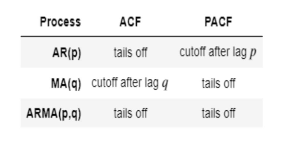
The above chart shows that reading PACF gives us a lag "p" = 3 and reading ACF gives us a lag "q" of 1. Let's Use Statsmodel's ARMA with those parameters to build a model. The way to evaluate the model is to look at AIC - see if it reduces or increases. The lower the AIC (i.e. the more negative it is), the better the model.
Build ARIMA Model
Since we differenced the weekly closing prices, we technically only need to build an ARMA model. The data has already been integrated and is stationary.
from statsmodels.tsa.arima_model import ARMA

# Notice that you have to use udiff - the differenced data rather than the original data.
ar1 = ARMA(tuple(udiff.values), (3, 1)).fit()
ar1.summary()
Our model doesn't do a good job predicting variance in the original data (peaks and valleys).
plt.figure(figsize=(12, 8))
plt.plot(udiff.values, color='blue')
preds = ar1.fittedvalues
plt.plot(preds, color='red')
plt.show()
Let's make a forecast 2 weeks ahead:
steps = 2

forecast = ar1.forecast(steps=steps)[0]

plt.figure(figsize=(12, 8))
plt.plot(udiff.values, color='blue')

preds = ar1.fittedvalues
plt.plot(preds, color='red')

plt.plot(pd.DataFrame(np.array([preds[-1],forecast[0]]).T,index=range(len(udiff.values)+1, len(udiff.values)+3)), color='green')
plt.plot(pd.DataFrame(forecast,index=range(len(udiff.values)+1, len(udiff.values)+1+steps)), color='green')
plt.title('Display the predictions with the ARIMA model')
plt.show()
The forecast is not great but if you tune the hyper parameters some more, you might be able to reduce the errors.