Using Qurro with Arbitrary Compositional Data
Although Qurro was initially designed for use with microbiome sequencing data, it can totally be used on any sort of compositional data. The main challenge is just getting your data formatted properly.
We're going to demonstrate this by creating a Qurro visualization from "color composition data for 22 abstract paintings." These data were taken from Table 1 of Aitchison and Greenacre (2002).
Requirements
0. Setting up
In this section, we replace the output directory with an empty directory. This just lets us run this notebook multiple times, without any tools complaining about overwriting files.
# Clear the output directory so we can write these files there
!rm -rf output
# Since git doesn't keep track of empty directories, create the output/ directory if it doesn't already exist
# (if it does already exist, -p ensures that an error won't be thrown)
!mkdir -p output
1. Getting the input data ready
At minimum, three files are needed to generate a Qurro visualization. This section goes into detail on each of these three files, and what they look like for the color composition data.
1.1. Feature Table
This is a table of abundance data detailing the frequencies of features in samples. Qurro expects this table to be in the BIOM format, but fortunately converting TSV files to BIOM isn't too bad.
1.1.1. Wait, hold on, what do you mean by "features" and "samples"?
In the color composition data, we consider each of the 22 paintings as a sample, and each color (e.g. Red) as a feature.
1.1.2. Viewing the example file
We've provided a TSV file input/color-table.tsv containing the color composition data for the 22 paintings. Notice how the columns are samples, and the rows are features.
from qurro._metadata_utils import read_metadata_file
table = read_metadata_file("input/color-table.tsv")
table.head()
| 1 | 2 | 3 | 4 | 5 | 6 | 7 | 8 | 9 | 10 | ... | 13 | 14 | 15 | 16 | 17 | 18 | 19 | 20 | 21 | 22 | |
|---|---|---|---|---|---|---|---|---|---|---|---|---|---|---|---|---|---|---|---|---|---|
| FeatureID | |||||||||||||||||||||
| Black | 0.125 | 0.143 | 0.147 | 0.164 | 0.197 | 0.157 | 0.153 | 0.115 | 0.178 | 0.164 | ... | 0.155 | 0.126 | 0.199 | 0.163 | 0.136 | 0.184 | 0.169 | 0.146 | 0.200 | 0.135 |
| White | 0.243 | 0.224 | 0.231 | 0.209 | 0.151 | 0.256 | 0.232 | 0.249 | 0.167 | 0.183 | ... | 0.251 | 0.273 | 0.170 | 0.196 | 0.185 | 0.152 | 0.207 | 0.240 | 0.172 | 0.225 |
| Blue | 0.153 | 0.111 | 0.058 | 0.120 | 0.132 | 0.072 | 0.101 | 0.176 | 0.048 | 0.158 | ... | 0.091 | 0.045 | 0.080 | 0.107 | 0.162 | 0.110 | 0.111 | 0.141 | 0.059 | 0.217 |
| Red | 0.031 | 0.051 | 0.129 | 0.047 | 0.033 | 0.116 | 0.062 | 0.025 | 0.143 | 0.027 | ... | 0.085 | 0.156 | 0.076 | 0.054 | 0.020 | 0.039 | 0.057 | 0.038 | 0.120 | 0.019 |
| Yellow | 0.181 | 0.159 | 0.133 | 0.178 | 0.188 | 0.153 | 0.170 | 0.176 | 0.118 | 0.186 | ... | 0.161 | 0.131 | 0.158 | 0.144 | 0.193 | 0.165 | 0.156 | 0.184 | 0.136 | 0.187 |
5 rows × 22 columns
1.1.3. Converting from TSV to BIOM
We need to convert this TSV file to a BIOM file that can be used with Qurro:
!echo $PATH
/home/marcus/.npm-global/bin /home/marcus/Dropbox/dotfiles/cmds /home/marcus/.npm-global/bin /home/marcus/Dropbox/dotfiles/cmds /home/marcus/.npm-global/bin /home/marcus/anaconda3/bin /home/marcus/anaconda3/condabin /home/marcus/Dropbox/dotfiles/cmds /usr/local/sbin /usr/local/bin /usr/sbin /usr/bin /sbin /bin /usr/games /usr/local/games /snap/bin /home/marcus/anaconda3/envs/q2-2022.2-unfucked/bin
!biom convert \
    -i input/color-table.tsv \
    --to-json \
    -o output/color-table.biom
1.1.4. Summarizing the newly created BIOM file
The | head -4 thing below just means "only show the first four lines of the output summary."
!biom summarize-table -i output/color-table.biom | head -4
Num samples: 22
Num observations: 6
Total count: 21
Table density (fraction of non-zero values): 1.000
1.2. Sample Metadata
This is a file containing descriptive information about samples, where each sample has a row in the file and each sample metadata field has a column in the file. Qurro expects this to be a TSV file.
1.2.1. What sort of "metadata" do we have for the color composition data?
We don't have much, honestly. Just from Table 1 in Aitchison and Greenacre (2002), all we really know about a given painting is its color composition.
For illustrative purposes (we need some sort of sample metadata to run Qurro), we've added proportion_blue, proportion_black, etc. columns to the sample metadata, as well as a data_source column which is just AitchisonGreenacre2002 for all samples. These columns are obviously a bit silly; if we were super interested in studying why certain paintings seem different, you could imagine us taking the time to investigate and then adding in more useful metadata columns like artist, date painted, canvas height, etc.
1.2.2. Viewing the example file
We've provided an example TSV file, input/color-sample-metadata.tsv, containing the sample metadata for the color composition data. This file is suitable as-is for use in Qurro as sample metadata.
metadata = read_metadata_file("input/color-sample-metadata.tsv")
metadata.head()
| proportion_black | proportion_white | proportion_blue | proportion_red | proportion_yellow | proportion_other | data_source | |
|---|---|---|---|---|---|---|---|
| SampleID | |||||||
| 1 | 0.125 | 0.243 | 0.153 | 0.031 | 0.181 | 0.266 | AitchisonGreenacre2002 |
| 2 | 0.143 | 0.224 | 0.111 | 0.051 | 0.159 | 0.313 | AitchisonGreenacre2002 |
| 3 | 0.147 | 0.231 | 0.058 | 0.129 | 0.133 | 0.303 | AitchisonGreenacre2002 |
| 4 | 0.164 | 0.209 | 0.120 | 0.047 | 0.178 | 0.282 | AitchisonGreenacre2002 |
| 5 | 0.197 | 0.151 | 0.132 | 0.033 | 0.188 | 0.299 | AitchisonGreenacre2002 |
1.3. Feature Rankings
By "feature rankings," we usually mean either the feature loadings in a biplot or "differentials." Please see Qurro's paper (preprint here) for more details on what these terms mean.
In the next section we're going to generate a biplot for the color composition abundance data using Aitchison PCA, and use the feature loadings in that biplot as the feature rankings.
2. Generating and visualizing a compositional biplot
We generate the biplot using Aitchison PCA, wherein we take the singular value decomposition of the center log-ratio transform of the feature table.
As you can see, this looks pretty similar to the biplot figures of this data shown in Aitchison and Greenacre (2002). Some of the axes are inverted compared to that paper's biplots (i.e. here Red points to the right and Blue points to the left, whereas in the 2002 paper it's the opposite), but the interpretation should be the same.
(One fun tidbit: if you're wondering why painting 20 here seems incorrectly placed compared to the A&G 2002 paper, it's because there's a small error in some of that paper's figures! See here for details.)
from plotting_helper import apca, draw_painting_biplot

# Perform Aitchison PCA
ordination = apca(table.astype(float))

# Style and draw the biplot, using the first and second principal components
# https://github.com/jupyter/notebook/issues/3523#issuecomment-534379015
%matplotlib inline
draw_painting_biplot(ordination, "Axis 1", "Axis 2")

2.1. Viewing the loadings from the biplot
When we used Aitchison PCA above, we got a scikit-bio OrdinationResults object. This contains the sample and feature loadings underlying the biplot that was generated, as well as some additional information. (If you're interested in more details, we encourage you to check out the plotting_helper.py code provided in this folder.)
2.1.1. Feature Loadings
ordination.features.head()
| Axis 1 | Axis 2 | |
|---|---|---|
| FeatureID | ||
| Black | 0.064761 | -0.544208 |
| White | 0.020050 | 0.724314 |
| Blue | -0.541021 | 0.119259 |
| Red | 0.822854 | 0.130236 |
| Yellow | -0.153330 | 0.028251 |
2.1.2. Sample Loadings
ordination.samples.head()
| Axis 1 | Axis 2 | |
|---|---|---|
| SampleID | ||
| 1 | -0.201856 | 0.229034 |
| 2 | -0.030162 | 0.070389 |
| 3 | 0.287573 | 0.124102 |
| 4 | -0.064628 | -0.006208 |
| 5 | -0.159943 | -0.367294 |
2.2. Export the ordination information to a file
This will enable us to use the feature loadings contained in this file as feature rankings in Qurro.
ordination.write("output/apca-ordination.txt")
'output/apca-ordination.txt'
2.3. Optional: merge the sample loadings into the sample metadata
As we mentioned before, we don't really have a lot of information about these paintings. One thing we do have now, though, are loadings in the biplot for each sample. You can imagine visualizing these loadings in relation to a selected log-ratio—for example, as shown in the bottom four sub-figures of Fig. 5 in Martino et al. 2019.
Here we're going to merge these loadings with our previous metadata to generate an augmented metadata file, and we'll use that augmented metadata file in Qurro.
merged_metadata = metadata.merge(
    ordination.samples,
    how="left",
    left_index=True,
    right_index=True,
    suffixes=(False, False)
)
merged_metadata.to_csv("output/merged-metadata.tsv", sep="\t")
merged_metadata.head()
| proportion_black | proportion_white | proportion_blue | proportion_red | proportion_yellow | proportion_other | data_source | Axis 1 | Axis 2 | |
|---|---|---|---|---|---|---|---|---|---|
| SampleID | |||||||||
| 1 | 0.125 | 0.243 | 0.153 | 0.031 | 0.181 | 0.266 | AitchisonGreenacre2002 | -0.201856 | 0.229034 |
| 2 | 0.143 | 0.224 | 0.111 | 0.051 | 0.159 | 0.313 | AitchisonGreenacre2002 | -0.030162 | 0.070389 |
| 3 | 0.147 | 0.231 | 0.058 | 0.129 | 0.133 | 0.303 | AitchisonGreenacre2002 | 0.287573 | 0.124102 |
| 4 | 0.164 | 0.209 | 0.120 | 0.047 | 0.178 | 0.282 | AitchisonGreenacre2002 | -0.064628 | -0.006208 |
| 5 | 0.197 | 0.151 | 0.132 | 0.033 | 0.188 | 0.299 | AitchisonGreenacre2002 | -0.159943 | -0.367294 |
!qurro --help
Usage: qurro [OPTIONS]

  Generates a visualization of feature rankings and log-ratios.

  The resulting visualization contains two plots. The first plot shows how
  features are ranked, and the second plot shows the log-ratio of "selected"
  features' abundances within samples.

  The visualization is interactive, so which features are "selected" to
  construct log-ratios -- as well as various other properties of the
  visualization -- can be changed by the user.

Options:
  -r, --ranks TEXT                Either feature differentials (contained in a
                                  TSV file, where each row describes a feature
                                  and each column describes a differential
                                  field) or a scikit-bio OrdinationResults
                                  file for a biplot (containing feature
                                  loadings). When sorted numerically,
                                  differentials and feature loadings alike
                                  provide 'rankings.'  [required]

  -t, --table TEXT                A BIOM table describing the abundances of
                                  the ranked features in samples. Note that
                                  empty samples and features will be removed
                                  from the Qurro visualization.  [required]

  -sm, --sample-metadata TEXT     Sample metadata, formatted as a TSV file
                                  (where each row describes a sample and each
                                  column describes a 'metadata' field, and the
                                  first column contains sample IDs). In Qurro
                                  visualizations, you can use sample metadata
                                  fields to change the x-axis and colors in
                                  the sample plot.  [required]

  -fm, --feature-metadata TEXT    Feature metadata, formatted as a TSV file
                                  (where each row describes a feature and each
                                  column describes a 'metadata' field, and the
                                  first column contains feature IDs). In Qurro
                                  visualizations, you can use feature metadata
                                  fields to filter features in the rank plot
                                  when selecting log-ratios.

  -o, --output-dir TEXT           Directory to write the HTML/JS/... files
                                  defining a Qurro visualization to. If this
                                  directory already exists, files/directories
                                  already within it will be overwritten if
                                  necessary. Note that you need to keep the
                                  files in this directory together -- moving
                                  the index.html file in this directory to
                                  another location, without also moving the
                                  JS/etc. files, will break the visualization.
                                  [required]

  -x, --extreme-feature-count INTEGER
                                  If specified, Qurro will only use this many
                                  "extreme" features from both ends of all of
                                  the rankings. This is useful when dealing
                                  with huge datasets (e.g. with BIOM tables
                                  exceeding 1 million entries), for which
                                  running Qurro normally might take a long
                                  amount of time or crash due to memory
                                  limits. Note that the automatic removal of
                                  empty samples and features from the table
                                  will be done *after* this filtering step.

  --debug                         If this flag is used, Qurro will output
                                  debug messages.

  --version                       Show the version and exit.
  --help                          Show this message and exit.
3.2. Generating a Qurro visualization
Our inputs will be the following three files:
Feature table: The BIOM table we generated in section 1.1.3 above.
Sample metadata: The merged metadata file we generated in section 2.3 above.
Feature rankings: The feature loadings we exported in section 2.2 above.
!qurro \
    --table output/color-table.biom \
    --sample-metadata output/merged-metadata.tsv \
    --ranks output/apca-ordination.txt \
    --output-dir output/qurro-viz/
Successfully generated a visualization in the folder output/qurro-viz/.
3.3. Interacting with the Qurro visualization
The command you just ran will generate a folder containing the Qurro visualization. To view the visualization, you can just open up the index.html file contained within this folder in a web browser. You should see something like this:

The top-left of the screen contains the rank plot: a plot showing the loadings for each feature for a selected axis or principal component. The top-right of the screen contains the sample plot: a plot that will show how a selected log-ratio of features looks for all of the samples.
Things look pretty blank right now, since nothing is selected. Let's fix that!
3.3.1. Selecting a log-ratio
One thing that's clear from looking at the biplot visualization we generated earlier is that Red and Blue seemed to differentiate samples along Axis 1. Looking at the rank plot for Axis 1 confirms this -- check out how the magnitudes of Red and Blue for the Axis 1 feature loadings are relatively larger than the other colors.
So, let's try seeing how the Red:Blue log-ratio looks in Qurro. To select a log-ratio of individual features, you can just click on the rank plot -- the first click sets the new numerator and the second click sets the new denominator. In this case, we're going to click on the rightmost bar (Red), and then the leftmost bar (Blue).
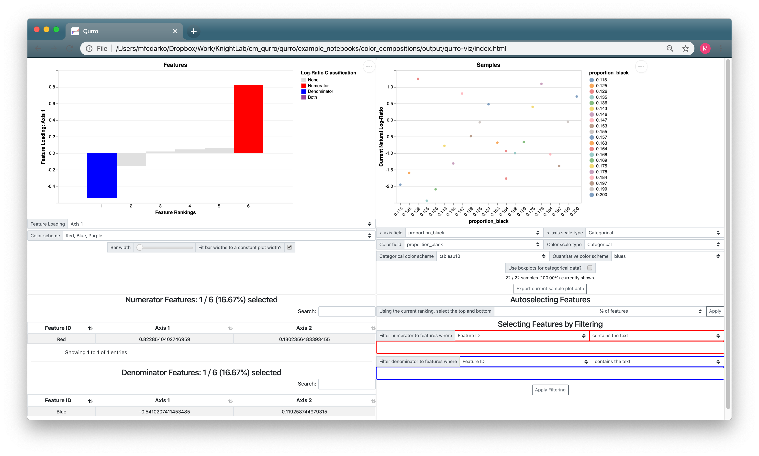
3.3.2. Adjusting the sample plot
The sample plot just looks like a bunch of noise! Mostly, this is because the way the sample plot x-axis is set up doesn't make sense: it's set to proportion_black (which we don't really have a reason to expect would be associated with the Red:Blue log-ratio), and its scale type is set to Categorical (despite the fact that proportion_black is a quantitative field). If we set the sample plot x-axis to proportion_red, and change up some of the other sample plot controls, we get a much more useful visualization:
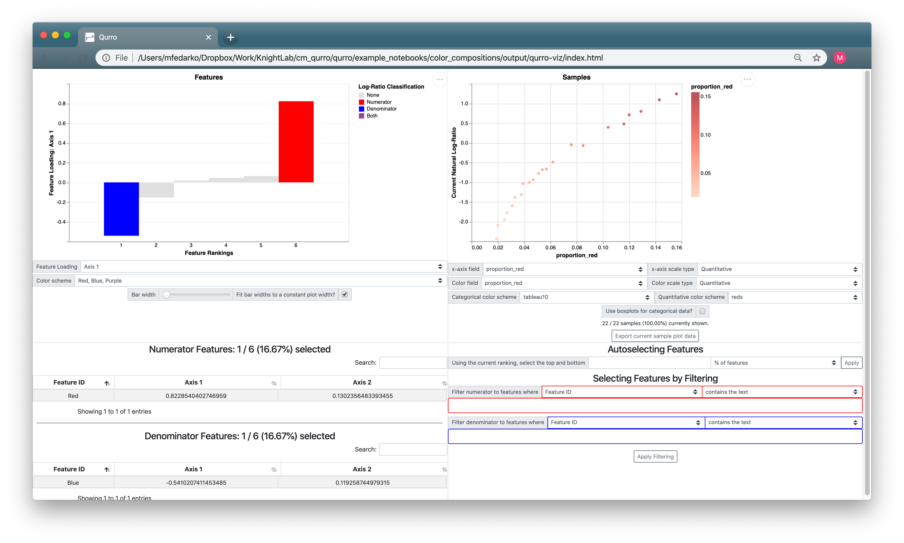
So we can see from here that the Red:Blue log-ratio is very correlated with the proportion of Red in a given painting. Hopefully this makes sense! All the sample plot is showing is that ln(r / b) is correlated with r, which shouldn't be too crazy.
But we have some other things we can try out.
3.3.3. Relating feature log-ratios to sample loadings
Remember the sample loadings we merged into the metadata a while back? We can use those here, and replicate the sorts of figures shown in Fig. 5 in Martino et al. 2019.
We know that Red and Blue differentiate samples along Axis 1, so let's look at how the Axis 1 sample loadings are correlated with the Red:Blue log-ratio. We already have that log-ratio selected, so all we need to do is change the sample plot x-axis field from proportion_red to Axis 1:

That's cool. We can see that the Red:Blue log-ratio is highly correlated with the Axis 1 sample loadings of paintings, which confirms our observations from looking at the biplot visualization.
3.3.4. Trying additional log-ratios
As an exercise for the reader: try switching the rank plot's Feature Loading to Axis 2, then try selecting the log-ratio of White:Black. How does this look when we view samples' Axis 1 sample loadings? How does this look when we view samples' Axis 2 sample loadings? (This is shown below.) What differences do you see, and why do you think these are the case?

3.4. Finishing up; additional reading
There are a few other functionalities in Qurro that we haven't covered here. We encourage you to check out the interface for yourself!
There are a lot of ways to visualize compositional data, and a lot of ways to use Qurro in conjunction with a compositional biplot. Our hope is that you interpret this document as less of a strict guide and more as a starting point for how to use Qurro. In particular, Aitchison and Greenacre (2002), where we got this color composition data from, goes pretty in-depth in how to interpret compositional biplots -- we highly recommend checking that paper out to get a sense of what these results "mean."
Thanks for reading this tutorial! As always, please feel free to open an issue in Qurro's repository (or ask a question on the QIIME 2 forums) if you have any questions, comments, or suggestions.