Basic Time Series Metrics & Resampling
A Summary of lecture "Manipulating Time Series Data in Python", via datacamp
- toc: true
- badges: true
- comments: true
- author: Chanseok Kang
- categories: [Python, Datacamp, Time_Series_Analysis]
- image: images/interpolate.png
import pandas as pd
import numpy as np
import matplotlib.pyplot as plt
import seaborn as sns

plt.rcParams['figure.figsize'] = (10, 5)
Compare time series growth rates
- Comparing stock performance
- Stock price series: hard to compare at difference levels
- Simple solution: normalize price series to start at 100
- Divide all prices by first in series, multiply by 100
- Same starting point
- All prices relative to starting point
- Difference to starting point in percentage points
Compare the performance of several asset classes
You have seen in the video how you can easily compare several time series by normalizing their starting points to 100, and plot the result.
To broaden your perspective on financial markets, let's compare four key assets: stocks, bonds, gold, and oil.
# Import data here
prices = pd.read_csv('./dataset/asset_classes.csv', parse_dates=['DATE'], index_col='DATE')

# Inspect prices here
print(prices.info())

# Slect first prices
first_prices = prices.iloc[0]

# Create normalized
normalized = prices.div(first_prices) * 100

# Plot normalized
normalized.plot();
<class 'pandas.core.frame.DataFrame'>
DatetimeIndex: 2469 entries, 2007-06-29 to 2017-06-26
Data columns (total 4 columns):
 #   Column  Non-Null Count  Dtype
---  ------  --------------  -----
 0   SP500   2469 non-null   float64
 1   Bonds   2469 non-null   float64
 2   Gold    2469 non-null   float64
 3   Oil     2469 non-null   float64
dtypes: float64(4)
memory usage: 96.4 KB
None

Comparing stock prices with a benchmark
You also learned in the video how to compare the performance of various stocks against a benchmark. Now you'll learn more about the stock market by comparing the three largest stocks on the NYSE to the Dow Jones Industrial Average, which contains the 30 largest US companies.
The three largest companies on the NYSE are:
| Company | Stock Ticker |
|---|---|
| Johnson & Johnson | JNJ |
| Exxon Mobil | XOM |
| JP Morgan Chase | JPM |
# Import stock prices and index here
stocks = pd.read_csv('./dataset/nyse.csv', parse_dates=['date'], index_col='date')
dow_jones = pd.read_csv('./dataset/dow_jones.csv', parse_dates=['date'], index_col='date')

# Concatenate data and inspect result here
data = pd.concat([stocks, dow_jones], axis=1)
print(data.info())

# Normalize and plot your data here
first_value = data.iloc[0]
normalized = data.div(first_value).mul(100).plot();
<class 'pandas.core.frame.DataFrame'>
DatetimeIndex: 1762 entries, 2010-01-04 to 2016-12-30
Data columns (total 4 columns):
 #   Column  Non-Null Count  Dtype
---  ------  --------------  -----
 0   JNJ     1762 non-null   float64
 1   JPM     1762 non-null   float64
 2   XOM     1762 non-null   float64
 3   DJIA    1762 non-null   float64
dtypes: float64(4)
memory usage: 68.8 KB
None

Plot performance difference vs benchmark index
In the video, you learned how to calculate and plot the performance difference of a stock in percentage points relative to a benchmark index.
Let's compare the performance of Microsoft (MSFT) and Apple (AAPL) to the S&P 500 over the last 10 years.
# Create tickers
tickers = ['MSFT', 'AAPL']

# Import stock data here
stocks = pd.read_csv('./dataset/msft_aapl.csv', parse_dates=['date'], index_col='date')

# Import index here
sp500 = pd.read_csv('./dataset/sp500.csv', parse_dates=['date'], index_col='date')

# Concatenate stocks and index here
data = pd.concat([stocks, sp500], axis=1).dropna()

# Normalize data
normalized = data.div(data.iloc[0]).mul(100)

# Subtract the normalized index from the normalized stock prices, and plot the result
normalized[tickers].sub(normalized['SP500'], axis=0).plot();

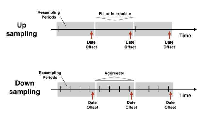
Changing the time series frequency: resampling
Convert monthly to weekly data
You have learned in the video how to use .reindex() to conform an existing time series to a DateTimeIndex at a different frequency.
Let's practice this method by creating monthly data and then converting this data to weekly frequency while applying various fill logic options.
# Set start and end dates
start = '2016-1-1'
end = '2016-2-29'

# Create monthly_dates here
monthly_dates = pd.date_range(start=start, end=end, freq='M')

# Create and print monthly here
monthly = pd.Series(data=[1, 2], index=monthly_dates)
print(monthly)

# Create weekly_dates here
weekly_dates = pd.date_range(start=start, end=end, freq='W')

# Print monthly, reindexed using weekly_dates
print(monthly.reindex(weekly_dates))
print(monthly.reindex(weekly_dates, method='bfill'))
print(monthly.reindex(weekly_dates, method='ffill'))
2016-01-31    1
2016-02-29    2
Freq: M, dtype: int64
2016-01-03    NaN
2016-01-10    NaN
2016-01-17    NaN
2016-01-24    NaN
2016-01-31    1.0
2016-02-07    NaN
2016-02-14    NaN
2016-02-21    NaN
2016-02-28    NaN
Freq: W-SUN, dtype: float64
2016-01-03    1
2016-01-10    1
2016-01-17    1
2016-01-24    1
2016-01-31    1
2016-02-07    2
2016-02-14    2
2016-02-21    2
2016-02-28    2
Freq: W-SUN, dtype: int64
2016-01-03    NaN
2016-01-10    NaN
2016-01-17    NaN
2016-01-24    NaN
2016-01-31    1.0
2016-02-07    1.0
2016-02-14    1.0
2016-02-21    1.0
2016-02-28    1.0
Freq: W-SUN, dtype: float64
Create weekly from monthly unemployment data
The civilian US unemployment rate is reported monthly. You may need more frequent data, but that's no problem because you just learned how to upsample a time series.
You'll work with the time series data for the last 20 years, and apply a few options to fill in missing values before plotting the weekly series.
# Import data here
data = pd.read_csv('./dataset/unrate_2000.csv', parse_dates=['date'], index_col='date')

# Show first five rows of weekly series
print(data.asfreq('W').head(5))

# Show first five rows of weekly seres with bfill option
print(data.asfreq('W', method='bfill').head(5))

# Create weekly series with ffill option and show first five rows
weekly_ffill = data.asfreq('W', method='ffill')
print(weekly_ffill.head(5))

# Plot weekly_fill starting 2015 here
weekly_ffill.loc['2015':].plot()
            UNRATE
date
2000-01-02     NaN
2000-01-09     NaN
2000-01-16     NaN
2000-01-23     NaN
2000-01-30     NaN
            UNRATE
date
2000-01-02     4.1
2000-01-09     4.1
2000-01-16     4.1
2000-01-23     4.1
2000-01-30     4.1
            UNRATE
date
2000-01-02     4.0
2000-01-09     4.0
2000-01-16     4.0
2000-01-23     4.0
2000-01-30     4.0
<matplotlib.axes._subplots.AxesSubplot at 0x200fb51dfc8>

Use interpolation to create weekly employment data
You have recently used the civilian US unemployment rate, and converted it from monthly to weekly frequency using simple forward or backfill methods.
Compare your previous approach to the new .interpolate() method that you learned about in this video.
unrate = pd.read_csv('./dataset/unrate.csv', parse_dates=['DATE'], index_col='DATE')
monthly = unrate.resample('MS').first()
monthly.head()
| UNRATE | |
|---|---|
| DATE | |
| 2010-01-01 | 9.8 |
| 2010-02-01 | 9.8 |
| 2010-03-01 | 9.9 |
| 2010-04-01 | 9.9 |
| 2010-05-01 | 9.6 |
# Inspect data here
print(monthly.info())

# Create weekly dates
weekly_dates = pd.date_range(start=monthly.index.min(), end=monthly.index.max(), freq='W')

# Reindex monthly to weekly data
weekly = monthly.reindex(weekly_dates)

# Create ffill and interpolated columns
weekly['ffill'] = weekly.UNRATE.ffill()
weekly['interpolated'] = weekly.UNRATE.interpolate()

# Plot weekly
weekly.plot();
plt.savefig('../images/interpolate.png')
<class 'pandas.core.frame.DataFrame'>
DatetimeIndex: 85 entries, 2010-01-01 to 2017-01-01
Freq: MS
Data columns (total 1 columns):
 #   Column  Non-Null Count  Dtype
---  ------  --------------  -----
 0   UNRATE  85 non-null     float64
dtypes: float64(1)
memory usage: 3.8 KB
None

Interpolate debt/GDP and compare to unemployment
Since you have learned how to interpolate time series, you can now apply this new skill to the quarterly debt/GDP series, and compare the result to the monthly unemployment rate.
# Import & inspect data here
data = pd.read_csv('./dataset/debt_unemployment.csv', parse_dates=['date'], index_col='date')
print(data.info())

# Interpolate and inspect here
interpolated = data.interpolate()
print(interpolated.info())

# Plot interpolated data here
interpolated.plot(secondary_y='Unemployment');
<class 'pandas.core.frame.DataFrame'>
DatetimeIndex: 89 entries, 2010-01-01 to 2017-05-01
Data columns (total 2 columns):
 #   Column        Non-Null Count  Dtype
---  ------        --------------  -----
 0   Debt/GDP      29 non-null     float64
 1   Unemployment  89 non-null     float64
dtypes: float64(2)
memory usage: 2.1 KB
None
<class 'pandas.core.frame.DataFrame'>
DatetimeIndex: 89 entries, 2010-01-01 to 2017-05-01
Data columns (total 2 columns):
 #   Column        Non-Null Count  Dtype
---  ------        --------------  -----
 0   Debt/GDP      89 non-null     float64
 1   Unemployment  89 non-null     float64
dtypes: float64(2)
memory usage: 2.1 KB
None

Downsampling & aggregation
Compare weekly, monthly and annual ozone trends for NYC & LA
You have seen in the video how to downsample and aggregate time series on air quality.
First, you'll apply this new skill to ozone data for both NYC and LA since 2000 to compare the air quality trend at weekly, monthly and annual frequencies and explore how different resampling periods impact the visualization.
# Import and inspect data here
ozone = pd.read_csv('./dataset/ozone_nyla.csv', parse_dates=['date'], index_col='date')
print(ozone.info())

# Calculate and plot the weekly average ozone trend
ozone.resample('W').mean().plot();

# Calculate and plot the monthly average ozone trend
ozone.resample('M').mean().plot();

# Calculate and plot the annual average ozone trend
ozone.resample('A').mean().plot();
<class 'pandas.core.frame.DataFrame'>
DatetimeIndex: 6291 entries, 2000-01-01 to 2017-03-31
Data columns (total 2 columns):
 #   Column       Non-Null Count  Dtype
---  ------       --------------  -----
 0   Los Angeles  5488 non-null   float64
 1   New York     6167 non-null   float64
dtypes: float64(2)
memory usage: 147.4 KB
None


Compare monthly average stock prices for Facebook and Google
Now, you'll apply your new resampling skills to daily stock price series for Facebook and Google for the 2015-2016 period to compare the trend of the monthly averages.
# Import and inspect data here
stocks = pd.read_csv('./dataset/goog_fb.csv', parse_dates=['date'], index_col='date')
print(stocks.info())

# Calculate and plot the monthly average
monthly_average = stocks.resample('M').mean()
monthly_average.plot(subplots=True);
<class 'pandas.core.frame.DataFrame'>
DatetimeIndex: 504 entries, 2015-01-02 to 2016-12-30
Data columns (total 2 columns):
 #   Column  Non-Null Count  Dtype
---  ------  --------------  -----
 0   FB      504 non-null    float64
 1   GOOG    504 non-null    float64
dtypes: float64(2)
memory usage: 11.8 KB
None

Compare quarterly GDP growth rate and stock returns
With your new skill to downsample and aggregate time series, you can compare higher-frequency stock price series to lower-frequency economic time series.
As a first example, let's compare the quarterly GDP growth rate to the quarterly rate of return on the (resampled) Dow Jones Industrial index of 30 large US stocks.
GDP growth is reported at the beginning of each quarter for the previous quarter. To calculate matching stock returns, you'll resample the stock index to quarter start frequency using the alias 'QS'``, and aggregating using the.first()``` observations.
# Import and inspect gdp_growth here
gdp_growth = pd.read_csv('./dataset/gdp_growth.csv', parse_dates=['date'], index_col='date')
print(gdp_growth.info())

# Import and inspect djia here
djia = pd.read_csv('./dataset/djia.csv', parse_dates=['date'], index_col='date')
print(djia.info())

# Calculate djia quarterly returns here
djia_quarterly = djia.resample('QS').first()
djia_quarterly_return = djia_quarterly.pct_change().mul(100)

# Concatenate, rename and plot djia_quarterly_return and gdp_growth here
data = pd.concat([gdp_growth, djia_quarterly_return], axis=1)
data.columns = ['gdp', 'djia']
data.plot();
<class 'pandas.core.frame.DataFrame'>
DatetimeIndex: 41 entries, 2007-01-01 to 2017-01-01
Data columns (total 1 columns):
 #   Column      Non-Null Count  Dtype
---  ------      --------------  -----
 0   gdp_growth  41 non-null     float64
dtypes: float64(1)
memory usage: 656.0 bytes
None
<class 'pandas.core.frame.DataFrame'>
DatetimeIndex: 2610 entries, 2007-06-29 to 2017-06-29
Data columns (total 1 columns):
 #   Column  Non-Null Count  Dtype
---  ------  --------------  -----
 0   djia    2519 non-null   float64
dtypes: float64(1)
memory usage: 40.8 KB
None

Visualize monthly mean, median and standard deviation of S&P500 returns
You have also learned how to calculate several aggregate statistics from upsampled data.
Let's use this to explore how the monthly mean, median and standard deviation of daily S&P500 returns have trended over the last 10 years.
# Import data here
sp500 = pd.read_csv('./dataset/sp500.csv', parse_dates=['date'], index_col='date')
print(sp500.info())

# Calculate daily returns here
daily_returns = sp500.squeeze().pct_change()

# Resample and calculate statistics
stats = daily_returns.resample('M').agg(['mean', 'median', 'std'])

# Plot stats here
stats.plot()
<class 'pandas.core.frame.DataFrame'>
DatetimeIndex: 2395 entries, 2007-06-29 to 2016-12-30
Data columns (total 1 columns):
 #   Column  Non-Null Count  Dtype
---  ------  --------------  -----
 0   SP500   2395 non-null   float64
dtypes: float64(1)
memory usage: 37.4 KB
None
<matplotlib.axes._subplots.AxesSubplot at 0x1376c06cc88>
