Tutorial 7. Large data
hvPlot and HoloViews support even high-dimensional datasets easily, and the standard mechanisms discussed already work well as long as you select a small enough subset of the data to display at any one time. However, some datasets are just inherently large, even for a single frame of data, and cannot safely be transferred for display in any standard web browser. Luckily, HoloViews makes it simple for you to use the separate Datashader library together with any of the plotting extension libraries it supports, including Bokeh and Matplotlib. Datashader is designed to complement standard plotting libraries by providing faithful visualizations for very large datasets, focusing on revealing the overall distribution, not just individual data points.
Datashader uses computations accelerated using Numba, making it fast to work with datasets of millions or billions of datapoints stored in Dask dataframes. Dask dataframes provide an API that is functionally equivalent to Pandas, but allows working with data out of core and scaling out to many processors across compute clusters. Here we will use Dask to load and visualize the entire earthquake dataset.


How does datashader work?
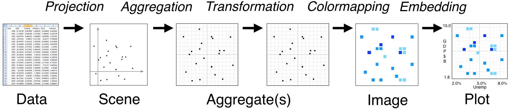
- Tools like Bokeh map Data (left) directly into an HTML/JavaScript Plot (right)
- datashader instead renders Data into a plot-sized Aggregate array, from which an Image can be constructed then embedded into a Bokeh Plot
- Only the fixed-sized Image needs to be sent to the browser, allowing millions or billions of datapoints to be used
- Every step automatically adjusts to the data, but can be customized
When not to use datashader
- Plotting less than 1e5 or 1e6 data points
- When every datapoint must be resolveable individually; standard Bokeh will render all of them
- For full interactivity (hover tools) with every datapoint
When to use datashader
- Actual big data; when Bokeh/Matplotlib have trouble
- When the distribution matters more than individual points
- When you find yourself sampling, decimating, or binning to better understand the distribution
import holoviews as hv
import dask.dataframe as dd
import datashader as ds, datashader.geo

from holoviews import opts
from holoviews.operation.datashader import datashade, rasterize

hv.extension('bokeh')
Load the data
As a first step we will load the earthquake dataset, with 2.1 million seismological events. Let's load this data using Dask to create a dataframe df:
df = dd.read_parquet('../data/earthquakes.parq', engine='fastparquet').persist()

print('%s Rows' % len(df))
print('Columns:', list(df.columns))
x, y = ds.geo.lnglat_to_meters(df.longitude, df.latitude)
ddf = df.assign(x=x, y=y).persist()
points = hv.Points(ddf, ['x', 'y'])
We could now simply type points, and Bokeh would attempt to display this data as a standard Bokeh plot. Before doing that, however, remember that we have 2 million rows of data, and a normal web browser will be very unhappy with that amount of data! Instead of letting Bokeh see this data, let's convert it to something far more tractable using the datashade operation. This operation will aggregate the data on a 2D grid, apply shading to assign pixel colors to each bin in this grid, and build an RGB Element (just a fixed-sized image) we can safely display in a browser:
datashade(points).opts(width=700, height=500, bgcolor="lightgray")
The results are the same as if you pass datashade=True to hvPlot. If you zoom in you will note that the plot rerenders depending on the zoom level, which allows the full dataset to be explored interactively even though only an image of it is ever sent to the browser. The way this works is that datashade is a dynamic operation that also declares some linked streams. These linked streams are automatically instantiated and dynamically supply the plot_size, x_range, and y_range from the Bokeh plot to the operation based on your current viewport as you zoom or pan:
datashade.streams
# Exercise: Plot the earthquake locations ('longitude' and 'latitude' columns)
# Warning: Don't try to display hv.Points() directly; it's too big! Use datashade() or rasterize() for any display
# Optional: Change the cmap on the datashade operation to inferno

# from datashader.colors import inferno
Adding a tile source
Using a publicly available tiled map service, we can display a geographic map in the background.
from holoviews.element.tiles import EsriImagery

tiles = EsriImagery().opts(xaxis=None, yaxis=None, width=700, height=500)
tiles * datashade(points)
# Exercise: Overlay the earthquake data on top of the Wikipedia tile source
Aggregating with a variable
So far we have simply been counting earthquakes, but our dataset is much richer than that. We have information about a number of variables, as listed above. Datashader provides a number of aggregator functions, which you can supply to the datashade operation. Here we use the ds.mean aggregator to compute the average magnitude at each location, for events with a depth below zero:
selected = points.select(depth=(None, 0))
selected.data = selected.data.persist()
tiles * rasterize(selected, aggregator=ds.mean('mag')).opts(colorbar=True)
# Exercise: Use the ds.min or ds.max aggregator to visualize other fields
# Optional: Eliminate outliers by using select
Grouping by a variable
Because datashading happens only just before visualization, you can use any of the techniques shown in previous sections to select, filter, or group your data before visualizing it, such as grouping it by the declared type:
dset = hv.Dataset(ddf)
grouped = dset.to(hv.Points, ['x', 'y'], groupby=['type'], dynamic=True)
tiles.opts(alpha=0.4, bgcolor="black") * datashade(grouped).opts(
    opts.RGB(width=600, height=500, xaxis=None, yaxis=None, tools=['hover']))
# Exercise: Facet a subset of the types as an NdLayout
# Hint: You can reuse the existing grouped variable or select a subset before using the .to method
As you can see, Datashader requires taking some extra steps into consideration, but it makes it practical to work with even quite large datasets on an ordinary laptop. On a 16GB machine, datasets 100X or 1000X the one used here should be very practical, as illustrated at the datashader web site.
Here the examples all use point data, but Datashader also supports raster data as shown in earlier sections, along with many other data types (lines, time series, trajectories, areas, trimeshes, quadmeshes, networks, etc.)
Onwards
- The HoloViews Large Data user guide explains in more detail how to work with large datasets using Datashader.
- HoloViews also contains a sample bokeh app using this dataset and an additional linked stream that works well as a starting point.