import holoviews as hv
import panel as pn
from bokeh.themes.theme import Theme

hv.extension("bokeh")
hv.renderer('bokeh').theme = Theme(json={}) # Reset Theme
pn.extension()
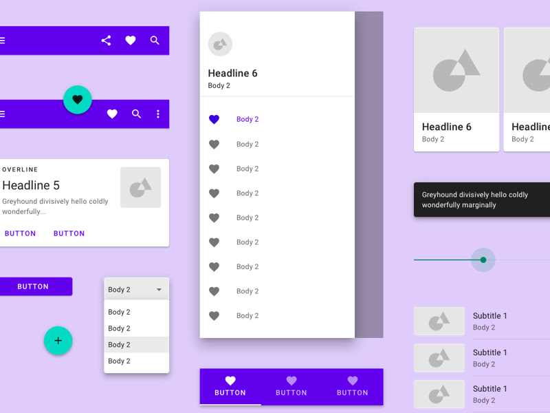
Material Template for Panel
Panel is a framework for creating awesome analytics apps in Python.
In Panel you are able to customize the layout and style using a Custom Template.
One popular design specification is Material Design. The following frameworks aims to implement the Material Design specification
- Material Design Lite (
mdl) (simple components) - Material Design Components for the Web (
mdc) (advanced components) - Material Web Components (
mwc) (web components on top of mdc)
The mwc components should be the easiest to integrate with Panel, so we will base the following on mwc with a fall back to mdc when needed.

fonts_html = """
<link href="https://fonts.googleapis.com/css?family=Roboto:300,400,500" rel="stylesheet">
<link href="https://fonts.googleapis.com/css?family=Material+Icons&display=block" rel="stylesheet">
"""
pn.pane.HTML(fonts_html, height=0, width=0, sizing_mode="fixed", margin=0)
MWC Components
We start by importing the components.
We will be using the mwc-button, mwc-drawer, mwc-icon-button, mwc-slider, mwc-top-app-bar-fixed in our examples.
modules_html = """
<script src="https://unpkg.com/@webcomponents/webcomponentsjs@next/webcomponents-loader.js"></script>
<script type="module" src="https://unpkg.com/@material/mwc-button?module"></script>
<script type="module" src="https://unpkg.com/@material/mwc-drawer?module"></script>
<script type="module" src="https://unpkg.com/@material/mwc-icon-button?module"></script>
<script type="module" src="https://unpkg.com/@material/mwc-slider?module"></script>
<script type="module" src="https://unpkg.com/@material/mwc-top-app-bar-fixed?module"></script>
"""
pn.pane.HTML(modules_html, height=0, width=0, sizing_mode="fixed", margin=0)
Then the app layout, contents and some code to enable toggling of the mwcdrawer as well as displaying the app in a note book cell.
example_html = """
<div>
<mwc-drawer hasHeader type="dismissible">
    <span slot="title">Material App</span>
    <div class="appMenu">
        <mwc-button label="Data" icon="archive"></mwc-button>
        <mwc-button label="Models" icon="gesture"></mwc-button>
        <mwc-button label="Analytics" icon="assessment"></mwc-button>
    </div>
    <div class="appContent" slot="appContent">
        <mwc-top-app-bar-fixed class="appBar">
            <mwc-icon-button icon="menu" slot="navigationIcon" class="appDrawerToggleButton"></mwc-icon-button>
            <div slot="title" style="font-size:20px;">Panel App using Custom Template</div>
            <mwc-icon-button icon="file_download" slot="actionItems"></mwc-icon-button>
            <mwc-icon-button icon="print" slot="actionItems"></mwc-icon-button>
            <mwc-icon-button icon="favorite" slot="actionItems"></mwc-icon-button>
        </mwc-top-app-bar-fixed>
        <div style="padding: 25px">
            <p><h1>Main Content!</h1></p>
            <mwc-button raised="" label="raised"></mwc-button>
            <mwc-icon-button icon="favorite" slot="actionItems"></mwc-icon-button>
            <mwc-slider pin markers max="50" value="10" step="5"></mwc-slider>
        </div>
    </div>
</mwc-drawer>
<script>
        var drawers = document.getElementsByTagName("mwc-drawer");

        <!-- Enables toggling of multiple drawers -->
        for (let drawer of drawers){
            var button = drawer.getElementsByClassName('appDrawerToggleButton')[0];
            button.onclick = function(e) {
            var button = e.target;
            var drawer = button;
            while (drawer.tagName!=="MWC-DRAWER") {
              drawer=drawer.parentElement;
            }
            drawer.open = !drawer.open;
            };


            <!-- Enables displaying the bar in a notebook cell instead of full window -->
            var bar = drawer.getElementsByClassName('appBar')[0];
            bar.scrollTarget = drawer.getElementsByClassName('appContent')[0];
        }
</script>
</div>
"""
pn.pane.HTML(example_html, sizing_mode="stretch_width", height=300)
MDC Grid
The mwc framework does not contain a grid system. But the mdc framework does.
It uses a a system of columns to create responsiveness and layout across mobile, tablet and desktop.
- Desktop: 12 Columns
- Tables: 8 Columns
- Mobile: 4 Columns
grid_import_html = """
<link rel="stylesheet" type="text/css" href="https://unpkg.com/@material/layout-grid@3.1.0/dist/mdc.layout-grid.min.css">
"""
pn.pane.HTML(grid_import_html, height=0, width=0, sizing_mode="fixed", margin=0)
grid_example_html = """
<div class="mdc-layout-grid demo-grid">
<div class="mdc-layout-grid__inner">
    <div class="mdc-layout-grid__cell mdc-layout-grid__cell--span-12 demo-grid-cell"></div>
    <div class="mdc-layout-grid__cell mdc-layout-grid__cell--span-6 demo-grid-cell"></div>
    <div class="mdc-layout-grid__cell mdc-layout-grid__cell--span-6 demo-grid-cell"></div>
    <div class="mdc-layout-grid__cell mdc-layout-grid__cell--span-3 demo-grid-cell"></div>
    <div class="mdc-layout-grid__cell mdc-layout-grid__cell--span-3 demo-grid-cell"></div>
    <div class="mdc-layout-grid__cell mdc-layout-grid__cell--span-3 demo-grid-cell"></div>
    <div class="mdc-layout-grid__cell mdc-layout-grid__cell--span-3 demo-grid-cell"></div>
    <div class="mdc-layout-grid__cell mdc-layout-grid__cell--span-1 demo-grid-cell"></div>
    <div class="mdc-layout-grid__cell mdc-layout-grid__cell--span-8 demo-grid-cell"></div>
    <div class="mdc-layout-grid__cell mdc-layout-grid__cell--span-3 demo-grid-cell"></div>
</div>
</div>
<style>
.demo-grid {
  background: rgba(0, 0, 0, 0.2);
  min-width: 360px;
}

.demo-grid-cell {
  background: rgba(0, 0, 0, 0.2);
  height: 75px;
}
</style>
"""
pn.pane.Markdown(grid_example_html, sizing_mode="stretch_width", height=500)
Try resizing the window from large to small and back and see how the grid responds.
Material Template for Panel with grid layout
Using the above we are now able to construct an example Material Template for Panel with a grid layout.
template = """
{% extends base %}

<!-- goes in head -->
{% block postamble %}
<script src="https://unpkg.com/@webcomponents/webcomponentsjs@next/webcomponents-loader.js"></script>
<script type="module" src="https://unpkg.com/@material/mwc-button?module"></script>
<script type="module" src="https://unpkg.com/@material/mwc-drawer?module"></script>
<script type="module" src="https://unpkg.com/@material/mwc-icon-button?module"></script>
<script type="module" src="https://unpkg.com/@material/mwc-slider?module"></script>
<script type="module" src="https://unpkg.com/@material/mwc-top-app-bar-fixed?module"></script>
<link href="https://fonts.googleapis.com/css?family=Roboto:300,400,500" rel="stylesheet">
<link href="https://fonts.googleapis.com/css?family=Material+Icons&display=block" rel="stylesheet">
<link rel="stylesheet" type="text/css" href="https://unpkg.com/@material/layout-grid@0.41.0/dist/mdc.layout-grid.min.css">
<style>
.grid {
  width: 100%;
  background: #EEEEEE;
}

.grid-cell {
  height: 210px;
  border-radius: 4px;
  <-- box-shadow:0 10px 16px 0 rgba(0,0,0,0.2),0 6px 20px 0 rgba(0,0,0,0.19); -->
  padding: 5px;
}
</style>

<style>
body {
    font-family: roboto;
    margin: 0px;
}
mwc-top-app-bar-fixed {
    box-shadow: 5px 5px 20px #9E9E9E;
    font-size: 20px;
}

mwc-drawer {
    min-height:200px;
    height:100%;
}
.appMenu * {
    width:100%;
    align-items: left;
}
.appMain {
    margin: 25px;
    padding: 25px;
}
</style>

{% endblock %}

<!-- goes in body -->
{% block contents %}
<mwc-drawer hasHeader type="dismissible">
    <span slot="title">{{ app_title }}</span>
    <span slot="subtitle">subtitle</span>
    <div class="appMenu">
        <mwc-button label="Data" icon="archive"></mwc-button>
        <mwc-button label="Models" icon="gesture"></mwc-button>
        <mwc-button label="Analytics" icon="assessment"></mwc-button>
    </div>
    <div class="appContent" slot="appContent">
        <mwc-top-app-bar-fixed class="appBar">
            <mwc-icon-button icon="menu" slot="navigationIcon" class="appDrawerToggleButton"></mwc-icon-button>
            <div slot="title" style="font-size:20px;">{{ app_title }}</div>
            <mwc-icon-button icon="favorite" slot="actionItems"></mwc-icon-button>
            <mwc-icon-button icon="perm_identity" slot="actionItems" label="Login"></mwc-icon-button>
        </mwc-top-app-bar-fixed>
        <div class="appMain">
            {{ embed(roots.Styles) }}
            <p><h1>Content!</h1></p>
            <p>This is a Panel app using <b>a custom template</b> based on Material Design. It works both in the Notebook and as a web app.</p><br>
            <mwc-button raised="" label="raised"></mwc-button>
            <mwc-icon-button icon="favorite" slot="actionItems"></mwc-icon-button>
            <mwc-slider pin markers max="50" value="10" step="5"></mwc-slider>
            <div class="mdc-layout-grid grid">
            <div class="mdc-layout-grid__inner">
            <div class="mdc-layout-grid__cell mdc-layout-grid__cell--span-12 grid-cell">{{ embed(roots.G) }}</div>
            <div class="mdc-layout-grid__cell mdc-layout-grid__cell--span-6 grid-cell">{{ embed(roots.A) }}</div>
            <div class="mdc-layout-grid__cell mdc-layout-grid__cell--span-6 grid-cell">{{ embed(roots.B) }}</div>
            <div class="mdc-layout-grid__cell mdc-layout-grid__cell--span-3 grid-cell">{{ embed(roots.C) }}</div>
            <div class="mdc-layout-grid__cell mdc-layout-grid__cell--span-3 grid-cell">{{ embed(roots.D) }}</div>
            <div class="mdc-layout-grid__cell mdc-layout-grid__cell--span-3 grid-cell">{{ embed(roots.E) }}</div>
            <div class="mdc-layout-grid__cell mdc-layout-grid__cell--span-3 grid-cell">{{ embed(roots.F) }}</div>
        </div>
    </div>
</mwc-drawer>
<script>
    var drawers = document.getElementsByTagName("mwc-drawer");

    <!-- Enables toggling of drawer -->
    for (let drawer of drawers){
      var button = drawer.getElementsByClassName('appDrawerToggleButton')[0];
      button.onclick = function(e) {
        var button = e.target;
        var drawer = button;
        while (drawer.tagName!=="MWC-DRAWER") {
          drawer=drawer.parentElement;
        }
        drawer.open = !drawer.open;
        const open = drawer.open;

        var drawers = document.getElementsByTagName("mwc-drawer");
        for (let drawer of drawers){drawer.open=open}
      };

      <!-- Enables displaying the bar in a notebook cell instead of full window -->
      var bar = drawer.getElementsByClassName('appBar')[0];
      bar.scrollTarget = drawer.getElementsByClassName('appContent')[0];

      drawer.shadow
    }
</script>
{% endblock %}
"""
Let's use the template
# The style_panel supports incrementally adding css in cells below for educational reasons
style_panel = pn.pane.HTML("", height=0, width=0, sizing_mode="fixed", margin=0)
tmpl = pn.Template(template=template)

tmpl.add_variable('app_title', 'Panel App using Custom Template')
material_green = "rgb(0, 128, 0)"
material_purple= "#9C27B0"
color = material_green
line_width=4

tmpl.add_panel('A', hv.Curve([1, 2, 3]).opts(height=200,color=color, line_width=line_width, responsive=True))
tmpl.add_panel('B', hv.Curve([1, 2, 3]).opts(height=200,color=color, line_width=line_width, responsive=True))
tmpl.add_panel('C', hv.Curve([1, 2, 3]).opts(height=200,color=color, line_width=line_width, responsive=True))
tmpl.add_panel('D', hv.Curve([1, 2, 3]).opts(height=200,color=color, line_width=line_width, responsive=True))
tmpl.add_panel('E', hv.Curve([1, 2, 3]).opts(height=200,color=color, line_width=line_width, responsive=True))
tmpl.add_panel('F', hv.Curve([1, 2, 3]).opts(height=200,color=color, line_width=line_width, responsive=True))
tmpl.add_panel('G', hv.Curve([1, 2, 3]).opts(height=200,color=color, line_width=line_width, responsive=True))
tmpl.add_panel('Styles', style_panel)
tmpl
Lets take a look in the server
def show_in_server(event):
    tmpl.show()
show_in_server_button = pn.widgets.Button(name="Show in server")
show_in_server_button.on_click(show_in_server)
show_in_server_button
Lets update the theme in the notebook.
dark_theme_style = """
<style>
:root {
    --mdc-theme-primary: green;
    --mdc-theme-on-primary: white;
    --mdc-theme-secondary: purple;
    --mdc-theme-on-secondary: white;
    --mdc-theme-background: #121212;
}
mwc-drawer {
    color: white;
    background: var(--mdc-theme-background);
}

mwc-top-app-bar-fixed {
    box-shadow: none;
}
body {
    background: var(--mdc-theme-background);
}
.grid {
    background: #121212;
}
.grid-cell {
  box-shadow: none;
}

.mdc-layout-grid__cell {
    background: white;
    background: #121212;
    margin: -1px;
    margin-right: -5px;
}

.mdc-layout-grid__cell .bk {
    border-radius: 4px;
}
<style>
"""
style_panel.object += dark_theme_style
Go back and take a look at the app.
Holoviews Theme
You will also need to update the theme of each widget or pane your are using accordingly. For example the Holoviews plots as shown below.
def set_hv_theme(
    text,
    inner_plot_color,
    outer_plot_color,
    legend_color,

):
    theme = {
        "attrs": {
            "Figure": {
                "background_fill_color": inner_plot_color,
                "border_fill_color": outer_plot_color,
                "outline_line_color": legend_color,
                "outline_line_alpha": 0.25,
            },
            "Grid": {"grid_line_color": text, "grid_line_alpha": 0.25},
            "Axis": {
                "major_tick_line_alpha": 0,
                "major_tick_line_color": text,
                "minor_tick_line_alpha": 0,
                "minor_tick_line_color": text,
                "axis_line_alpha": 0,
                "axis_line_color": text,
                "major_label_text_color": text,
                "major_label_text_font": "roboto",
                "major_label_text_font_size": "1.025em",
                "axis_label_standoff": 10,
                "axis_label_text_color": text,
                "axis_label_text_font": "roboto",
                "axis_label_text_font_size": "1.25em",
                "axis_label_text_font_style": "normal",
            },
            "Legend": {
                "spacing": 8,
                "glyph_width": 15,
                "label_standoff": 8,
                "label_text_color": text,
                "label_text_font": "roboto",
                "label_text_font_size": "1.025em",
                "border_line_alpha": 0,
                "background_fill_alpha": 0.25,
                "background_fill_color": legend_color,
            },
            "ColorBar": {
                "title_text_color": text,
                "title_text_font": "roboto",
                "title_text_font_size": "1.025em",
                "title_text_font_style": "normal",
                "major_label_text_color": text,
                "major_label_text_font": "roboto",
                "major_label_text_font_size": "1.025em",
                "background_fill_color": legend_color,
                "major_tick_line_alpha": 0,
                "bar_line_alpha": 0,
            },
            "Title": {
                "text_color": text,
                "text_font": "roboto",
                "text_font_size": "1.15em",
            },
        }
    }
    hv.renderer('bokeh').theme = Theme(json=theme)


set_hv_theme(
    text="white",
    inner_plot_color="#424242",
    outer_plot_color="#212121",
    legend_color="#333333",
)
tmpl.servable()
Resources
mdc: Github, Demo, Grid-Demo Css settingsmwc: Github, Demo- material-io: Color System, Color Tool, Resources
- Other: material-ui