This week we are going to learn a bit about Data Visualization, an important aspect in Computational Social Science. Why is it so important to make nice plots if we can use stats and modelling? I hope I will convince that it is very important to make meaningful visualizations. In the second part of the class, we will learn how to produce some beautiful figures using the data you downloaded last week.
Here is the plan:
Start by watching this short introduction video to Data Visualization.
- Video Lecture: Intro to Data Visualization
from IPython.display import YouTubeVideo
YouTubeVideo("oLSdlg3PUO0",width=800, height=450)
Ok, but is data visualization really so necessary? Let's see if I can convince you of that with this little visualization exercise.
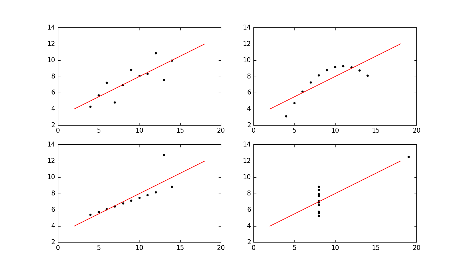
Exercise 1: Visualization vs stats
Start by downloading these four datasets: Data 1, Data 2, Data 3, and Data 4. The format is
.tsv, which stands for tab separated values. Each file has two columns (separated using the tab character). The first column is $x$-values, and the second column is $y$-values.
- Using the
numpyfunctionmean, calculate the mean of both $x$-values and $y$-values for each dataset.- Use python string formatting to print precisely two decimal places of these results to the output cell. Check out this stackoverflow page for help with the string formatting.
- Now calculate the variance for all of the various sets of $x$- and $y$-values (to three decimal places).
- Use
scipy.stats.pearsonrto calculate the Pearson correlation between $x$- and $y$-values for all four data sets (also to three decimal places).- The next step is use linear regression to fit a straight line $f(x) = a x + b$ through each dataset and report $a$ and $b$ (to two decimal places). An easy way to fit a straight line in Python is using
scipy'slinregress. It works like thisfrom scipy import stats slope, intercept, r_value, p_value, std_err = stats.linregress(x,y)
- Finally, it's time to plot the four datasets using
matplotlib.pyplot. Use a two-by-twosubplotto put all of the plots nicely in a grid and use the same $x$ and $y$ range for all four plots. And include the linear fit in all four plots. (To get a sense of what I think the plot should look like, you can take a look at my version here.)- Explain - in your own words - what you think my point with this exercise is.
Get more insight in the ideas behind this exercise by reading here.
And the video below generalizes in the coolest way imaginable. It's a treat, but don't watch it until after you've done the exercises.
from IPython.display import YouTubeVideo
YouTubeVideo("DbJyPELmhJc",width=800, height=450)
Before even starting visualizing some cool data, I just want to give a few tips for making nice plots in matplotlib. Unless you are already a pro-visualizer, those should be pretty useful to make your plots look much nicer. Paying attention to details can make an incredible difference when we present our work to others.
Note: there are many Python libraries to make visualizations. I am a huge fan of matplotlib, which is one of the most widely used ones, so this is what we will use for this class.
Video Lecture: How to improve your plots
from IPython.display import YouTubeVideo
YouTubeVideo("sdszHGaP_ag",width=800, height=450)
It's really time to put into practice what we learnt by plotting some data! We will start by looking at the time series describing the number of comments about GME in wallstreetbets over time. Using exploratory data visualization, we will try to answer the folling research question:
Is the activity on wallstreetbet related to the price of the GME stock?
We will use two datasets today:
Reading: Section 14.1 of the Data Visualization book. Start by reading about "visualizing trends" in the Data Visualization Book. We will use moving averages, so you can skip the part on LOESS.
Reading: Sections 3.1 and 3.2 of the Data Visualization book. Learn about non-linear axes to better visualize hetereogeneous data.
Exercise 2 : Plotting prices and comments using line-graphs.
- Plot the daily volume of the GME stock over time using the GME market data. On top of the daily data, plot the rolling average, using a 7 days window (you can use the function
pd.rolling). Use a log-scale on the y-axis.- Now make a second plot where you plot the total number of comments on Reddit per day. Follow the same steps you followed in step 1.
- What is the advantage of using the log-scale on the y-axis? What is the advantage of using a rolling-window?
- Now take a minute to look at these two figures. Then write in a couple of lines: What are the three most important observations you can draw by looking at the figures?
We will continue by studying more in depth the association between GME market indicators and the attention to the topic on Reddit. First, we will create the time-series of daily returns. Returns measure the change in price between two given points in time (in our case we will focus on consecutive days). They constitute a quantity of interest when it comes to stock time-series, because they tell us how much profit one would make if he/she bought the stock on a given day and sold it at a later time. For consistency, we will also compute returns (corresponding to daily changes) in the number of Reddit comments over time.
Reading: Sections 12.1 and 12.2 of the Data Visualization book. Learn about visualizing and measuring associations.
Exercise 3 : Returns vs number of comments using scatter-plots. In this exercise, we will look at the association between GME market indicators and the volume of comments on Reddit.
- Compute the daily log-returns as
np.log(Close_price(t)/Close_price(t-1)), whereClose_price(t)is the Close Price of GME on day t. You can use the function pd.Series.shift. Working with log-returns instead of regular returns is a standard thing to do in economics, if you are interested in why, check out this blog post.- Compute the daily log-change in number of new comments as
np.log(comments(t)/comments(t-1))wherecomments(t)is the number of comments on day t.- Compute the correlation coefficient (find the formula in the Data Visualization book, section 12.2) between the series computed in step 1 and step 2 (note that you need to first remove days without any comments from the time-series). Is the correlation statistically significant? Hint: check the Wikipedia page of the Pearson correlation to learn about significant values and its scipy implementation. What is the meaning of the p-value returned by the scipy function?
- Make a scatter plot of the daily log-return on investment for the GME stock against the daily log-change in number of comments. Color the markers for 2020 and 2021 in different colors, and make the marker size proportional to the Close price.
- Now take a minute to look at the figure you just prepared. Then write in a couple of lines: What are the three most salient observations you can draw by looking at it?
- Based on the exploratory data visualization in Exercises 2 and 3, what can you conclude on the research question: Is the activity on wallstreetbet related to the price of the GME stock?
But what is the role played by different redditors? It is time to start looking at the activity of different redditors over time, and study the differences between them. First, I will show some tips and tricks to visualize distributions, then we will put things into practice by visualizing the distribution of key quantities describing redditors on wallstreetbets.
Video Lecture: Plotting histograms and distributions
YouTubeVideo("UpwEsguMtY4",width=800, height=450)
Exercise 4: Authors overall activity. We will start by studying the distribution of comments per author.
Compute the total number of comments per author using the comments dataset. Then, make a histogram of the number of comments per author, using the function
numpy.histogram, using logarithmic binning. Here are some important points on histograms (they should be already quite clear if you have watched the video above):
- Binning: By default numpy makes 10 equally spaced bins, but you always have to customize the binning. The number and size of bins you choose for your histograms can completely change the visualization. If you use too few bins, the histogram doesn't portray well the data. If you have too many, you get a broken comb look. Unfortunately is no "best" number of bins, because different bin sizes can reveal different features of the data. Play a bit with the binning to find a suitable number of bins. Define a vector $\nu$ including the desired bins and then feed it as a parameter of numpy.histogram, by specifying bins=$\nu$ as an argument of the function. You always have at least two options:
- Linear binning: Use linear binning, when the data is not heavy tailed, by using
np.linspaceto define bins.- Logarithmic binning: Use logarithmic binning, when the data is heavy tailed, by using
np.logspaceto define your bins.- Normalization: To plot probability densities, you can set the argument density=True of the
numpy.histogramfunction.Compute the mean and the median value of the number of comments per author and plot them as vertical lines on top of your histogram. What do you observe? Which value do you think is more meaningful?
Exercise 5: Authors lifespan. We will now move on to study authors lifespan, using a two-dimensional histogram.
- For each author, find the time of publication of their first comment, minTime, and the time of publication of their last comment, maxTime, in unix timestamp.
- Compute the "lifespan" of authors as the difference between maxTime and minTime. Note that timestamps are measured in seconds, but it is appropriate here to compute the lifespan in days. Make a histogram showing the distribution of lifespans, choosing appropriate binning. What do you observe?
- Now, we will look at how many authors joined and abandoned the discussion on GME over time. First, use the numpy function numpy.histogram2d to create a 2-dimensional histogram for the two variables minTime and maxTime. A 2D histogram, is nothing but a histogram where bins have two dimensions, as we look simultaneously at two variables. You need to specify two arrays of bins, one for the values along the x-axis (minTime) and the other for the values along the y-axis (maxTime). Choose bins with length 1 week.
- Now, use the matplotlib function
plt.imshowto visualize the 2d histogram. You can follow this example on StackOverflow. To show dates instead of unix timestamps in the x and y axes, usemdates.date2num. More details in this StackOverflow example, see accepted answer.- Make sure that the colormap allows to well interpret the data, by passing
norm=mpl.colors.LogNorm()as an argument to imshow. This will ensure that your colormap is log-scaled. Then, add a colorbar on the side of the figure, with the appropriate colorbar label.- As usual :) Look at the figure, and write down three key observations.
- Based on the data visualizations in Exercises 4 and 5, what can you conclude on the question: What is the role played by different redditors?