Here is the plan for today.
Part 1: In the first part of the class we will learn few things about Data Visualization, an important aspect in Computational Social Science. Why is it so important to make nice plots if we can use stats and modelling? I hope I will convince that it is very important to make meaningful visualizations.
Part 2: In the second part of the class we will learn about Visualizing Distributions. Plotting histogram is something you are probably very familiar with at this point, but there are a few things that you should know about how to visualize distributions when the data you have is highly heterogeneous.
Part 3: In the final part of the class, we will learn about Heavy tailed distributions. Heavy tailed distributions are ubiquitous in Computational Social Science, so it is really important to understand what they are and how to study them.
Start by watching this short introduction video to Data Visualization.
- Video Lecture: Intro to Data Visualization
from IPython.display import YouTubeVideo
YouTubeVideo("oLSdlg3PUO0",width=800, height=450)
Ok, but is data visualization really so necessary? Let's see if I can convince you of that with this little visualization exercise.
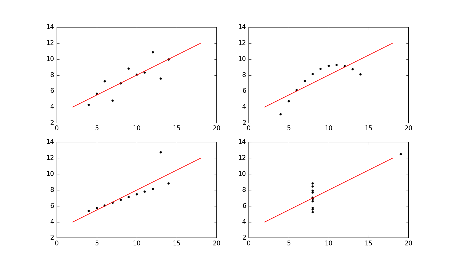
Exercise 1: Visualization vs stats
Start by downloading these four datasets: Data 1, Data 2, Data 3, and Data 4. The format is
.tsv, which stands for tab separated values. Each file has two columns (separated using the tab character). The first column is $x$-values, and the second column is $y$-values.
- Using the
numpyfunctionmean, calculate the mean of both $x$-values and $y$-values for each dataset.- Use python string formatting to print precisely two decimal places of these results to the output cell. Check out this stackoverflow page for help with the string formatting.
- Now calculate the variance for all of the various sets of $x$- and $y$-values (to three decimal places).
- Use
scipy.stats.pearsonrto calculate the Pearson correlation between $x$- and $y$-values for all four data sets (also to three decimal places).- The next step is use linear regression to fit a straight line $f(x) = a x + b$ through each dataset and report $a$ and $b$ (to two decimal places). An easy way to fit a straight line in Python is using
scipy'slinregress. It works like thisfrom scipy import stats slope, intercept, r_value, p_value, std_err = stats.linregress(x,y)
- Finally, it's time to plot the four datasets using
matplotlib.pyplot. Use a two-by-twosubplotto put all of the plots nicely in a grid and use the same $x$ and $y$ range for all four plots. And include the linear fit in all four plots. (To get a sense of what I think the plot should look like, you can take a look at my version here.)- Explain - in your own words - what you think my point with this exercise is.
Get more insight in the ideas behind this exercise by reading here.
And the video below generalizes in the coolest way imaginable. It's a treat, but don't watch it until after you've done the exercises.
from IPython.display import YouTubeVideo
YouTubeVideo("DbJyPELmhJc",width=800, height=450)
Before even starting visualizing some cool data, I just want to give a few tips for making nice plots in matplotlib. Unless you feel like you are already a pro-visualizer, those should be pretty useful to make your plots look much nicer. Paying attention to details can make an incredible difference when we present our work to others.
Note: there are many Python libraries to make visualizations. I am a huge fan of matplotlib, which is one of the most widely used ones, so this is what we will use for this class.
Video Lecture: How to improve your plots
from IPython.display import YouTubeVideo
YouTubeVideo("sdszHGaP_ag",width=800, height=450)
As you probably have discovered in the exercise above, using summary statistics (mean, median, standard deviations) to capture the properties of your dataset can be sometimes misleading. It is very good practice, whenever you have a dataset at hand, to start by plotting the distribution of the data. There is a lot we can learn about our data just by looking at the probability distribution of data points.
Very often, when it comes to real-world datasets, the data span several orders of magnitude. In these cases, plotting probability distributions as histograms in the usual way does not work very well. But there are a couple of tricks you can apply in these instances to visualize the distribution.
In the video-lecture below, I guide you through plotting histograms for very heterogeneous datasets. The example I go through is based on two datasets: (i) financial data describing the prices and returns of a stock; and (ii) a dataset describing the number of comments posted by a set of Reddit users. In fact, the dataset I use don't really matter. You can use the same techniques to plot any data.
Video Lecture: Plotting histograms and distributions
YouTubeVideo("UpwEsguMtY4",width=800, height=450)
Exercise 2: Paper citations. Now, we will put things into practice by plotting the distribution of citations per author. Consider the Paper dataset, you prepared in Week2, Exercise 3.
- Select all the papers published in 2009, and store their "citationCount" in an array. Note: You should have an array of a few hundreds data points (if you don't come and talk to me).
- Make a histogram of the number of citations per paper, using the function
numpy.histogram. Here are some important points on histograms (they should be already quite clear if you have watched the video above):
- Binning: By default numpy makes 10 equally spaced bins, but you always have to customize the binning. The number and size of bins you choose for your histograms can completely change the visualization. If you use too few bins, the histogram doesn't portray well the data. If you have too many, you get a broken comb look. Unfortunately is no "best" number of bins, because different bin sizes can reveal different features of the data. Play a bit with the binning to find a suitable number of bins. Define a vector $\nu$ including the desired bins and then feed it as a parameter of numpy.histogram, by specifying bins=$\nu$ as an argument of the function. You always have at least two options:
- Linear binning: Use linear binning, when the data is not heavy tailed, by using
np.linspaceto define bins.- Logarithmic binning: Use logarithmic binning, by using
np.logspaceto define your bins.- Normalization: To plot probability densities, you can set the argument density=True of the
numpy.histogramfunction.- Have you used Logarithmic or Linear binning in this case? Justify your choice.
- Why do you think I wanted you to use only papers published in 2009?
- Compute the mean and the median value of the number of citations per paper and plot them as vertical lines on top of your histogram. What do you observe? Which value do you think is more meaningful?
When it comes to real-world data, it is very common to observe distributions that are so-called "Heavy tailed". In this section, we will explore this concept a bit more in detail. We will start by watching a video-lecure by me and reading a great paper.
Reading: Power laws, Pareto distributions and Zipf’s law Read the introduction and skim through the rest of the article.
Video Lecture: Heavy tailed distributions
YouTubeVideo("S2OZBTKx8_E",width=800, height=450)
As we have discussed in the lecture, one impact of heavy tails is that sample averages can be poor estimators of the underlying mean of the distribution. To understand this point better, recall the Law of Large Numbers. Consider a sample of IID variables $ X_1, \ldots, X_n $ from the same distribution $ F $ with finite expected value $ \mathbb E |X_i| = \int x F(dx) = \mu $.
According to the law, the mean of the sample $ \bar X_n := \frac{1}{n} \sum_{i=1}^n X_i $ satisfies $$ \bar X_n \to \mu \text{ as } n \to \infty $$
This basically tell us that if we have a large enough sample, the sample mean will converge to the population mean.
The condition that $ \mathbb E | X_i | $ is finite holds in most cases but can fail if the distribution $ F $ is very heavy tailed. Further, even when $ \mathbb E | X_i | $ is finite, the variance of a heavy tailed distribution can be so large that the sample mean will converge very slowly to the population mean. We will look into this in the following exercise.
Exercise 3: Law of large numbers.
- Sample N=10,000 data points from a Gaussian Distribution with parameters $\mu = 0 $ and $\sigma = 4$, using the
np.random.standard_normal()function. Store your data in a numpy array $\mathbf{X}$.- Create a figure.
- Plot the distribution of the data in $\mathbf{X}$.
- Compute the cumulative average of $\mathbf{X}$ (you achieve this by computing $average(\{\mathbf{X}[0],..., \mathbf{X}[i-1]\})$ for each index $i \in [1, ..., N+1]$ ). Store the result in an array.
- In a similar way, compute the cumulative standard error of $\mathbf{X}$. Note: the standard error of a sample is defined as $ \sigma_{M} = \frac{\sigma}{\sqrt(n)} $, where $\sigma$ is the sample standard deviation and $n$ is the sample size. Store the result in an array.
- Compute the values of the distribution mean and median using the formulas you can find on the Wikipedia page of the Gaussian Distribution
- Create a figure.
- Plot the cumulative average computed in point 3. as a line plot (where the x-axis represent the size of the sample considered, and the y-axis is the average).
- Add errorbars to each point in the graph with width equal to the standard error of the mean (the one you computed in point 4).
- Add a horizontal line corresponding to the distribution mean (the one you found in point 5).
- Compute the cumulative median of $\mathbf{X}$ (you achieve this by computing $median(\{\mathbf{X}[0],..., \mathbf{X}[i-1]\})$ for each index $i \in [1, ..., N+1]$). Store the result in an array.
- Create a figure.
- Plot the cumulative median computed in point 7. as a line plot (where the x-axis represent the size of the sample considered, and the y-axis is the average).
- Add a horizontal line corresponding to the distribution median (the one you found in point 5).
- Optional: Add errorbars to your median line graph, with width equal to the standard error of the median. You can compute the standard error of the median via bootstrapping.
- Now sample N = 10,000 data points from a Pareto Distribution with parameters $x_m=1$ and $\alpha=0.5$ using the
np.random.pareto()function, and store it in a numpy array. (Optional: Write yourself the function to sample from a Pareto distribution using the Inverse Transform Sampling method)- Repeat points 2 to 8 for the Pareto Distribution sample computed in point 9.
- Now sample N = 10,000 data points from a Lognormal Distribution with parameters $\mu=0$ and $\sigma=4$ using the
np.random.standard_normal()function, and store it in a numpy array.- Repeat points 2 to 8 for the Lognormal Distribution sample computed in point 11.
- Now, consider the array collecting the citations of papers from 2009 you created in Exercise 2, point 1. First, compute the mean and median number of citations for this population. Then, extract a random sample of N=10,000 papers.
- Repeat points 2,3,4,6,7 and 8 above for the paper citation sample prepared in point 13.
- Answer the following questions (Hint: I suggest you plot the graphs above multiple times for different random samples, to get a better understanding of what is going on):
- Compare the evolution of the cumulative average for the Gaussian, Pareto and LogNormal distribution. What do you observe? Would you expect these results? Why?
- Compare the cumulative median vs the cumulative average for the three distributions. What do you observe? Can you draw any conclusions regarding which statistics (the mean or the median) is more usfeul in the different cases?
- Consider the plots you made using the citation count data in point 14. What do you observe? What are the implications?
- What do you think are the main take-home message of this exercise?
As we have discussed in the lecture, another property of heavy tailed distributed data is that outliers are very frequent. We will explore this better in the following exercise.
Exercise 4: The big jump principle.
- Produce a sample of N=10,000 data points extracted from a Gaussian distribution with parameters $\mu = 0 $ and $\sigma = 4$ (reuse the code from the previous exercise). Compute (i) the maximum and (ii) the sum of the values in the sample.
- Repeat point 1. for S = 1000 samples and store the sums and maxima in two arrays.
- Create a scatter plot, showing the sums against the maxima.
- Repeat points 1,2, and 3 for (i) a Pareto distribution with parameters $x_m=1$ and $\alpha=0.5$; (ii) a log-normal distribution with parameters $\mu=0$ and $\sigma=4$; and (iii) data samples of size N=10,000 extracted from the array collecting the number of citations of papers (from Exercise 3, point 1). Hint: Remember to use a logarithmic scale when the data span many orders of magnitude.
- Answer the following questions.
- Compare the scatterplots obtained for the Gaussian, Power-Law and Lognormal distributions. What do you observe? Would you expect that? Why?
- Focus on the scatter plot obtained for the citation data. What do you observe? What are the implications?