import pandas as pd
import lux
In this tutorial, we look at how you can select visualizations of interest from the Lux widget and export them for further analysis. We will be working with the Happy Planet Index dataset, which contains metrics related to well-being for 140 countries around the world.
df = pd.read_csv('https://github.com/lux-org/lux-datasets/blob/master/data/hpi.csv?raw=true')
lux.config.default_display = "lux" # Set Lux as default display
For the convienience of this tutorial, we set Lux as the default display to avoid having to Toggle from the Pandas table display everytime.
Exporting one or more visualizations from widget
In Lux, you can click on visualizations of interest and export them into a separate widget for further processing.
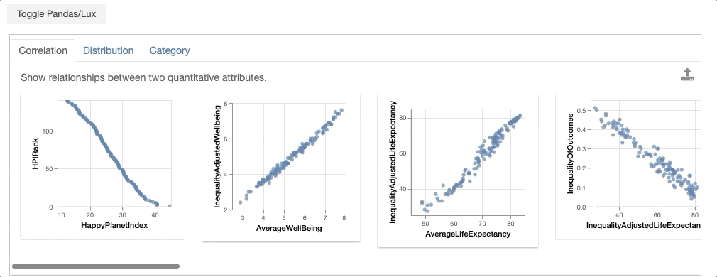
df
# Select charts from the widget above and click on the export button to access them here.
df.exported
From the dataframe recommendations, the visualization showing the relationship between GDPPerCapita and Footprint is very interesting. In particular, there is an outlier with extremely high ecological footprint as well as high GDP per capita. Select this visualization and click on the export button.
df
# Select the GDP by Footprint visualization and export it to the `gdp_footprint` variable
gdp_footprint = df.exported[0]
gdp_footprint
Setting the Intent with a Vis input
Often, we might be interested in other visualizations that is related to a visualization of interest and want to learn more. With the exported Vis, we can update the intent associated with dataframe to be based on the selected Vis to get more recommendations related to this visualization.
df.intent = gdp_footprint
df
Exporting Visualizations as Code
To allow further edits of visualizations, visualizations can be exported to code in Matplotlib, Altair, or as Vega-Lite specification.
print (gdp_footprint.to_altair())
This can be copy-and-pasted back into a new notebook cell for further editing.
import altair as alt

chart = alt.Chart(df).mark_circle().encode(
    x=alt.X('Footprint',scale=alt.Scale(domain=(0.6, 15.8)),type='quantitative'),
    y=alt.Y('GDPPerCapita',scale=alt.Scale(domain=(244, 105447)),type='quantitative')
)
chart = chart.configure_mark(tooltip=alt.TooltipContent('encoding')) # Setting tooltip as non-null
chart = chart.interactive() # Enable Zooming and Panning

chart = chart.configure_title(fontWeight=500,fontSize=13,font='Helvetica Neue')
chart = chart.configure_axis(titleFontWeight=500,titleFontSize=11,titleFont='Helvetica Neue',
			labelFontWeight=400,labelFontSize=8,labelFont='Helvetica Neue',labelColor='#505050')
chart = chart.configure_legend(titleFontWeight=500,titleFontSize=10,titleFont='Helvetica Neue',
			labelFontWeight=400,labelFontSize=8,labelFont='Helvetica Neue')
chart = chart.properties(width=160,height=150)

chart
You can also export this as Vega-Lite specification and vis/edit the specification on Vega Editor.
print (gdp_footprint.to_vegalite())
Visualizations can also be exported to code in Matplotlib.
print (gdp_footprint.to_matplotlib())
print (gdp_footprint.to_code(language="matplotlib"))
import matplotlib.pyplot as plt
plt.rcParams.update(
            {
                "axes.titlesize": 20,
                "axes.titleweight": "bold",
                "axes.labelweight": "bold",
                "axes.labelsize": 16,
                "legend.fontsize": 14,
                "legend.title_fontsize": 15,
                "xtick.labelsize": 13,
                "ytick.labelsize": 13,
            }
        )
import numpy as np
from math import nan
from matplotlib.cm import ScalarMappable
fig, ax = plt.subplots(figsize=(4.5, 4))
x_pts = df['InequalityAdjustedWellbeing']
y_pts = df['AverageWellBeing']
ax.scatter(x_pts, y_pts, alpha=0.5)
ax.set_xlabel('InequalityAdjus...dWellbeing', fontsize='15')
ax.set_ylabel('AverageWellBeing', fontsize='15')

fig