Take a Tour: Responsible AI Toolbox
The Responsible AI Toolbox is a customizable, interoperable tool where you can select components that perform analytical functions relevant to one of these areas:
- Model Assessment and Debugging, which involves determining how and why AI systems behave the way they do, identifying and diagnosing issues, then using that knowledge to take targeted steps to improve their performance. This can be encapsulated in a multi-step workflow:

- Decision-making: While machine learning models are particularly powerful in identifying patterns in data and making predictions, they offer little support to boost decision making processes, which involves estimating how a real-world outcome changes in the presence of an intervention, or “interrogating” a model to determine what changes to a particular datapoint would flip the model decision to become different/favorable.
Each component has a variety of tabs and buttons. Take this tour to familiarize yourself with the different components of the dashboard and the options and functionalities available in each.
Error Analysis
Cohorts
At the top of the dashboard, you can create cohorts -- subgroups of datapoints sharing specified characteristics -- to focus your analysis on.

- Cohort settings: allows you to view and modify the details of each cohort in a side panel
- Dashboard configuration: allows you to view and modify the layout of the overall dashboard in a side panel
- Switch global cohort: allows you to select a different cohort and view its statistics in a popup
- Create new cohort: allows you to add a new cohort
Clicking the "Cohort settings" button reveals a side panel with details on all existing cohorts.

- Switch global cohort: allows you to select a different cohort and view its statistics in a popup
- Create new cohort: allows you to add a new cohort
- Cohort list: contains the number of data points, the number of filters, the percent of error coverage, and the error rate for each cohort
Clicking the "Dashboard settings" button reveals a side panel with details on the dashboard layout.

- Dashboard Component: lists the name of the component
- Delete: removes the component from the dashboard
Note: Each component row can be clicked and dragged to move it to a different location
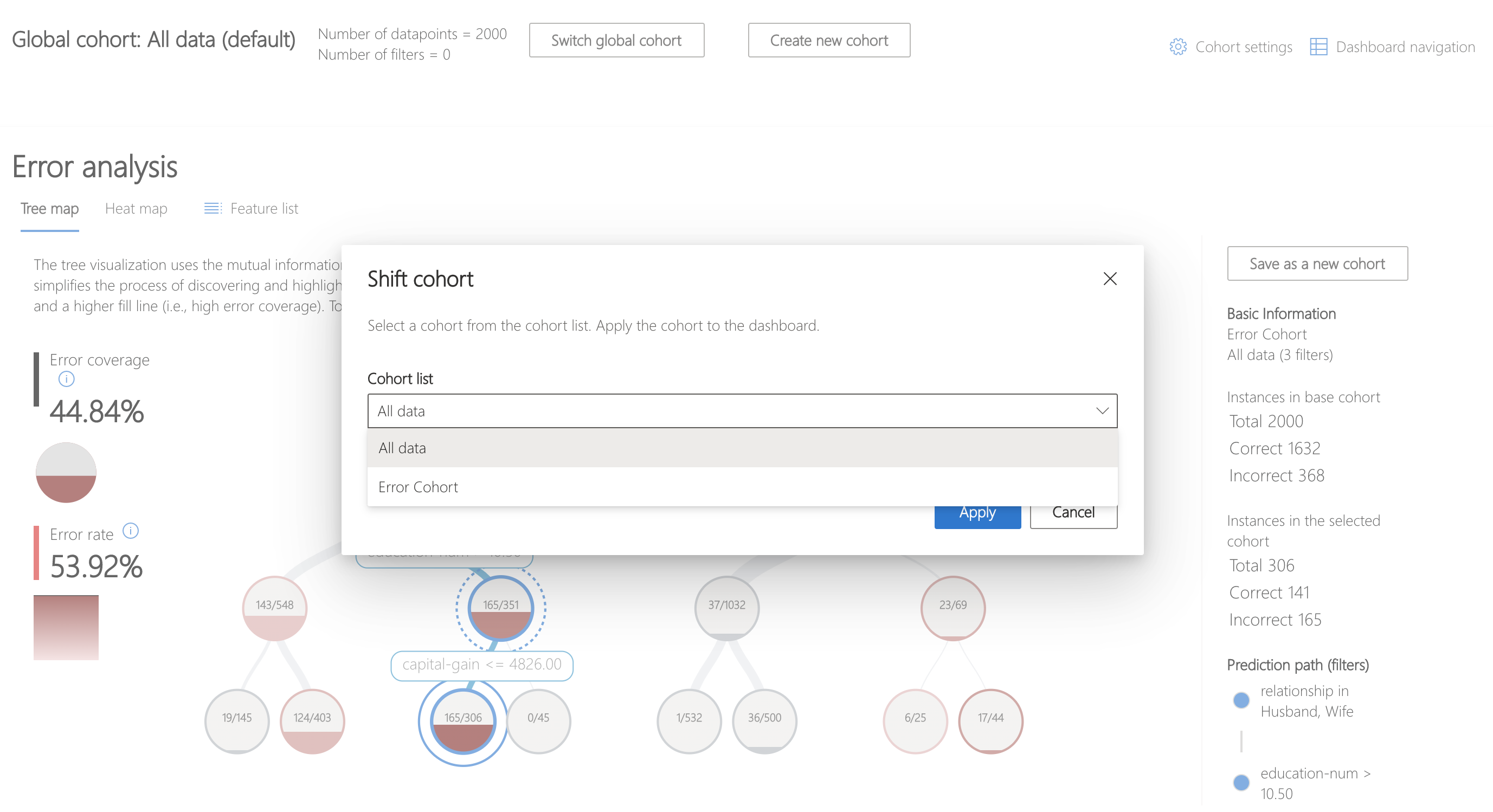
Clicking the "Switch global cohort" button on the dashboard or in the "Cohort settings" sidebar creates a popup that allows you to do that.
Clicking the "Create new cohort" button on the top of the Toolbox or in the "Cohort settings" sidebar creates a sidebar that allows you to do that.
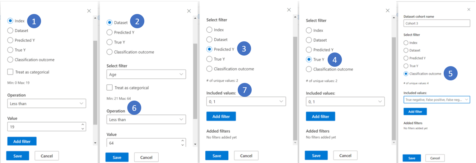
- Index: filters by the position of the datapoint in the full dataset
- Dataset: filters by the value of a particular feature in the dataset
- Predicted Y: filters by the prediction made by the model
- True Y: filters by the actual value of the target feature
- Classification Outcome: for classification problems, filters by type and accuracy of classification
- Numerical Values: filter by a Boolean operation over the values (i.e. select datapoints where age < 64)
- Categorical Values: filter by a list of values that should be included
Tree View
The first tab of the Error Analysis component is the tree view, which illustrates how model failure is distributed across different cohorts.
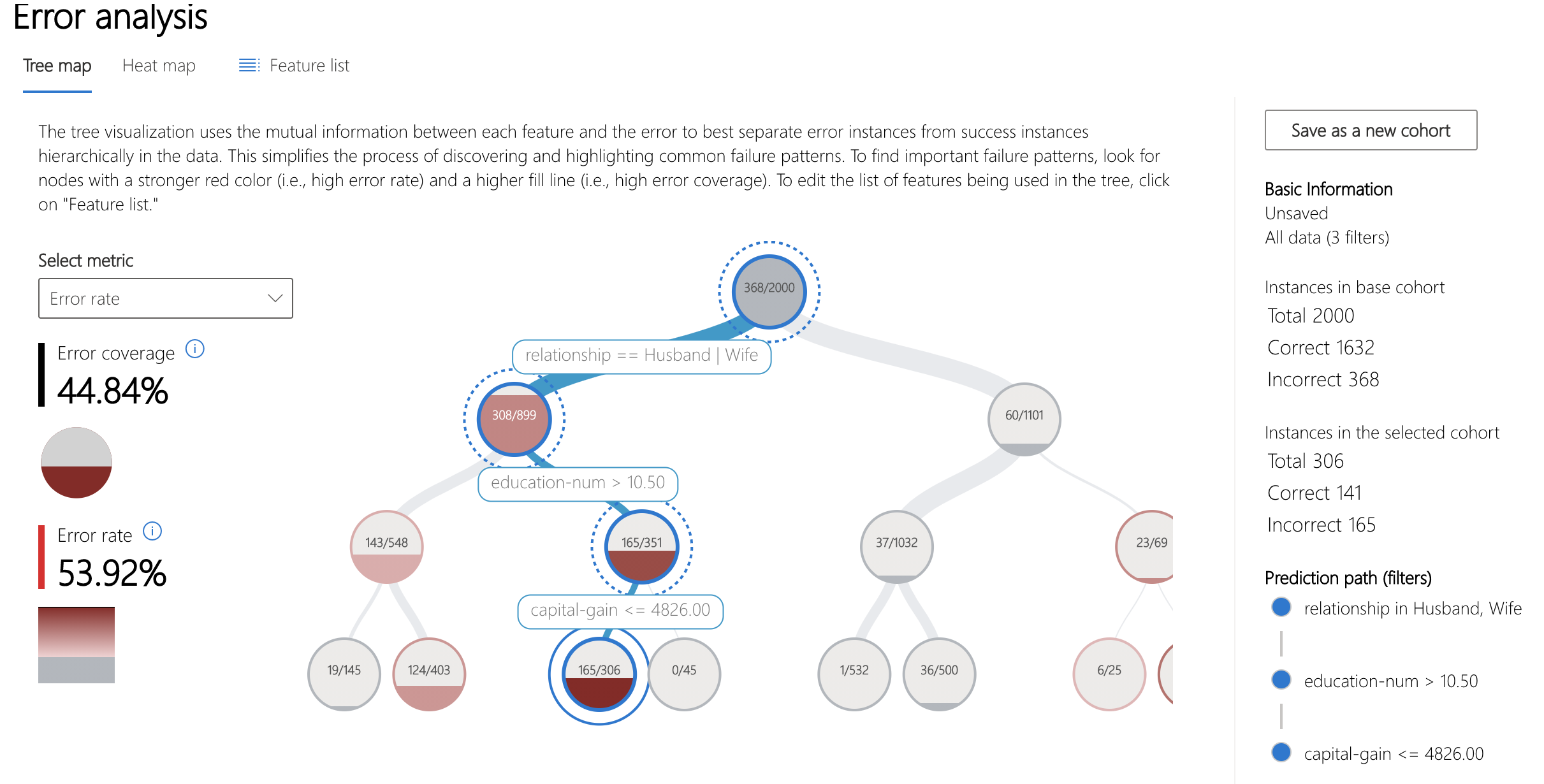
- Heatmap view: switches to heatmap visualization of error distribution
- Feature list: allows you to modify the features used in the heatmap using a side panel
- Error coverage: displays the percentage of all error in the dataset concentrated in the selected node
- Error rate: displays the percentage of failures of all the datapoints in the selected node
- Node: represents a cohort of the dataset, potentially with filters applied, and the number of errors out of the total number of datapoints in the cohort
- Fill line: visualizes the distribution of datapoints into child cohorts based on filters, with number of datapoints represented through line thickness
- Selection information: contains information about the selected node in a side panel
- Save as a new cohort: creates a new cohort with the given filters
- Instances in the base cohort: displays the total number of points in the entire dataset, as well as the number of correctly and incorrectly predicted points
- Instances in the selected cohort: displays the total number of points in the selected node, as well as the number of correctly and incorrectly predicted points
- Prediction path (filters): lists the filters placed over the full dataset to create this smaller cohort
Clicking on the "Feature list" button displays a side panel.
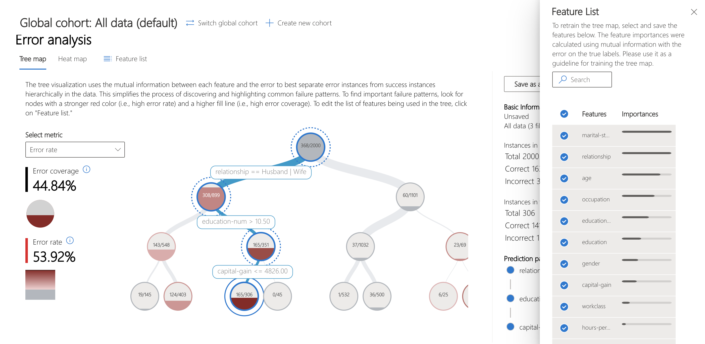
- Search features: allows you to find specific features in the dataset
- Features: lists the name of the feature in the dataset
- Importances: visualizes the relative global importances of each feature in the dataset
- Check mark: allows you to add or remove the feature from the tree map
Heatmap View
Clicking on the "Heatmap view" tab switches to a different view of the error in the dataset. You can click on one or many heatmap cells and create new cohorts.

- No. Cells: displays the number of cells selected
- Error coverage: displays the percentage of all errors concentrated in the selected cell(s)
- Error rate: displays the percentage of failures of all datapoints in the selected cell(s)
- Axis features: selects the intersection of features to display in the heatmap
- Cells: represents a cohort of the dataset, with filters applied, and the percentage of errors out of the total number of datapoints in the cohort. A blue outline indicates selected cells, and the darkness of red represents the concentration of failures
- Prediction path (filters): lists the filters placed over the full dataset for each selected cohort
Data Explorer
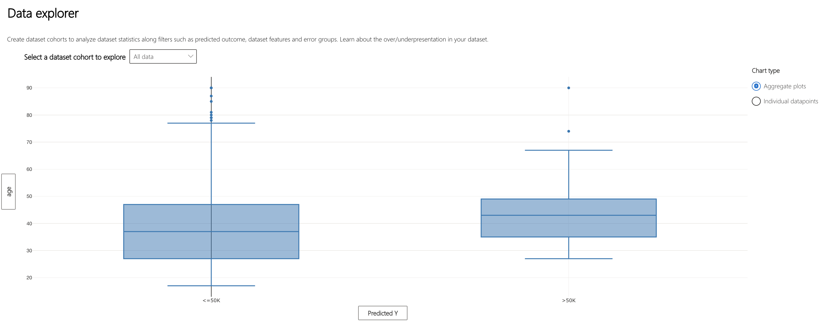
- X-axis: displays the type of value being plotted horizontally, modify by clicking to display a side panel
- Y-axis: displays the type of value being plotted vertically, modify by clicking to display a side panel
- Chart type: specifies whether the plot is aggregating values across all datapoints
- Aggregate plot: displays data in bins or categories along the x-axis
Clicking on the "Individual datapoints" option under "Chart type" shifts to a disaggregated view of the data.
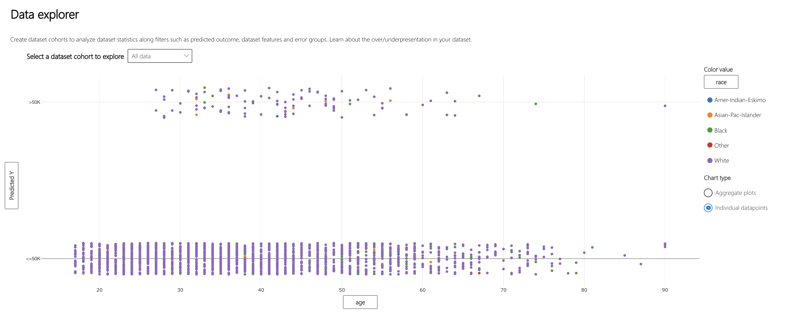
- Color value: allows you to select the type of legend used to group datapoints
- Disaggregate plot: scatterplot of datapoints along specified axes
Clicking on the labels of the axes displays a popup.
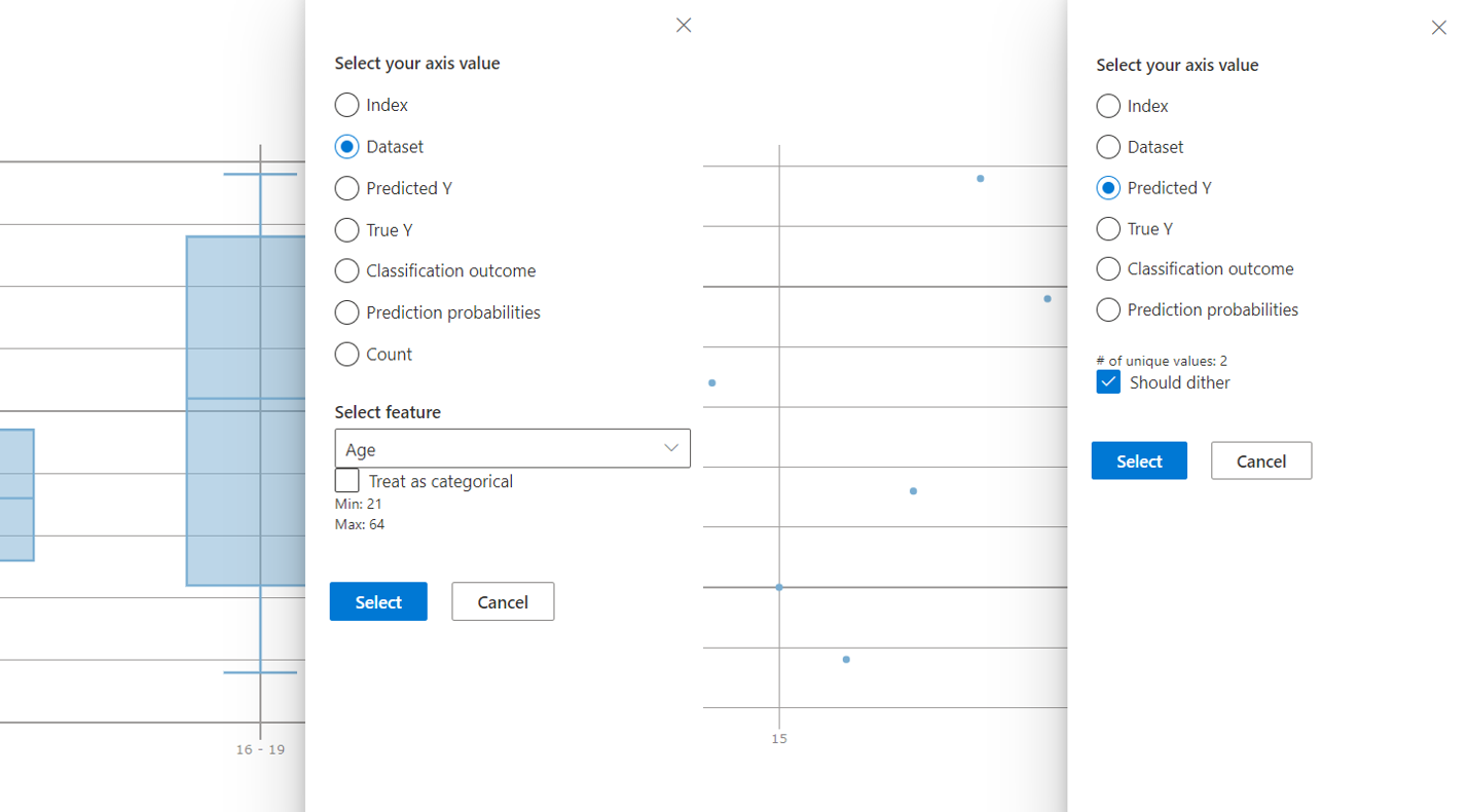
- Select your axis alue: allows you to select the value displayed on the axis, with the same options and variety as cohort creation
- Should dither: adds optional noise to the data to avoid overlapping points in the scatterplot
Model Statistics

- X-axis: allows you to select a particular statistic of model prediction
- Y-axis: plots model statistics for a specified cohort of data
- Metrics: lists the accuracy, precision, recall, false positive rate, and false negative rate of the model
Clicking the x-axis label allows you to select which cohorts to plot statistics for.
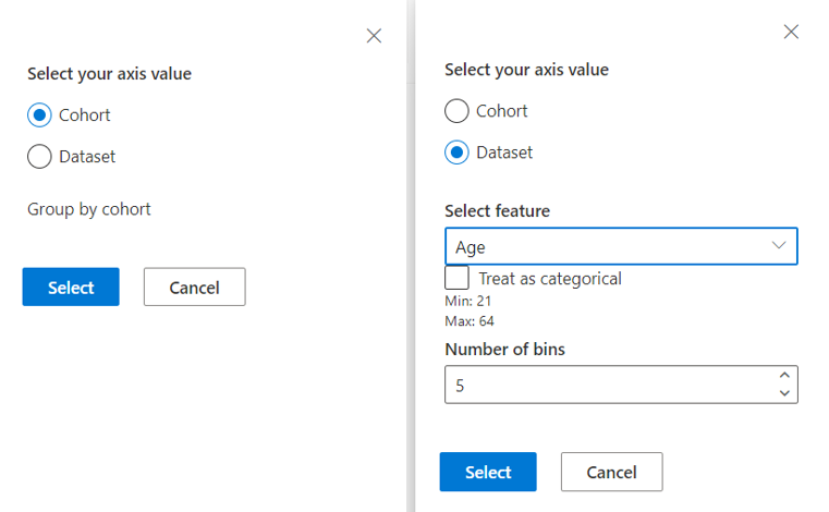
- Cohort: allows you to view model statistics of premade cohorts
- Dataset: allows you to view model statistics of a feature across bins or categories
Clicking the y-axis label allows you to select the metric(s) to plot for the cohorts.

- Predicted Y: plots based on the prediction made by the model
- True Y: plots based on the actual value of the target feature
- Classification outcome: for classification problems, plots based on the type and accuracy of classification
- Prediction probabilities: plots based on the probability of a certain prediction
Interpretability
Global Explanations
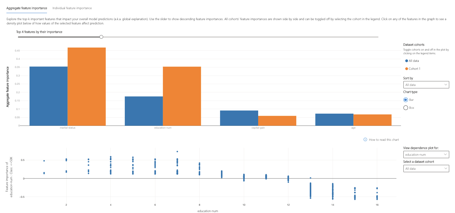
- Top features: lists the most important global features for a prediction and allows you to change it through buttons or a slider
- Aggregate feature importance: visualizes the weight of each feature in influencing model decisions across all predictions
- Dataset cohorts: displays the legend for aggregate feature importances for each cohort of data
- Sort by: allows you to select which cohort's importances to sort the aggregate feature importance graph by
- Chart type: allows you to select between a bar plot view of average importances for each feature and a box plot of importances for all data
- Feature importance of ____: Class: ____: plots the importance of a particular feature across the predictions in the cohort
- View dependence plot for: selects the feature whose importances you want to plot
- View cohort: selects the cohort whose importances you want to plot
Clicking the "Individual feature importances" tab shifts views to explain how features influence the predictions made on specific datapoints.
Local Explanations
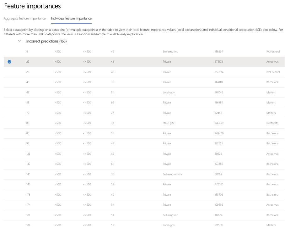

- Filter by: selects the cohort of points to display
- Scatter plot: switches to and from the scatter plot view of the points
- Point selection: selects the points to display in the feature importance plot or the ICE plot
- Feature importance plot: bar plot of the importance of each feature for the model's prediction on the selected datapoint(s)
- Individual conditional expectation (ICE) plot: switches to the ICE plot showing model predictions across a range of values of a particular feature
- Sort by: allows you to select the point (of those checked above) whose feature importances are displayed in descending order on the feature importance plot
- Top 1-n features: allows you to specify the number of features to show importances for through a slider
- Bar plot: displays the importance of each feature in the dataset for the model prediction of the selected datapoints
Clicking "Individual conditional expectation (ICE) plot" switches views to show how model prediction for the selected datapoint varies across values of a given feature.

- Min: specifies the lower bound of the range of predictions in the ICE plot
- Max: specifies the upper bound of the range of predictions in the ICE plot
- Steps: specifies the number of points to show predictions for within the interval
- Feature: specifies the feature to make predictions for
Counterfactuals
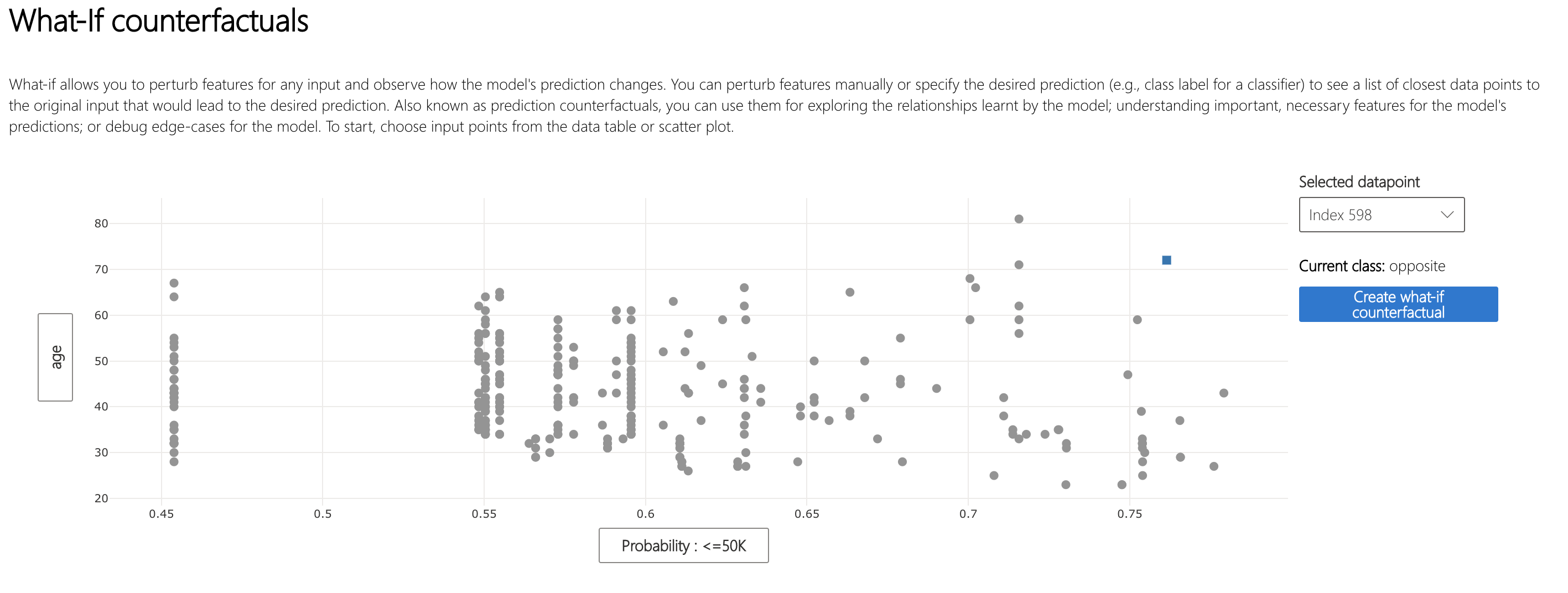
- Filter by: selects the cohort of points to display
- Scatter plot: switches to and from the scatter plot view of the points
- Point selection: selects the point to create a counterfactual for and display in the top ranking features plot
- Selected datapoint: performs the same action as the point selection in the table, except in a dropdown menu
- Desired class for counterfactual(s): specifies the class to generate counterfactuals for
- Create what-if counterfactual: displays side bar for counterfactual creation
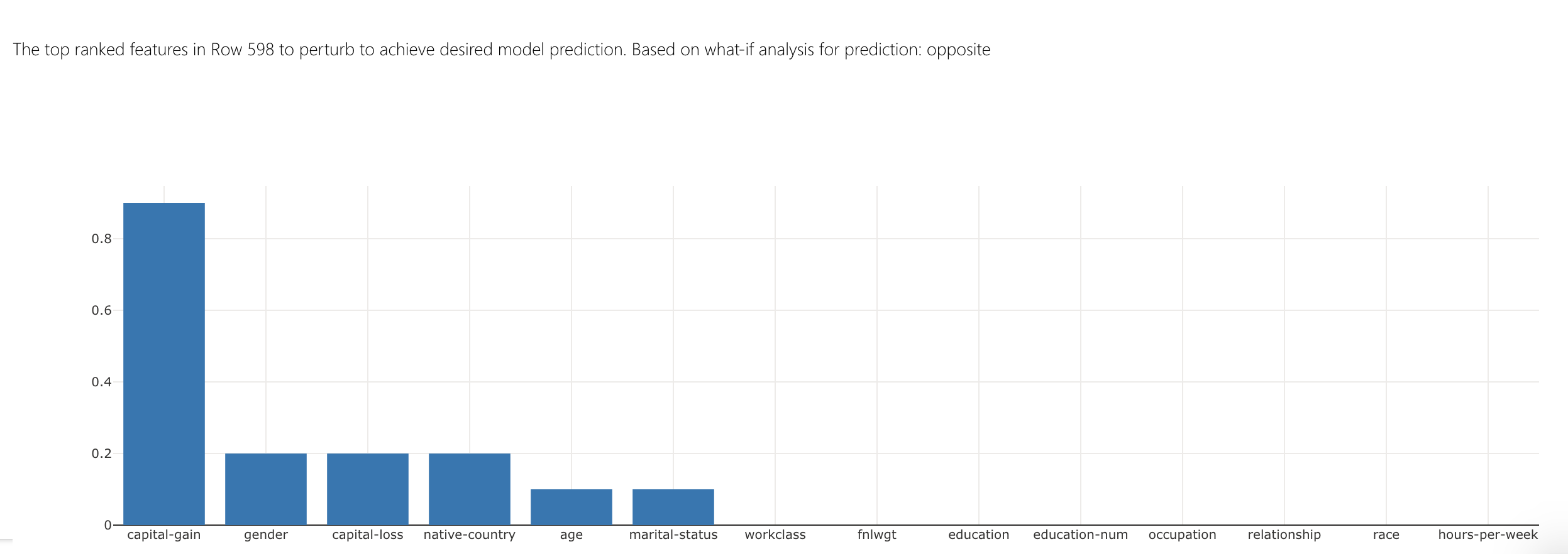
- Top ranked features plot: displays in order the features to perturb to create counterfactuals of the desired class
Clicking on "Create what-if counterfactual" results in a large side panel popping up.
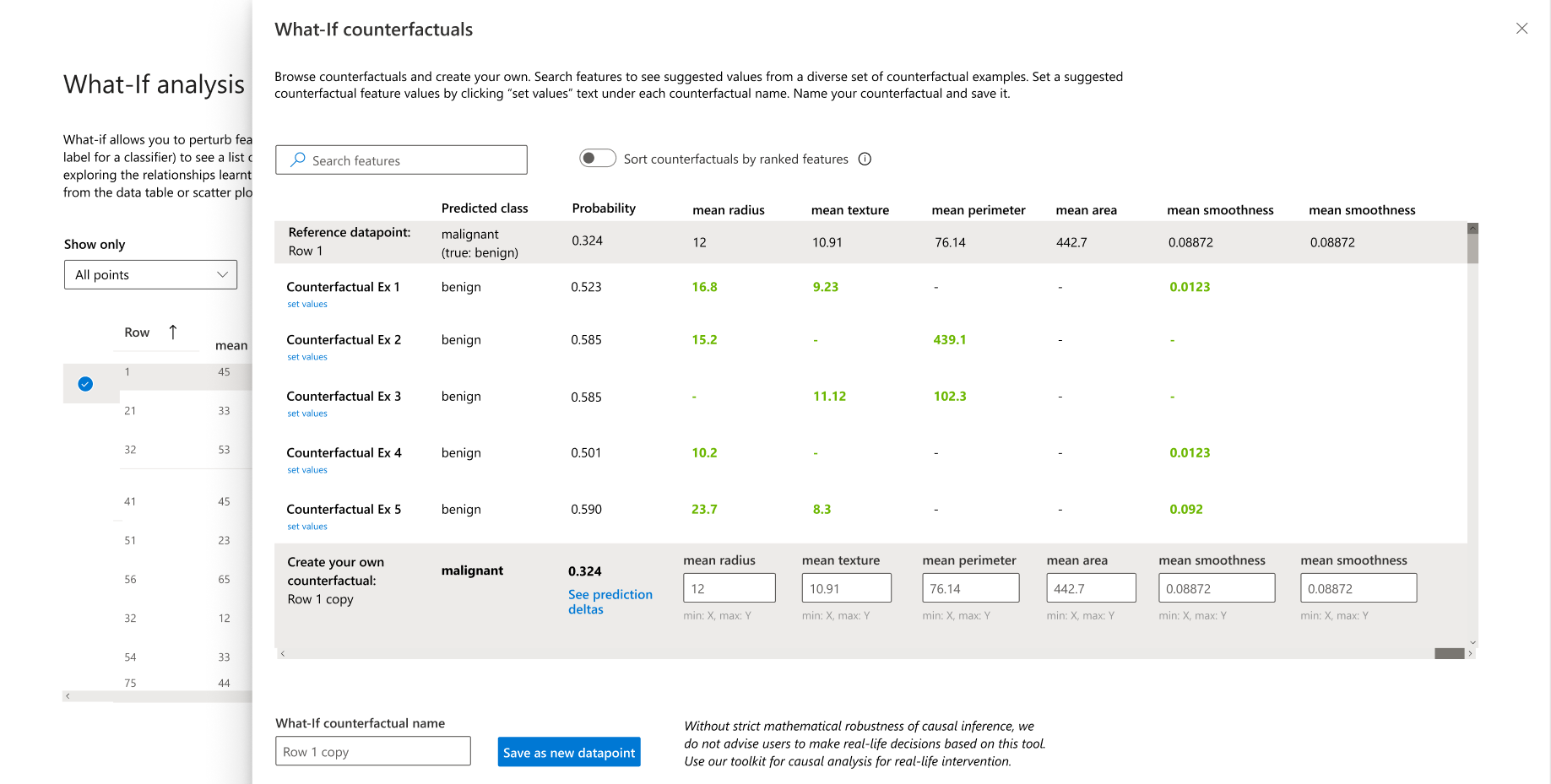
- Search features: finds features to observe and change values
- Sort counterfactual by ranked features: sorts counterfactual examples in order of perturbation effect (see above for top ranked features plot)
- Counterfactual Ex: lists feature values of example counterfactuals in a given class
- Predicted class: lists the model prediction of a counterfactual's class given those changed features
- Create your own counterfactual: allows you to perturb your own features to modify the counterfactual
- What-if counterfactual name: allows you to name the counterfactual uniquely
- Save as new datapoint: saves the counterfactual you have created
Causal Inferencing
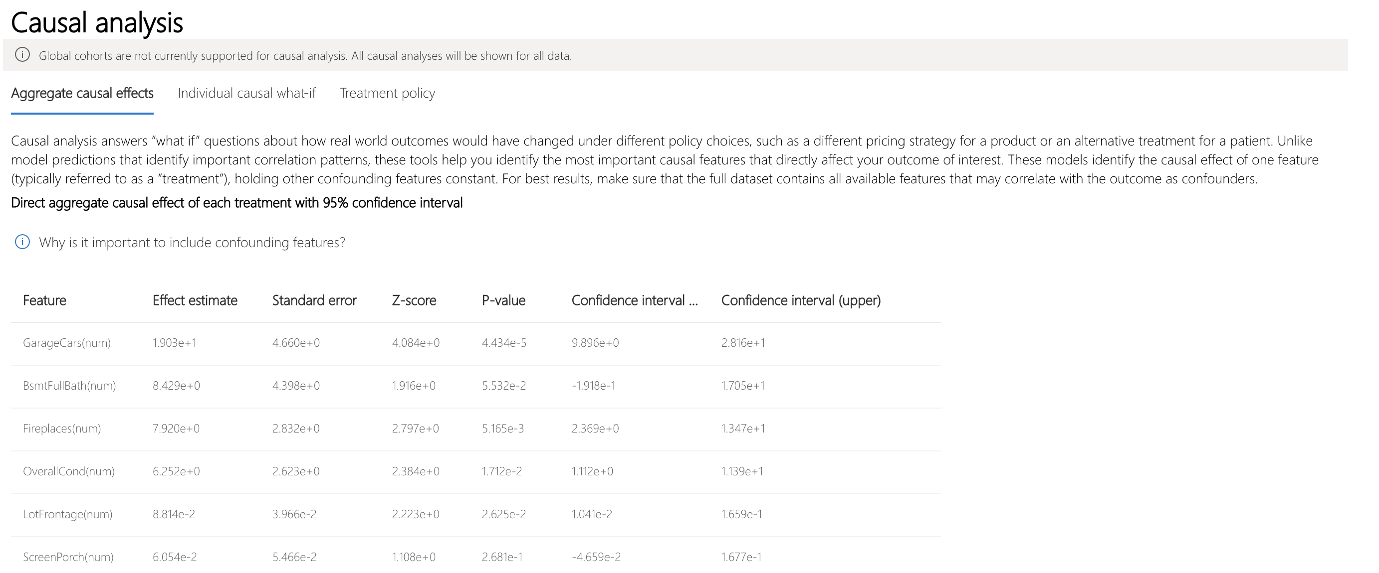
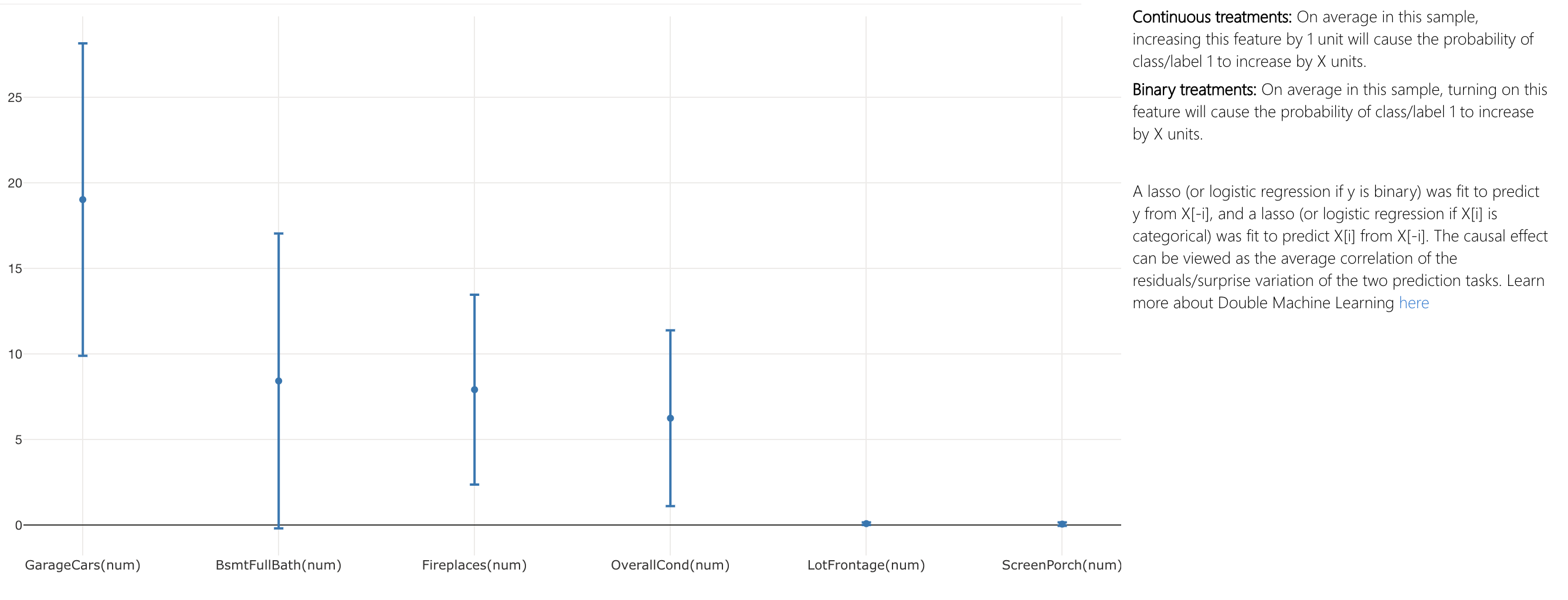
- Aggregate causal effects: current tab, shows causality on average in this sample
- Individual causal what-if: shows causality for individual datapoints
- Treatment policy: shows treatment(s) to apply to achieve a particular outcome
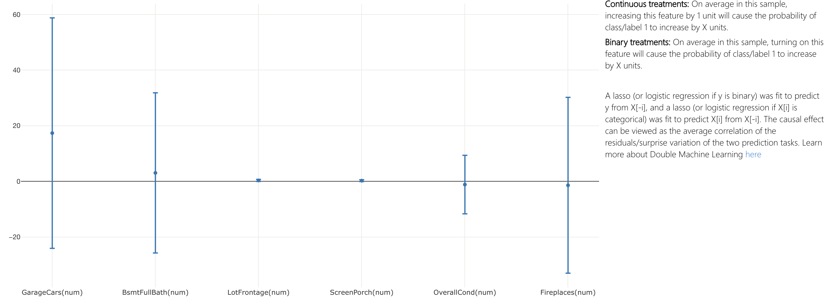
- Direct aggregate causal effect table: displays the causal effect of each feature aggregated on the entire dataset and associated confidence statistics
- Direct aggregate causal effect scatter plot: visualizes the causal effects and confidence intervals of the points in the table
To get a granular view of causation on a particular datapoint, switch to the "Individual causal what-if" tab.
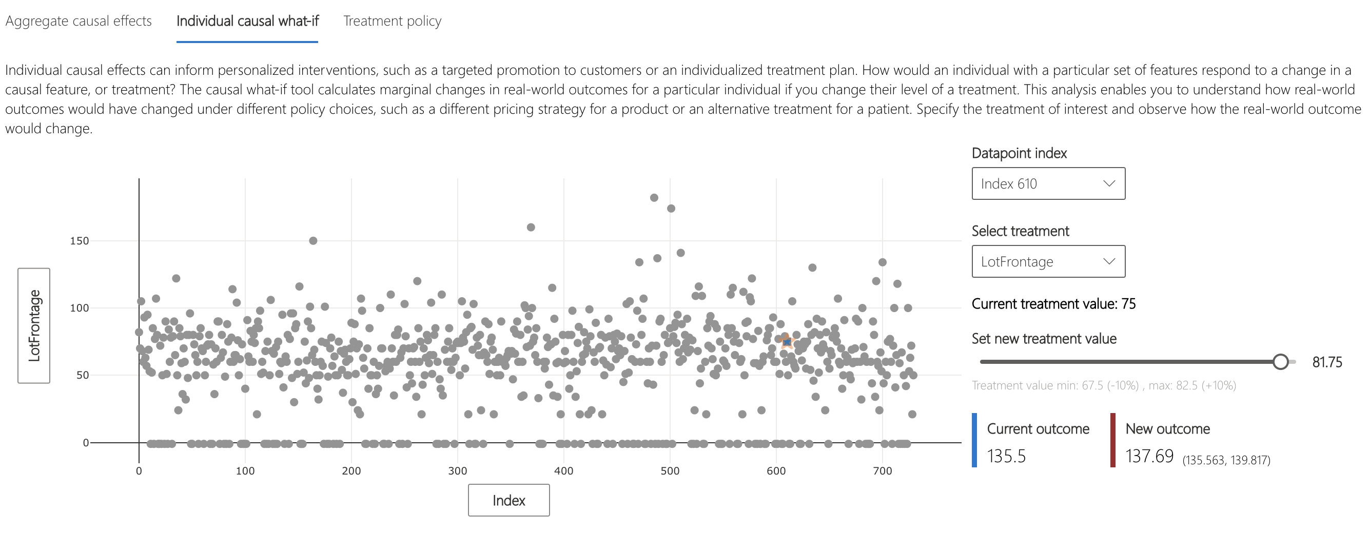

- X axis: selects feature to plot on the x-axis
- Y axis: selects feature to plot on the y-axis
- Individual causal scatter plot: visualizes points in table as scatter plot
- Set new treatment value (numerical): shows slider to change the value of the numerical feature as a real-world intervention
- Set new treatment value (categorical): shows dropdown to select the value of the categorical feature
Clicking on the "Treatment policy" tab switches to a view to help determine real-world interventions.
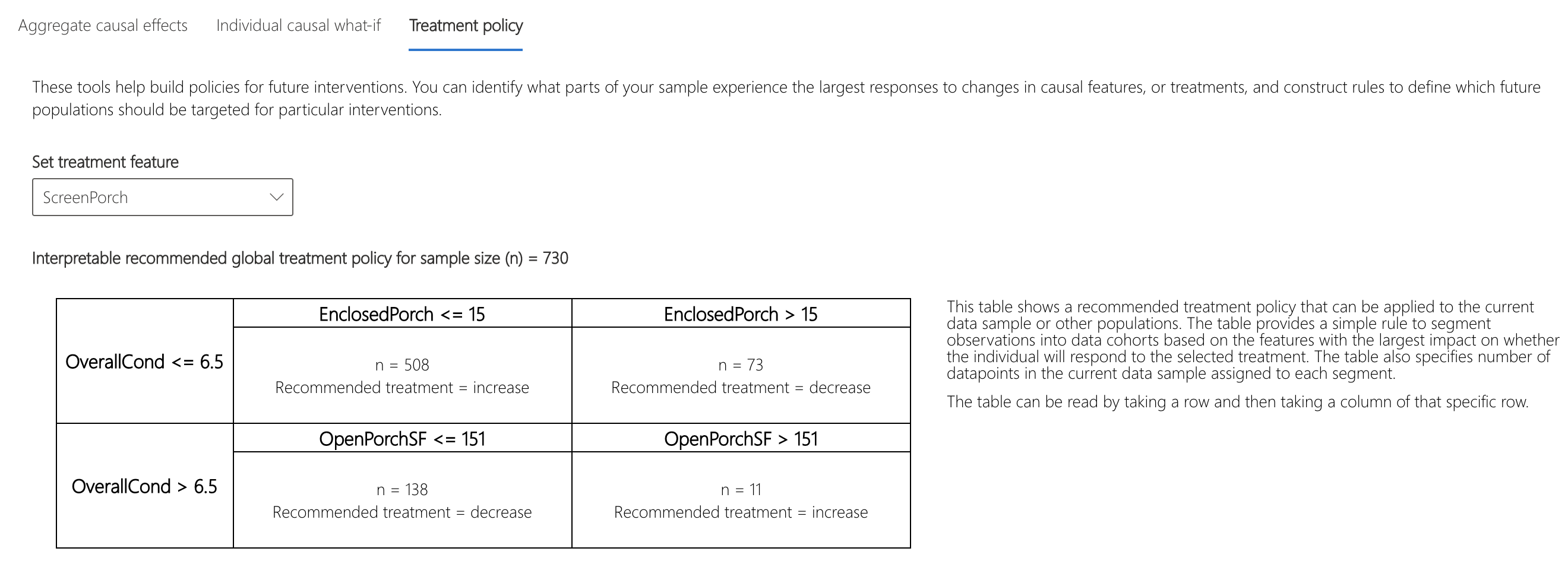

- Set treatment feature: selects feature to change as a real-world intervention
- Recommended global treatment policy: displays recommended interventions for data cohorts to improve target feature value
- Average gains of alternative policies over no ____ treatment: plots the target feature value with bars for treatment policy and no treatment policy
Scrolling down further shows treatment policies for individuals.
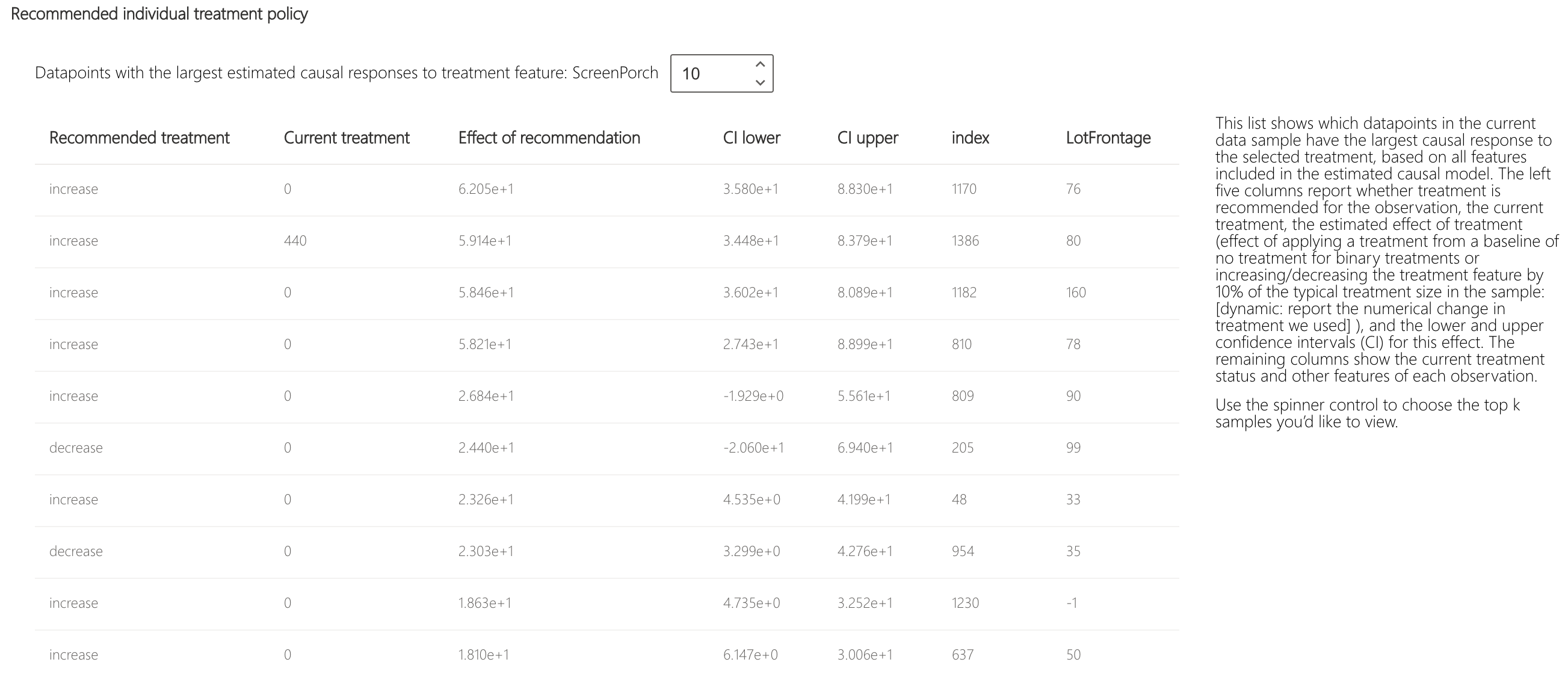
- Show top datapoint samples ordered by causal effects for recommended treatment feature: selects the number of datapoints to show in below table
- Recommended individual treatment policy table: lists in descending order the datapoints whose target features would be most improved by an intervention