Fitting Global Warming
It is well established that global average temperatures have been rising for many decades, and there is a broad scientific consensus that this change is primarily due to human activity.
But over short timescales, the random year-to-year variations in temperature are large, making it harder for humans to notice the long-term trend.
How do we extract average trends from noisy data? Linear algebra!
Global temperature data 1973–2022:
The following is data on the change (°C) in average global temperature (compared to the 1901–2000 average) since 1973 (the year Prof. Johnson was born), from the National Centers for Environmental Information:
year = [1973, 1974, 1975, 1976, 1977, 1978, 1979, 1980, 1981, 1982, 1983, 1984, 1985, 1986, 1987, 1988, 1989, 1990, 1991, 1992, 1993, 1994, 1995, 1996, 1997, 1998, 1999, 2000, 2001, 2002, 2003, 2004, 2005, 2006, 2007, 2008, 2009, 2010, 2011, 2012, 2013, 2014, 2015, 2016, 2017, 2018, 2019, 2020, 2021, 2022]
ΔT = [0.28, -0.19, 0.11, -0.02, 0.13, 0.16, 0.15, 0.33, 0.51, 0.14, 0.53, 0.3, 0.22, 0.31, 0.32, 0.56, 0.17, 0.36, 0.43, 0.46, 0.36, 0.27, 0.56, 0.25, 0.34, 0.6, 0.51, 0.34, 0.47, 0.71, 0.72, 0.61, 0.65, 0.5, 0.92, 0.27, 0.6, 0.73, 0.46, 0.44, 0.62, 0.69, 0.83, 1.12, 0.98, 0.75, 0.94, 1.14, 0.78, 0.89];
using PyPlot
plot(year, ΔT, "r.-")
xlabel("year")
ylabel("ΔT (°C) vs. 1901–2000 baseline")
title("Global average temperature change")
PyObject Text(0.5, 1.0, 'Global average temperature change')
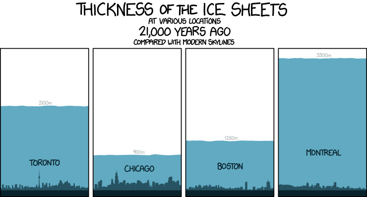
Is this a big change? For comparison, in the most recent ice age, the global average temperature was about 6° C colder than it is now … but that change took thousands of years.
So over my lifetime the temperature has changed by 1/6 of an ice age, warming > 10× faster than after the ice age, and in fact changing faster than it has for millions of years.

Naive slope estimation: Pick two data points
If you would like to estimate the slope (the rate of change of temperature per year), a naive way would be to pick two points and draw a straight line through them, but this would be a pretty poor approach because the data is so noisy.
You will get wildly varying slopes depending on which years you picked, especially for years that are close together:
plot(year, ΔT, "r.-")
xlabel("year")
ylabel("ΔT (°C) vs. 1901–2000 baseline")
title("Global average temperature change")

for (i,j,c) in ((1,50,"k"), (26,34,"b"), (25,35,"g"))
    slope = (ΔT[j] - ΔT[i]) / (year[j] - year[i])
    plot(year[[i,j]], ΔT[[i,j]], "$(c)o")
    plot(year[[begin,end]], ΔT[i] .+ (year[[begin,end]] .- year[i]) .* slope, "$c-")
end

ylim(-0.2, 1.2)
(-0.2, 1.2)
Even using the first and last points is not that great of an estimate unless the timespan is extremely long (but over a longer timescale the change is not linear … in the last century it has accelerated enormously).
Least-square fitting
Instead, a much more reliable approach is to look at all the data simultaneously.
We can't draw a single line that goes through all of the points, but we can try to minimize some average error between the fit and all of the points. The most common approach is to minimize the average |error|², which is called a least squares fit or, in the particular case of fitting to a line, linear regression:
For example, if we want to fit to the linear model $$ \mathrm{model}(\mathrm{year}) = \Delta T = x_1 + x_2 (\mathrm{year} - 1973) $$ where $x_1$ is the intercept and $x_2$ is the slope, then sum of the squares of errors for $m$ data points is: $$ \mathrm{SSE} = \sum_{k=1}^m \big[ \Delta T_k - \underbrace{\mathrm{model}(\mathrm{year}_k)}_{\mbox{row }k\mbox{ of }Ax} \big]^2 $$
Matrix formulation
A key fact is that this model depends linearly on the unknown x parameters. And so we can write it in terms of matrix and vector algebra.
In matrix form, we obtain:
$$
\mathrm{SSE} = \Vert b - Ax \Vert^2
$$
where
$$
A = \begin{pmatrix} 1 & \mathrm{year}_1 - 1973 \\ 1 & \mathrm{year}_2 - 1973 \\ \vdots & \vdots \\ 1 & \mathrm{year}_m - 1973 \end{pmatrix},
\qquad x = \begin{pmatrix} x_1 \\ x_2 \end{pmatrix}, \qquad b = \begin{pmatrix} \Delta T_1 \\ \Delta T_2 \\ \vdots \Delta T_m \end{pmatrix} \, .
$$
As we've seen in class, the minimum of $\Vert b - Ax \Vert^2$ is achieved by orthogonal projection of $b$ onto $C(A)$, corresponding to $\hat{x}$ solving the "normal equations"
$$
A^T A \hat{x} = A^T b
$$
or simply by A \ b in Julia:
b = ΔT
A = [ones(length(year)) year.-1973]

x̂ = A \ b
2-element Vector{Float64}:
 0.08468235294117633
 0.01638847539015606
# Alternatively, the normal equations solution:
(A'A) \ A'b
2-element Vector{Float64}:
 0.08468235294117676
 0.016388475390156053
Let's plot it:
using PyPlot
plot(year, ΔT, "r.-")
xlabel("year")
ylabel("ΔT (°C) vs. 1901–2000 baseline")
title("Global average temperature change: Linear fit")

plot(year, A * x̂, "k-")
legend(["data", "fit: slope $(round(x̂[2], sigdigits=2)) °C/year"])
PyObject <matplotlib.legend.Legend object at 0x7fa7e579eca0>
It's obvious by eye that this fit line is a better description of the overall trend than any two data points.
More precisely, if the data noise is uncorrelated, then in a certain statistical sense a least-squares estimate is optimal, as described by the Gauss–Markov theorem.