![]()
Section 3: Data Visualization
The human brain excels at finding patterns in visual representations of the data; so in this section, we will learn how to visualize data using pandas along with the Matplotlib and Seaborn libraries for additional features. We will create a variety of visualizations that will help us better understand our data.
Why is data visualization necessary?
So far, we have focused a lot on summarizing the data using statistics. However, summary statistics are not enough to understand the distribution – there are many possible distributions for a given set of summary statistics. Data visualization is necessary to truly understand the distribution:
Plotting with pandas
We can create a variety of visualizations using the plot() method. In this section, we will take a brief tour of some of this functionality, which under the hood uses Matplotlib.
Once again, we will be working with the TSA traveler throughput data that we cleaned up in the previous section:
import pandas as pd

tsa_melted_holiday_travel = pd.read_csv(
    '../data/tsa_melted_holiday_travel.csv',
    parse_dates=True, index_col='date'
)
tsa_melted_holiday_travel.head()
| year | travelers | holiday | |
|---|---|---|---|
| date | |||
| 2019-01-01 | 2019 | 2126398.0 | New Year's Day |
| 2019-01-02 | 2019 | 2345103.0 | New Year's Day |
| 2019-01-03 | 2019 | 2202111.0 | NaN |
| 2019-01-04 | 2019 | 2150571.0 | NaN |
| 2019-01-05 | 2019 | 1975947.0 | NaN |
To embed SVG-format plots in the notebook, we will configure the Matplotlib plotting backend to generate SVG output (first argument) with custom metadata (second argument):
import matplotlib_inline
from utils import mpl_svg_config

matplotlib_inline.backend_inline.set_matplotlib_formats(
    'svg', # output images using SVG format
    **mpl_svg_config('section-3') # optional: configure metadata
)
Note: The second argument is optional and is used here to make the SVG output reproducible by setting the hashsalt along with some metadata, which will be used by Matplotlib when generating any SVG output (see the utils.py file for more details). Without this argument, different runs of the same plotting code will generate plots that are visually identical, but differ at the HTML level due to different IDs, metadata, etc.
Line plots
Let's continue with the example of rolling and expanding calculations:
plot_data = tsa_melted_holiday_travel.drop(columns='year').loc['2020'].assign(
    **{
        '7D MA': lambda x: x.travelers.rolling('7D').mean(),
        'YTD mean': lambda x: x.travelers.expanding().mean()
      }
)
plot_data.head()
| travelers | holiday | 7D MA | YTD mean | |
|---|---|---|---|---|
| date | ||||
| 2020-01-01 | 2311732.0 | New Year's Day | 2311732.0 | 2311732.0 |
| 2020-01-02 | 2178656.0 | New Year's Day | 2245194.0 | 2245194.0 |
| 2020-01-03 | 2422272.0 | NaN | 2304220.0 | 2304220.0 |
| 2020-01-04 | 2210542.0 | NaN | 2280800.5 | 2280800.5 |
| 2020-01-05 | 1806480.0 | NaN | 2185936.4 | 2185936.4 |
The plot() method will generate line plots for all numeric columns by default:
plot_data.plot(title='2020 TSA Traveler Throughput', ylabel='travelers', alpha=0.8)
<Axes: title={'center': '2020 TSA Traveler Throughput'}, xlabel='date', ylabel='travelers'>
The plot() method returns an Axes object that can be modified further (e.g., to add reference lines, annotations, labels, etc.). Let's walk through an example.
Bar plots
For our next example, we will plot vertical bars to compare monthly TSA traveler throughput across years. Let's start by creating a pivot table with the information we need:
plot_data = tsa_melted_holiday_travel['2019':'2021-04']\
    .assign(month=lambda x: x.index.month)\
    .pivot_table(index='month', columns='year', values='travelers', aggfunc='sum')
plot_data.head()
| year | 2019 | 2020 | 2021 |
|---|---|---|---|
| month | |||
| 1 | 59405722.0 | 61930286.0 | 23598230.0 |
| 2 | 57345684.0 | 60428859.0 | 24446345.0 |
| 3 | 72530252.0 | 32995003.0 | 38050060.0 |
| 4 | 70518994.0 | 3322548.0 | 41826159.0 |
| 5 | 74617773.0 | 7244733.0 | NaN |
Pandas offers other plot types via the kind parameter, so we specify kind='bar' when calling the plot() method. Then, we further format the visualization using the Axes object returned by the plot() method:
import calendar
from matplotlib import ticker

ax = plot_data.plot(
    kind='bar', rot=0, xlabel='', ylabel='travelers',
    figsize=(8, 1.5), title='TSA Monthly Traveler Throughput'
)

# use month abbreviations for the ticks on the x-axis
ax.set_xticklabels(calendar.month_abbr[1:])

# show y-axis labels in millions instead of scientific notation
ax.yaxis.set_major_formatter(ticker.EngFormatter())

# customize the legend
ax.legend(title='', loc='center', bbox_to_anchor=(0.5, -0.3), ncols=3, frameon=False)
<matplotlib.legend.Legend at 0x12a5c6de0>
Some additional things to keep in mind:
- Matplotlib's
tickermodule provides functionality for customizing both the tick labels and locations – check out the documentation for more information. - Pandas supports horizontal and stacked bars as well; this article shows how to make stacked horizontal bars using a pivot table.
- The
plot()method takes a lot of parameters, many of which get passed down to Matplotlib; however, sometimes we need to use Matplotlib calls directly.
Plotting distributions
Let's now compare the distribution of daily TSA traveler throughput across years. We will create a subplot for each year with both a histogram and a kernel density estimate (KDE) of the distribution. Pandas has generated the Figure and Axes objects for both examples so far, but we can build custom layouts by creating them ourselves with Matplotlib using the plt.subplots() function. First, we will need to import the pyplot module:
import matplotlib.pyplot as plt
While pandas lets us specify that we want subplots and their layout (with the subplots and layout parameters, respectively), using Matplotlib to create the subplots directly gives us additional flexibility:
# define the subplot layout
fig, axes = plt.subplots(3, 1, sharex=True, sharey=True, figsize=(6, 4))

for year, ax in zip(tsa_melted_holiday_travel.year.unique(), axes):
    plot_data = tsa_melted_holiday_travel.loc[str(year)].travelers
    plot_data.plot(kind='hist', legend=False, density=True, alpha=0.8, ax=ax)
    plot_data.plot(kind='kde', legend=False, color='blue', ax=ax)
    ax.set(title=f'{year} TSA Traveler Throughput', xlabel='travelers')

fig.tight_layout() # handle overlaps
Tip: If you're new to the zip() function, check out this article.
Exercise 3.1
Using the TSA traveler throughput data in the tsa_melted_holiday_travel.csv file, create box plots for traveler throughput for each year in the data. Hint: Pass kind='box' into the plot() method to generate box plots.
# Complete this exercise in the workbook.ipynb file
# Click on `Exercise 3.1` above to open the workbook.ipynb file
# WARNING: if you complete the exercise here, your cell numbers
# for the rest of the training might not match the slides
Plotting with Seaborn
The Seaborn library provides the means to easily visualize long-format data without first pivoting it. In addition, it also offers some additional plot types – once again building on top of Mtplotlib. Here, we will look at a few examples of visualizations we can create with Seaborn.
Visualizing long-format data
With Seaborn, we can specify plot colors according to values of a column with the hue parameter. When working with functions that generate subplots, we can also specify how to split the subplots by values of a long-format column with the col and row parameters. Here, we revisit the comparison of the distribution of TSA traveler throughput across years:
import seaborn as sns

sns.displot(
    data=tsa_melted_holiday_travel, x='travelers', col='year', kde=True, height=2.5
)
<seaborn.axisgrid.FacetGrid at 0x13f0592b0>
Heatmaps
We can also use Seaborn to visualize pivot tables as heatmaps:
data = tsa_melted_holiday_travel['2019':'2021-04']\
    .assign(month=lambda x: x.index.month)\
    .pivot_table(index='month', columns='year', values='travelers', aggfunc='sum')

data
| year | 2019 | 2020 | 2021 |
|---|---|---|---|
| month | |||
| 1 | 59405722.0 | 61930286.0 | 23598230.0 |
| 2 | 57345684.0 | 60428859.0 | 24446345.0 |
| 3 | 72530252.0 | 32995003.0 | 38050060.0 |
| 4 | 70518994.0 | 3322548.0 | 41826159.0 |
| 5 | 74617773.0 | 7244733.0 | NaN |
| 6 | 76619900.0 | 14481802.0 | NaN |
| 7 | 79511968.0 | 20740781.0 | NaN |
| 8 | 74776010.0 | 21708071.0 | NaN |
| 9 | 66531258.0 | 21488263.0 | NaN |
| 10 | 72096495.0 | 25636496.0 | NaN |
| 11 | 68787654.0 | 25512987.0 | NaN |
| 12 | 70219363.0 | 26391765.0 | NaN |
ax = sns.heatmap(data=data / 1e6, cmap='Blues', annot=True, fmt='.1f')
_ = ax.set_yticklabels(calendar.month_abbr[1:], rotation=0)
_ = ax.set_title('Total TSA Traveler Throughput (in millions)')
Tip: Reference the Matplotlib documentation for more information on colormaps and named colors.
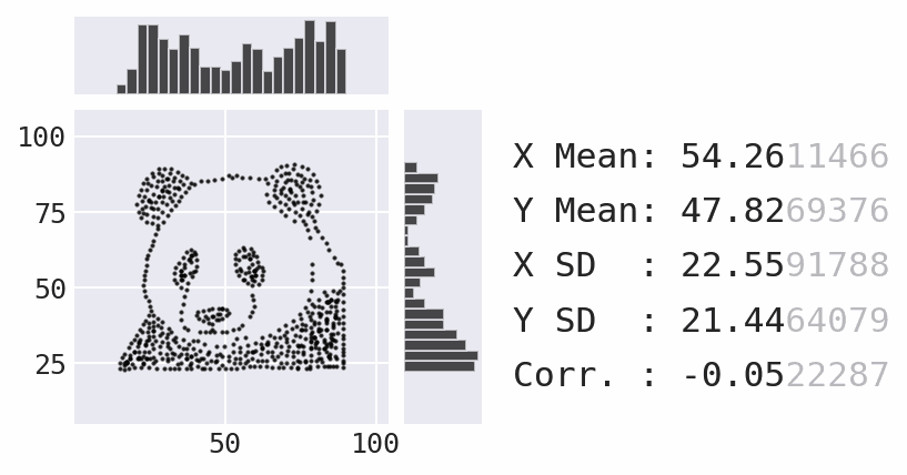
We're moving on from Seaborn now, but there is a lot more available in the API. Be sure to check out the following at a minimum:
- pairwise plots with
pairplot() - categorical scatter plots with
swarmplot() - joint distribution plots with
jointplot() - FacetGrids for custom layouts with any plot type
Exercise 3.2
Using the TSA traveler throughput data in the tsa_melted_holiday_travel.csv file, create a heatmap that shows the 2019 TSA median traveler throughput by day of week and month.
# Complete this exercise in the workbook.ipynb file
# Click on `Exercise 3.2` above to open the workbook.ipynb file
# WARNING: if you complete the exercise here, your cell numbers
# for the rest of the training might not match the slides
Customizing plots with Matplotlib
In this final section, we will discuss how to use Matplotlib to customize plots. Since there is a lot of functionality available, we will only be covering how to add shaded regions and annotations here, but be sure to check out the documentation for more.
Adding shaded regions
When looking at a plot of TSA traveler throughput over time, it's helpful to indicate periods during which there was holiday travel. We can do so with the axvspan() method:
plot_data = tsa_melted_holiday_travel['2019-05':'2019-11']
ax = plot_data.travelers.plot(
    title='TSA Traveler Throughput', ylabel='travelers', figsize=(9, 2)
)
ax.yaxis.set_major_formatter(ticker.EngFormatter())

# collect the holiday ranges (start and end dates)
holiday_ranges = plot_data.dropna().reset_index()\
    .groupby('holiday').agg({'date': ['min', 'max']})

# create shaded regions for each holiday in the plot
for start_date, end_date in holiday_ranges.to_numpy():
    ax.axvspan(start_date, end_date, color='gray', alpha=0.2)
Tip: Use axhspan() for horizontally shaded regions and axvline() / axhline() for vertical/horizontal reference lines.
Adding annotations
We can use the annotate() method to add annotations to the plot. Here, we point out the day in 2019 with the highest TSA traveler throughput, which was the day after Thanksgiving:
plot_data = tsa_melted_holiday_travel.loc['2019']
ax = plot_data.travelers.plot(
    title='TSA Traveler Throughput', ylabel='travelers', figsize=(9, 2)
)
ax.yaxis.set_major_formatter(ticker.EngFormatter())

# highest throughput
max_throughput_date = plot_data.travelers.idxmax()
max_throughput = plot_data.travelers.max()
_ = ax.annotate(
    f'{max_throughput_date:%b %d}\n({max_throughput / 1e6:.2f} M)',
    xy=(max_throughput_date, max_throughput),
    xytext=(max_throughput_date - pd.Timedelta(days=25), max_throughput * 0.92),
    arrowprops={'arrowstyle': '->'}, ha='center'
)
Some things to keep in mind:
- We used
Axesmethods to customize our plots (i.e., an object-oriented approach), but thepyplotmodule provides equivalent functions (i.e., a functional approach) for adding shaded regions, reference lines, annotations, etc. – although the function names might be slightly different than theirAxesmethod counterparts (e.g.,Axes.set_xlabel()vs.plt.xlabel()). - In general, try to stick to either the object-oriented or functional approach rather than mixing the two. However, be careful when working with subplots –
pyplotfunctions will only affect the last subplot. - The anatomy of a figure diagram in the Matplotlib documentation is a great resource for identifying which objects you will need to access for plot customizations.
For more on data visualization in Python, including animations and interactive plots, check out my Beyond the Basics: Data Visualization in Python workshop.
Exercise 3.3
Annotate the medians in the box plot from Exercise 3.1. Hint: The x coordinates will be 1, 2, and 3 for 2019, 2020, and 2021, respectively. Alternatively, to avoid hardcoding values, you can use the Axes.get_xticklabels() method, in which case you should look at the documentation for the Text class.
# Complete this exercise in the workbook.ipynb file
# Click on `Exercise 3.3` above to open the workbook.ipynb file
# TIP: the solution to Exercise 3.1 can be found at
# https://stefaniemolin.com/pandas-workshop/#/solution-3-1