NOTE: GitHub doesn't render all of the images in this notebook. Use nbviewer to render without full interactivity. View this locally for best results.
![]()
Section 3: Building Interactive Visualizations for Data Exploration
When exploring our data, interactive visualizations can provide the most value. Without having to create multiple iterations of the same plot, we can use mouse actions (e.g., click, hover, zoom, etc.) to explore different aspects and subsets of the data. In this section, we will learn how to use a few of the libraries in the HoloViz ecosystem to create interactive visualizations for exploring our data utilizing the Bokeh backend.

Learning Path
- Adding tooltips and sliders
- Linking plots
- Additional plot types
Adding tooltips and sliders
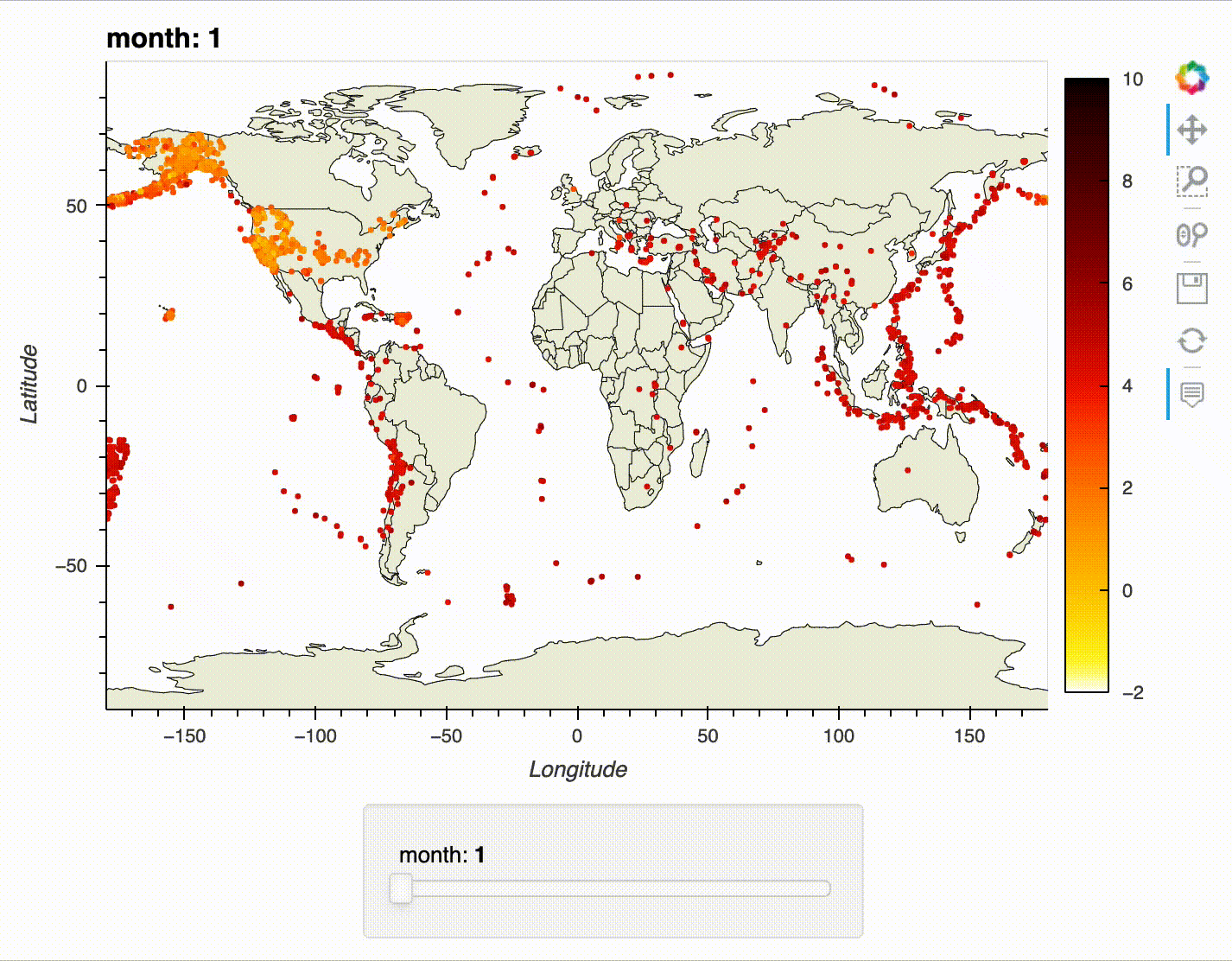
For our first foray into interactive visualizations, we will recreate the earthquake map from the previous section. However, this time, we will make it possible to select the month using a slider, zoom in on the map, and view additional information on each earthquake with tooltips.
To make this visualization, we will work through the following steps:
- Read in and prepare the data.
- Import the required libraries and set up the Bokeh backend.
- Create an overlay with tooltips and a slider.
- Render the visualization.
1. Read in and prepare the data.
As we did in the previous section, we will use GeoPandas to read in our dataset. We are once again creating a new column for the month, but this time, we are also dropping any rows with missing information:
import geopandas as gpd
import pandas as pd
earthquakes = gpd.read_file('../data/earthquakes.geojson').assign(
time=lambda x: pd.to_datetime(x.time, unit='ms'),
month=lambda x: x.time.dt.month
).dropna()
earthquakes.head()
| mag | place | time | tsunami | magType | geometry | month | |
|---|---|---|---|---|---|---|---|
| 0 | 2.75 | 80 km N of Isabela, Puerto Rico | 2020-01-01 00:01:56.590 | 0 | md | POINT Z (-67.12750 19.21750 12.00000) | 1 |
| 1 | 2.55 | 64 km N of Isabela, Puerto Rico | 2020-01-01 00:03:38.210 | 0 | md | POINT Z (-67.09010 19.07660 6.00000) | 1 |
| 2 | 1.81 | 12 km SSE of Maria Antonia, Puerto Rico | 2020-01-01 00:05:09.440 | 0 | md | POINT Z (-66.85410 17.87050 6.00000) | 1 |
| 3 | 1.84 | 9 km SSE of Maria Antonia, Puerto Rico | 2020-01-01 00:05:36.930 | 0 | md | POINT Z (-66.86360 17.89930 8.00000) | 1 |
| 4 | 1.64 | 8 km SSE of Maria Antonia, Puerto Rico | 2020-01-01 00:09:20.060 | 0 | md | POINT Z (-66.86850 17.90660 8.00000) | 1 |
Source: USGS API
2. Import the required libraries and set up the Bokeh backend.
We will be working with GeoViews once again. However, this time, we are going to use the Bokeh backend. Bokeh maps use the Mercator projection, so we will also need to import the crs module from Cartopy in order to project back into the coordinate system used by our data (Plate Carree projection):
from cartopy import crs
import geoviews as gv
import geoviews.feature as gf
gv.extension('bokeh')


3. Create an overlay with tooltips and a slider.
We will start by creating our points and specifying their ranges:
points = gv.Points(
earthquakes,
kdims=['longitude', 'latitude'],
vdims=['month', 'place', 'tsunami', 'mag', 'magType']
)
# set colorbar limits for magnitude and axis limits
points = points.redim.range(
mag=(-2, 10), longitude=(-180, 180), latitude=(-90, 90)
)
Next, we will create an overlay with a slider for the month:
overlay = gf.land * gf.coastline * gf.borders * points.groupby('month')
Finally, we customize each of the components of our plot, adding the option to hover over the points to trigger a tooltip:
interactive_map = overlay.opts(
gv.opts.Feature(projection=crs.PlateCarree()),
gv.opts.Overlay(width=700, height=450),
gv.opts.Points(color='mag', cmap='fire_r', colorbar=True, tools=['hover'])
)
4. Render the visualization.
While we could use the hv.output() function to render our visualization, we will use Panel for this example. Panel, which is also part of HoloViz, provides additional functionality and flexibility when it comes to the layout. As you create more complex visualizations, Panel will become a necessity:
import panel as pn
earthquake_viz = pn.panel(interactive_map, widget_location='bottom')
Try using the slider, tooltips, and zoom/pan functionality:
earthquake_viz.embed()
Tip: Whenever we interact with the visualization, it has to determine what to update, which can be slow if the JavaScript visualization has to work with the Python backend. To get around this, you can use Panel to embed the visualization like we are doing above. Be careful though – this can make your notebook file size much larger. Another option is to look into the Datashader library from HoloViz.
The interactivity works best in a notebook environment – here's an example of the slider, tooltips, and zoom/pan functionality in action:
Learning Path
- Adding tooltips and sliders
- Linking plots
- Additional plot types
Linking plots
In the previous example, we saw that we could link together a slider and a plot. We can also link together plots, which makes using interactivity to explore our data even more powerful. For this example, we will create a link between a map of the earthquakes in January 2020 and a table of those same earthquakes that provides some additional information; we will be able to select earthquakes on the map and use that to filter our dataset. To further explore HoloViz, we will use the hvPlot library here; hvPlot makes it easy to build interactive visualizations with syntax similar to plotting in pandas.
We will work through the following steps to build this visualization:
- Isolate the January earthquake data and prepare it for plotting.
- Enable the use of hvPlot for interactive plotting with pandas.
- Build a layout composed of an interactive map and a table with hvPlot.
- Link selections across the visualizations in the layout.
1. Isolate the January earthquake data and prepare it for plotting.
Let's filter our dataset down to just January and then pull out the latitude and longitude information for our plot:
january_earthquakes = earthquakes.query('month == 1').assign(
longitude=lambda x: x.geometry.x,
latitude=lambda x: x.geometry.y
).drop(columns=['month', 'geometry'])
2. Enable the use of hvPlot for interactive plotting with pandas.
To enable interactive plotting with pandas, we have to import the following:
import hvplot.pandas
Important: While hvPlot is using HoloViews and GeoViews for the plotting logic, there is currently a bug with this feature in GeoViews; however, we can still put together a working example using hvPlot since the projections are handled differently.
3. Build a layout composed of an interactive map and a table with hvPlot.
Plotting with hvPlot works just like plotting with pandas – instead of calling the plot() method, we now call hvplot() to switch from static plots to interactive ones with the Bokeh backend. In doing so, hvPlot will take care of the HoloViews and GeoViews code for us. Here, we make the interactive map using tiles, which makes it possible to zoom in on the map and see more detail:
geo = january_earthquakes.hvplot(
x='longitude', y='latitude', kind='points',
color='mag', cmap='fire_r', clim=(-2, 10),
tiles='CartoLight', geo=True, global_extent=True,
xlabel='Longitude', ylabel='Latitude', title='January 2020 Earthquakes',
frame_height=450
)
Next, we create the table by once again calling the hvplot() method:
table = january_earthquakes.sort_values(['longitude', 'latitude']).hvplot(
kind='table', width=650, height=450, title='Raw Data'
)
Now, we create a layout with the map and table:
layout = geo + table
4. Link selections across the visualizations in the layout.
With our layout, we have everything we need to compose our visualization – we just need to link the components together. Here, we are creating an instance, so that we can use it to filter our data after interacting with the visualization:
import holoviews as hv
selection = hv.link_selections.instance()
map_and_table_tabs = selection(layout).opts(tabs=True)
Let's take a look at our visualization now – note that this only works in the JupyterLab setup, not in Visual Studio Code. Try using the Box Select tool to select some earthquakes on the map and then take a look at the Raw Data tab:
map_and_table_tabs
The result can be interacted with after displaying it, but this kind of interactivity only works in the notebook. Here's an example:
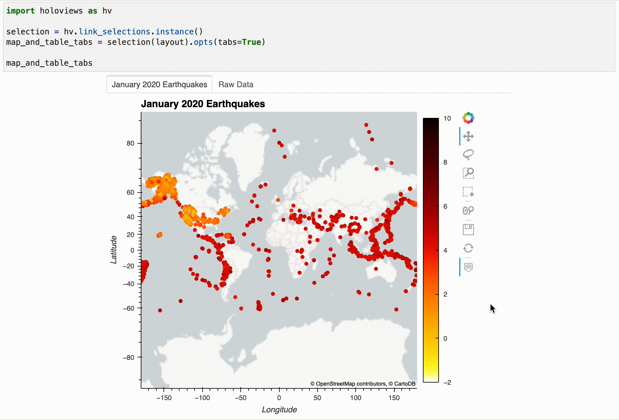
Using the selection from the visualization, we can filter our dataset as follows:
selection.filter(january_earthquakes).nlargest(3, 'mag')
| mag | place | time | tsunami | magType | longitude | latitude | |
|---|---|---|---|---|---|---|---|
| 16362 | 5.1 | 270 km SE of Chiniak, Alaska | 2020-01-31 11:25:37.262 | 1 | mww | -149.3295 | 55.7981 |
| 911 | 5.0 | 217 km SSE of Old Harbor, Alaska | 2020-01-02 08:54:33.083 | 1 | mww | -151.4274 | 55.5493 |
| 7831 | 4.3 | 258 km SE of Chiniak, Alaska | 2020-01-13 09:00:21.044 | 0 | mb | -149.3261 | 55.9471 |
Note: Selecting something other than what is shown in the screen recording will yield different results.
Solution
We start by reading in the dataset:
import geopandas as gpd
import pandas as pd
earthquakes = gpd.read_file('../data/earthquakes.geojson').assign(
time=lambda x: pd.to_datetime(x.time, unit='ms'),
month=lambda x: x.time.dt.month
).dropna()
earthquakes.head()
| mag | place | time | tsunami | magType | geometry | month | |
|---|---|---|---|---|---|---|---|
| 0 | 2.75 | 80 km N of Isabela, Puerto Rico | 2020-01-01 00:01:56.590 | 0 | md | POINT Z (-67.12750 19.21750 12.00000) | 1 |
| 1 | 2.55 | 64 km N of Isabela, Puerto Rico | 2020-01-01 00:03:38.210 | 0 | md | POINT Z (-67.09010 19.07660 6.00000) | 1 |
| 2 | 1.81 | 12 km SSE of Maria Antonia, Puerto Rico | 2020-01-01 00:05:09.440 | 0 | md | POINT Z (-66.85410 17.87050 6.00000) | 1 |
| 3 | 1.84 | 9 km SSE of Maria Antonia, Puerto Rico | 2020-01-01 00:05:36.930 | 0 | md | POINT Z (-66.86360 17.89930 8.00000) | 1 |
| 4 | 1.64 | 8 km SSE of Maria Antonia, Puerto Rico | 2020-01-01 00:09:20.060 | 0 | md | POINT Z (-66.86850 17.90660 8.00000) | 1 |
Next, we use hvPlot to create the visualization and Panel to embed it:
import hvplot.pandas
import panel as pn
pn.panel(earthquakes[['mag', 'magType']].hvplot(
kind='hist', x='mag', groupby='magType', ylabel='frequency',
frame_height=200, responsive=True, widget_location='left'
)).embed()
Important: This example is embeded so that the dropdown updates the plot in the slides, but the other interaction tools function best in the notebook.
Learning Path
- Adding tooltips and sliders
- Linking plots
- Additional plot types
Additional plot types
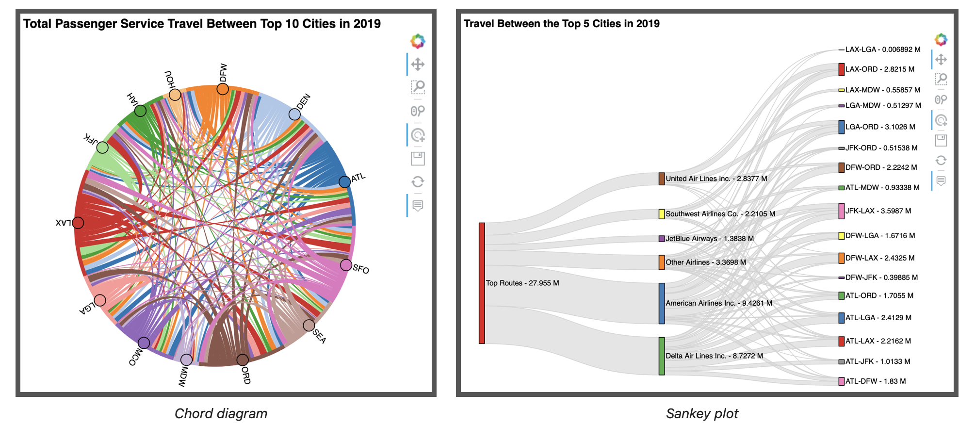
So far, we've seen how easy it is to make interactive visualizations with the Bokeh backend, but another benefit of using HoloViz is the ability to easily make a variety of plots that may require significant effort to create from scratch (e.g., network/graph diagrams, heatmaps, chord diagrams, and Sankey plots). In this section, we will see how to create a chord diagram and a Sankey plot in just a few lines of code using the HoloViews library directly.
We will be working with a new dataset for these examples: 2019 flight statistics from the United States Department of Transportation’s Bureau of Transportation Statistics. The dataset contains 321,409 rows and 41 columns. Here, we read it in and perform some initial processing on it for our visualizations:
import numpy as np
flight_stats = pd.read_csv(
'../data/T100_MARKET_ALL_CARRIER.zip',
usecols=[
'CLASS', 'REGION', 'UNIQUE_CARRIER_NAME', 'ORIGIN_CITY_NAME', 'ORIGIN',
'DEST_CITY_NAME', 'DEST', 'PASSENGERS', 'FREIGHT', 'MAIL'
]
).rename(lambda x: x.lower(), axis=1).assign(
region=lambda x: x.region.replace({
'D': 'Domestic', 'I': 'International', 'A': 'Atlantic',
'L': 'Latin America', 'P': 'Pacific', 'S': 'System'
}),
route=lambda x: np.where(
x.origin < x.dest,
x.origin + '-' + x.dest,
x.dest + '-' + x.origin
)
)
Our dataset looks like this:
flight_stats.head()
| passengers | freight | unique_carrier_name | region | origin | origin_city_name | dest | dest_city_name | class | route | ||
|---|---|---|---|---|---|---|---|---|---|---|---|
| 0 | 0.0 | 53185.0 | 0.0 | Emirates | International | DXB | Dubai, United Arab Emirates | IAH | Houston, TX | G | DXB-IAH |
| 1 | 0.0 | 9002.0 | 0.0 | Emirates | International | DXB | Dubai, United Arab Emirates | JFK | New York, NY | G | DXB-JFK |
| 2 | 0.0 | 2220750.0 | 0.0 | Emirates | International | DXB | Dubai, United Arab Emirates | ORD | Chicago, IL | G | DXB-ORD |
| 3 | 0.0 | 1201490.0 | 0.0 | Emirates | International | IAH | Houston, TX | DXB | Dubai, United Arab Emirates | G | DXB-IAH |
| 4 | 0.0 | 248642.0 | 0.0 | Emirates | International | JFK | New York, NY | DXB | Dubai, United Arab Emirates | G | DXB-JFK |
Source: T-100 Market (All Carriers) dataset provided by the United States Bureau of Transportation Statistics.
This dataset only includes travel to/from the US, so as a starting point for our analysis, we will only consider travel to/from the top 10 cities by passenger counts and – for the Sankey plot only – the top 5 airlines in the US as found in this article, which analyzes this dataset:
cities = [
'Atlanta, GA', 'Chicago, IL', 'New York, NY', 'Los Angeles, CA',
'Dallas/Fort Worth, TX', 'Denver, CO', 'Houston, TX',
'San Francisco, CA', 'Seattle, WA', 'Orlando, FL'
]
top_airlines = [
'American Airlines Inc.', 'Delta Air Lines Inc.', 'JetBlue Airways',
'Southwest Airlines Co.', 'United Air Lines Inc.'
]
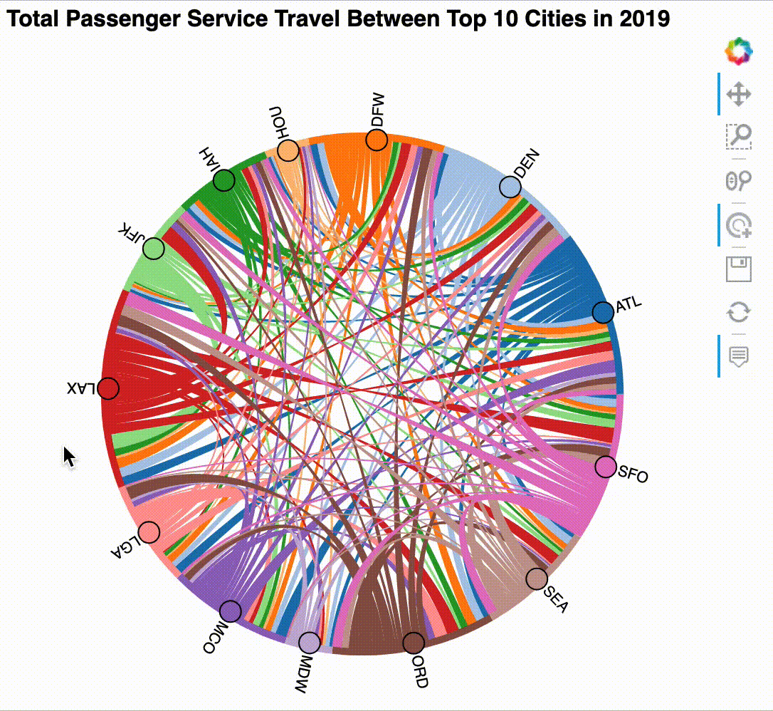
Chord diagram
A chord diagram is a way of showing many-to-many relationships between a set of entities called nodes: the nodes are arranged in a circle, and chords (which can be thought of as edges) are drawn between those that are connected, with the width of the chord encoding the strength of the connection. In this section, we will be making a chord diagram for total passenger service travel between the top 10 cities in 2019:
Let's work through these steps to create the chord diagram:
- Aggregate the dataset to get total flight statistics between the top cities.
- Create a chord diagram with HoloViews.
- Customize the tooltips using Bokeh.
1. Aggregate the dataset to get total flight statistics between the top cities.
Our dataset contains flights that aren't considered passenger service, so we will need to filter to just passenger service between the cities in our list. After that, we are grouping by both the city and airport for each point of the trip (origin and destination) because some cities have multiple airports. Finally, we calculate the total number of passengers and pounds of mail/freight transported in 2019. Note that we are limiting the result to rows with total passengers greater than zero since our chord diagram will use this column to draw the chords:
total_flight_stats = flight_stats.query(
'`class` == "F" and origin_city_name != dest_city_name'
f' and origin_city_name.isin({cities}) and dest_city_name.isin({cities})'
).groupby([
'origin', 'origin_city_name', 'dest', 'dest_city_name'
])[['passengers', 'freight', 'mail']].sum().reset_index().query('passengers > 0')
Our aggregated dataset looks like this:
total_flight_stats.sample(10, random_state=1)
| origin | origin_city_name | dest | dest_city_name | passengers | freight | ||
|---|---|---|---|---|---|---|---|
| 78 | LGA | New York, NY | DEN | Denver, CO | 589190.0 | 506023.0 | 293108.0 |
| 117 | ORD | Chicago, IL | SEA | Seattle, WA | 810594.0 | 1063463.0 | 2627325.0 |
| 31 | DFW | Dallas/Fort Worth, TX | MCO | Orlando, FL | 683700.0 | 187672.0 | 95570.0 |
| 5 | ATL | Atlanta, GA | LAX | Los Angeles, CA | 1121378.0 | 8707125.0 | 3267077.0 |
| 126 | SEA | Seattle, WA | LGA | New York, NY | 24.0 | 0.0 | 0.0 |
| 45 | IAH | Houston, TX | ATL | Atlanta, GA | 566369.0 | 367543.0 | 726670.0 |
| 14 | DEN | Denver, CO | HOU | Houston, TX | 305193.0 | 363119.0 | 0.0 |
| 44 | HOU | Houston, TX | SFO | San Francisco, CA | 1843.0 | 5523.0 | 0.0 |
| 73 | LAX | Los Angeles, CA | MDW | Chicago, IL | 277226.0 | 2022416.0 | 0.0 |
| 89 | MCO | Orlando, FL | DEN | Denver, CO | 594878.0 | 368516.0 | 138811.0 |
2. Create a chord diagram with HoloViews.
Next, we create an instance of hv.Chord by specifying that the paths are between the origin and dest columns (which are not the city names, but rather the airport codes) and that the remaining values associated with each origin-destination pair should be used as value dimensions. Note that only the first value dimension will be used to size the chords, but the rest will be accessible in the tooltip:
chord = hv.Chord(
total_flight_stats,
kdims=['origin', 'dest'],
vdims=['passengers', 'origin_city_name', 'dest_city_name', 'mail', 'freight']
)
3. Customize the tooltips using Bokeh.
Our dataset contains large numbers, which can be hard to read in tooltips without formatting. In addition, the default tooltip is rather long since it lists all of the columns we provided as kdims and vdims. To improve usability of the tooltips, we should combine the city and airport information into a single line for each source/destination since those fields are related (e.g., Chicago, IL (ORD)). While this functionality is possible, we will have to use Bokeh directly to achieve it. Here, we instantiate an instance of Bokeh's HoverTool with our desired tooltip format:
from bokeh.models import HoverTool
tooltips = {
'Source': '@origin_city_name (@origin)',
'Target': '@dest_city_name (@dest)',
'Passengers': '@passengers{0,.}',
'Mail': '@mail{0,.} lbs.',
'Freight': '@freight{0,.} lbs.',
}
hover = HoverTool(tooltips=tooltips)
Now, we will set up the display options on our chord diagram and enable the hover tool. In the previous section, we passed in tools=['hover'] to enable tooltips, but here, we pass in the HoverTool object that we just created along with 'tap' to be able to select nodes and highlight their inbound and outbound chords:
chord = chord.opts(
labels='index', node_color='index', cmap='Category20', # node config
edge_color='origin', edge_cmap='Category20', directed=True, # edge config
inspection_policy='edges', tools=[hover, 'tap'], # tooltip config
frame_width=500, aspect=1, # plot size config
title='Total Passenger Service Travel Between Top 10 Cities in 2019'
)
Try exploring the chord diagram by clicking on the nodes and using the tooltips on the chords:
chord
The result can be interacted with after displaying it, but it works best in the notebook – the GIF below shows some example interactions. Note that for this visualization the interactivity is what makes it useful:
Sankey plot
For our final visualization, we will create a Sankey plot, which is a way to visualize flow as edges between nodes. Here, we will use it to analyze airline market share for passenger service flights between the top 5 US cities:
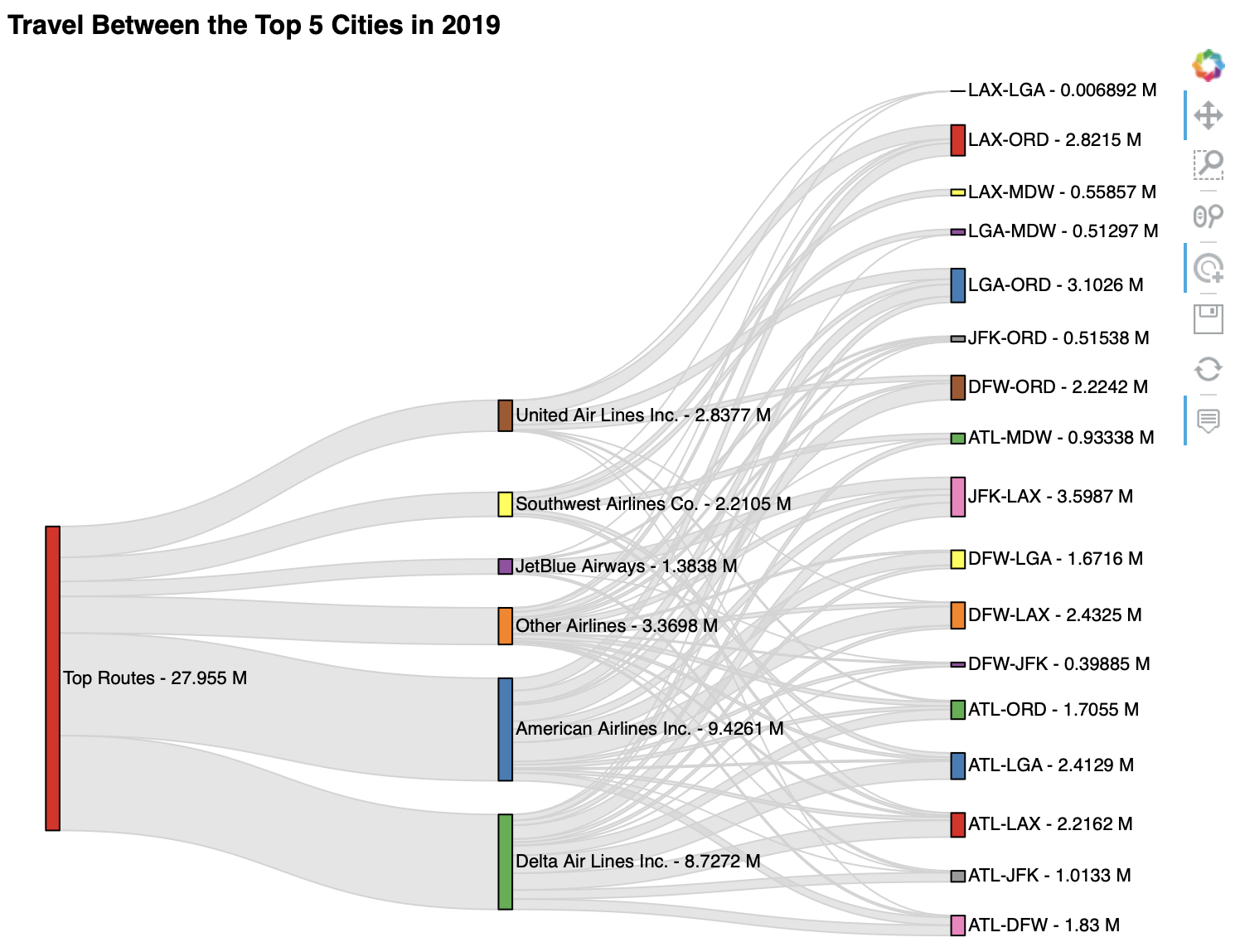
To build this visualization, we will work through the following steps:
- Isolate flight statistics for top routes.
- Convert the data into a set of edges.
- Create the Sankey plot with HoloViews.
1. Isolate flight statistics for top routes.
We need to filter our data to just domestic passenger service between the top 5 cities. Since we want to look at market share, we need to keep information for all airlines (i.e., we can't filter to the top airlines yet):
top_cities = cities[:5]
domestic_passenger_travel = flight_stats.query(
'region == "Domestic" and `class` == "F" and origin_city_name != dest_city_name '
f'and origin_city_name.isin({top_cities}) and dest_city_name.isin({top_cities})'
).groupby([
'region', 'unique_carrier_name', 'route', 'origin_city_name', 'dest_city_name'
]).passengers.sum().reset_index()
domestic_passenger_travel.head()
| region | unique_carrier_name | route | origin_city_name | dest_city_name | passengers | |
|---|---|---|---|---|---|---|
| 0 | Domestic | Air Wisconsin Airlines Corp | ATL-ORD | Atlanta, GA | Chicago, IL | 915.0 |
| 1 | Domestic | Air Wisconsin Airlines Corp | ATL-ORD | Chicago, IL | Atlanta, GA | 556.0 |
| 2 | Domestic | Alaska Airlines Inc. | JFK-LAX | Los Angeles, CA | New York, NY | 265307.0 |
| 3 | Domestic | Alaska Airlines Inc. | JFK-LAX | New York, NY | Los Angeles, CA | 257685.0 |
| 4 | Domestic | Alaska Airlines Inc. | LAX-ORD | Chicago, IL | Los Angeles, CA | 48269.0 |
Note: In reality, all the routes we are considering are domestic, but we are keeping the region column because it will serve as the basis for a root node in our Sankey plot, which allows us to easily see the total across airlines.
2. Convert the data into a set of edges.
The trickiest part of building this visualization is unraveling our dataset into a set of edges: a Sankey plot can be used to represent a directed, acyclic graph (DAG), meaning that we have to be careful there are no cycles (loops) when compiling our edge list.
We will be making two sets of edges for our Sankey plot: one set from region to airline and another from airline to route. Note that there is more data than we can display in the plot, so we have to group together any airlines that aren't in the top 5 and restrict to only routes between the top 5 cities.
Let's start by grouping all airlines outside the top 5 into a new airline called "Other Airlines" – this is necessary to keep our Sankey plot a manageable size:
domestic_passenger_travel.unique_carrier_name = (
domestic_passenger_travel.unique_carrier_name.replace(
'^(?!' + '|'.join(top_airlines) + ').*$',
'Other Airlines',
regex=True
)
)
Tip: Find more information on regular expressions (regex) in Python here.
Our top 5 airlines combined have close to 88% market share of travel between the top 5 cities:
domestic_passenger_travel.groupby('unique_carrier_name').passengers.sum().div(
domestic_passenger_travel.passengers.sum()
)
unique_carrier_name American Airlines Inc. 0.337186 Delta Air Lines Inc. 0.312187 JetBlue Airways 0.049500 Other Airlines 0.120544 Southwest Airlines Co. 0.079074 United Air Lines Inc. 0.101509 Name: passengers, dtype: float64
Next, we will define a function for converting a DataFrame into edges:
def get_edges(data, *, source_col, target_col):
aggregated = data.groupby([source_col, target_col]).passengers.sum()
return aggregated.reset_index().rename(
columns={source_col: 'source', target_col: 'target'}
).query('passengers > 0')
Recall: The asterisk in the function signature requires both source_col and target_col to be passed in by name. This makes sure that we explicitly define the direction for the edges when calling the function. Read more on this syntax here.
Let's use our function to get our first set of edges going from region to airline. Here, we will also rename the node "Domestic" to "Top Routes" for a more descriptive name for the root node of our Sankey plot:
carrier_edges = get_edges(
domestic_passenger_travel,
source_col='region',
target_col='unique_carrier_name'
).replace('^Domestic$', 'Top Routes', regex=True)
carrier_edges
| source | target | passengers | |
|---|---|---|---|
| 0 | Top Routes | American Airlines Inc. | 9426060.0 |
| 1 | Top Routes | Delta Air Lines Inc. | 8727210.0 |
| 2 | Top Routes | JetBlue Airways | 1383776.0 |
| 3 | Top Routes | Other Airlines | 3369815.0 |
| 4 | Top Routes | Southwest Airlines Co. | 2210533.0 |
| 5 | Top Routes | United Air Lines Inc. | 2837682.0 |
The other set of edges that we need is from airline to route for routes between the top cities:
carrier_to_route_edges = get_edges(
domestic_passenger_travel,
source_col='unique_carrier_name',
target_col='route'
)
carrier_to_route_edges.sample(10, random_state=1)
| source | target | passengers | |
|---|---|---|---|
| 39 | Other Airlines | DFW-LGA | 157366.0 |
| 41 | Other Airlines | JFK-LAX | 523222.0 |
| 2 | American Airlines Inc. | ATL-LAX | 294304.0 |
| 48 | Southwest Airlines Co. | ATL-MDW | 498481.0 |
| 50 | Southwest Airlines Co. | LAX-MDW | 558574.0 |
| 44 | Other Airlines | LAX-ORD | 378552.0 |
| 33 | Other Airlines | ATL-LAX | 146882.0 |
| 35 | Other Airlines | ATL-MDW | 1201.0 |
| 40 | Other Airlines | DFW-ORD | 241147.0 |
| 27 | JetBlue Airways | DFW-JFK | 140.0 |
Let's combine our edges into a single DataFrame now; we will also convert the total passengers number to millions for display purposes:
all_edges = pd.concat([carrier_edges, carrier_to_route_edges]).assign(
passengers=lambda x: x.passengers / 1e6
)
4. Create the Sankey plot with HoloViews.
As with the chord diagram, our key dimensions are the source and target of the edges. However, this time, we will only provide the passenger total as the value dimension – note that we are able to specify that the values are in millions by using hv.Dimension:
sankey = hv.Sankey(
all_edges,
kdims=['source', 'target'],
vdims=hv.Dimension('passengers', unit='M')
).opts(
labels='index', label_position='right', cmap='Set1', # node config
edge_color='lightgray', # edge config
width=750, height=600, # plot size config
title='Travel Between the Top 5 Cities in 2019'
)
Hover over the edges to explore the data in this Sankey plot:
sankey
The resulting visualization can be interacted with after displaying it, but it works best in the notebook. Here's an example:
Solution
We start by reading in the dataset:
import geopandas as gpd
import pandas as pd
earthquakes = gpd.read_file('../data/earthquakes.geojson').assign(
time=lambda x: pd.to_datetime(x.time, unit='ms'),
month=lambda x: x.time.dt.month
).dropna()
earthquakes.head()
| mag | place | time | tsunami | magType | geometry | month | |
|---|---|---|---|---|---|---|---|
| 0 | 2.75 | 80 km N of Isabela, Puerto Rico | 2020-01-01 00:01:56.590 | 0 | md | POINT Z (-67.12750 19.21750 12.00000) | 1 |
| 1 | 2.55 | 64 km N of Isabela, Puerto Rico | 2020-01-01 00:03:38.210 | 0 | md | POINT Z (-67.09010 19.07660 6.00000) | 1 |
| 2 | 1.81 | 12 km SSE of Maria Antonia, Puerto Rico | 2020-01-01 00:05:09.440 | 0 | md | POINT Z (-66.85410 17.87050 6.00000) | 1 |
| 3 | 1.84 | 9 km SSE of Maria Antonia, Puerto Rico | 2020-01-01 00:05:36.930 | 0 | md | POINT Z (-66.86360 17.89930 8.00000) | 1 |
| 4 | 1.64 | 8 km SSE of Maria Antonia, Puerto Rico | 2020-01-01 00:09:20.060 | 0 | md | POINT Z (-66.86850 17.90660 8.00000) | 1 |
Next, we will handle our imports. Note that bokeh.models provides the HoverTool and also classes for formatting the ticks, such as DatetimeTickFormatter, which we will use here to format the x-axis tick labels as month names:
from bokeh.models import HoverTool, DatetimeTickFormatter
import hvplot.pandas
import panel as pn
Finally, we define our custom tooltip using HoverTool and use hvPlot to create the visualization, displaying it with Panel:
hover = HoverTool(
tooltips=dict(date='@time{%b %d}', earthquakes='@0{0,.}'),
formatters={'@time': 'datetime'}
)
line_plot = earthquakes.resample('1D', on='time').size().hvplot(
title='Earthquakes per Day in 2020', ylabel='total earthquakes',
tools=[hover], responsive=True, frame_height=200,
xformatter=DatetimeTickFormatter(months='%B')
)
pn.panel(line_plot)
Important: See the notebook for full interactivity.
Additional resources
This section was designed to give you a quick overview of interactive plotting with HoloViz. As such, we haven't discussed anywhere near all of the functionality or available plot types. Here are some additional resources to learn more:
Section 3 Complete 🎉

Related content
All examples herein were developed exclusively for this workshop – be sure to check out my book, Hands-On Data Analysis with Pandas, and my pandas workshop for more Python data science content.

Thank you!
I hope you enjoyed the session. You can follow my work on the following platforms: