A brief glance at the wider Python data visualisation landscape
One of the strengths of Python is its community and the numerous packages at your disposal. As a result, there is an entire ecosystem of figure making libraries out there. The overview below is from Jake VanderPlas' talk "The Python Visualization Landscape" at PyCon 2017:
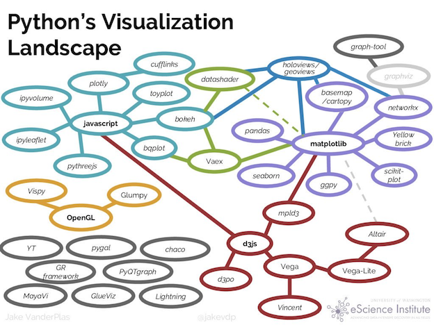
Now that we are nearing the end, sit back and relax and take a brief look at the possibilities that different Python packages offer for figure making.
The Python Graph Gallery is a nice resource if you have an idea of what kind of graph you'd like to make but you aren't sure what Python tools you can use for it, even though it's not entirely up to date in all sections. Or you can look at the tools listed below or displayed above. Websites of plotting libraries almost always have a "gallery" section which you can browse for inspiration for your next plot.
General purpose plotting libraries:
- matplotlib, of course! See Notebook 5.
- seaborn: statistical plotting, see Notebook 6.
- plotnine (less used): uses grammar of graphics, Python's answer to R's ggplot2, will feel very familiar for R users!
Interactive plots and dashboards:
- plotly and its high level wrapper plotly express
- Dash: interactive data visualisation apps. Comparable to R's Shiny.
- Bokeh
- Altair: follows a grammar of graphics.
Other libraries have more or less specific purposes:
- NetworkX: for working with and displaying different kinds of network data
- BioPython's GenomeDiagram for visualizing genomes
- ...
Making maps:
- Cartopy: high quality static maps, builds on matplotlib. See notebook 7.
- Folium: for interactive maps, based on the JavaScript library leaflet.js.
- Plotly maps: for easy interactive maps, based on the JavaScript library D3.js.
- pyproj (not a plotting library): if you need to transform your spatial data to another coordinate reference system/geographic projection, see for example Callum's tutorial on the UEA Python website.
Colour matters.
- Test your figures for accessibility by simulating different types of colorblindness: Coblis.
- There is some useful guidance on matplotlib's own tutorial on choosing colormaps.
- To explore why jet/rainbow is bad for science, go read this blog post or this Nature Communications paper.
- Good colourmaps:
- some (but definitely not all) of the matplotlib included colormaps
- cmocean (Kirsten Thyng)
- scientific colormaps (Fabio Crameri)
- ColorBrewer (Cynthia Brewer)
That's all folks!
Now is your time to look back over the notebooks and ask us about anything you're unsure of. You can experiment with your own data, try to import it to Python and plot it up. Feel free to ask the instructors for help
Further reading and useful resources
Much of this short course is condensed/stolen from the UEA Cefas 3 day "Python for data science" course. The materials are available as jupyter notebooks here.
Course evaluation (2 mins)
Your feedback helps us improve this course and is greatly appreciated: https://forms.gle/9v7PF6JVLXVFZLTu9.
Join the UEA scientific Python user group!
The group is open to all scientific Python users. Our members range from complete beginners to true experts.
We share tips, resources, what we're working on and are there to answer each other's questions. You can join us using the invite link
You can get a taste of previous tutorials on our website.