Globular Cluster Disruptions in the Milky Way
Understanding dark matter is one of the greatest challenges in astronomy, as every galaxy, including our own, is surrounded by a halo of dark matter. It does not interact with light and therefore we cannot observe it. So we turn to find indirect routes to learn more about dark matter given things that we can observe.
My research project focused on observing the movement of streams of stars created by the disruption of a globular cluster given different background potentials of the Milky Way galaxy. The disruptions acted as tracers of the overall gravity of the Milky Way, and in turn, its dark matter content. This notebook demonstrates some of the code I used to plot data that was produced after running simulations on NBODY6++ GPU.
Density Plot of Globular Clusters
By using the histogram function in Numpy, I was able to create a graph that gave an easy visualization of the distribution of the globular cluster.
# Import necessary libraries
# Shrinking sphere algorithm (my own) finds the center of mass of GC
import numpy as np
import matplotlib as mpl
import matplotlib.pyplot as plt
import h5py as h5
import shrinking_sphere as ss
Gather data
First I read the last output file that NBODY6++ produced, at 240 Myrs in NBODY units (or roughly 580 Myrs). Then I use the shrinking sphere module to instantiate a coordinate object using the data, and calculate the center of mass (CoM).
data = h5.File('../TestSim/data_files/snap.40_240.h5part','r')
coord = ss.Coordinates(data,0)
center = coord.shrinking_sphere()
Next I take all of the particles' x and y coordinates and subtract the x and y CoM coordinates from them respectively, obtaining the relative coordinates of the particles.
x_rel = coord.x-center[0]
y_rel = coord.y-center[1]
Visualize the results
Now I use the histogram function to create a density plot of the particles.
plt.figure()
# Use the logarithmic scale
c,x,y,d = plt.hist2d(x_rel, y_rel, bins=40, norm=mpl.colors.LogNorm(), range=[[-200,200],[-200,200]], cmap='RdPu')
c = np.rot90(c)
plt.clf()
plt.xlabel('x (pc)')
plt.ylabel('y (pc)')
plt.xlim(-200,200)
plt.ylim(-200,200)
plt.imshow(c, norm=mpl.colors.LogNorm(), cmap='RdPu', extent=[-200,200,-200,200])
cb = plt.colorbar()
cb.set_label('counts in bin')
Mass Profile of Globular Clusters
To understand the distribution of the masses further, I plotted a mass profile. In the code below, I compare the mass profiles from two simulations: one where the galaxy is surrounded by a dark matter halo (default), and one without.
# Files to compare
files = ['../TestSim/data_files/snap.40_240.h5part','../NoHalo/data_files/snap.40_240.h5part']
Create bins
First I create 30 bins of equal width in order to calculate the total mass within that bin of radius.
bins = np.linspace(0,100,30)
rightBinEdge = bins[1:]
Plot data
I use the module that I coded to calculate the total mass within each bin, and add a second plot to show the ratio of total masses between the two globular clusters.
# Create plots
fig = plt.figure()
fig.suptitle('Mass Comparison')
ax1 = fig.add_axes([0.1, 0.3, 0.8, 0.6], ylim=(-8, 405))
ax2 = fig.add_axes([0.1, 0.1, 0.8, 0.2], ylim=(0, 2.2))

import massprofile as mp
for i in range(2):
    data = h5.File(files[i],'r')
    if i==0:
        N1 = mp.mass_at(data,0,ax1,color='steelblue',label='with halo')
    else:
        N2 = mp.mass_at(data,0,ax1,color='mediumseagreen',label='no halo',marker='d')
ax1.legend()

ax2.plot(rightBinEdge,N1/N1,color='#ad5aa1')
ax2.plot(rightBinEdge,N1/N2,color='goldenrod',marker='*')
ax2.set_ylabel('Ratio')
ax2.grid(True)
Path of the Globular Clusters
Since I had the data, I wanted to compile them to create more visualizations that illustrated the actual movement of the streams of stars. I made three types of visualizations: path of the GC's center around the Milky Way (aka origin), distance of the CoM from the origin with respect to time, and (similar to the first one) path of the GC as a "video."
Extract time and xyz coordinates
For this example, I will use the outputs from when I changed the initial mass of the galaxy disk to $4.01 \times 10^{11} M_\odot$ and the mass of the dark matter halo to $9.06 \times 10^{11} M_\odot$. The ORBIT file extracted the coordinates and velocities outputted by NBODY6++.
time = np.genfromtxt("../Mdisk_4p01e11_Mhalo_9p06e11/data_files/global.30", usecols=1)[1:]
x = np.genfromtxt("../Mdisk_4p01e11_Mhalo_9p06e11/data_files/ORBIT",usecols=0)
y = np.genfromtxt("../Mdisk_4p01e11_Mhalo_9p06e11/data_files/ORBIT",usecols=1)
z = np.genfromtxt("../Mdisk_4p01e11_Mhalo_9p06e11/data_files/ORBIT",usecols=2)
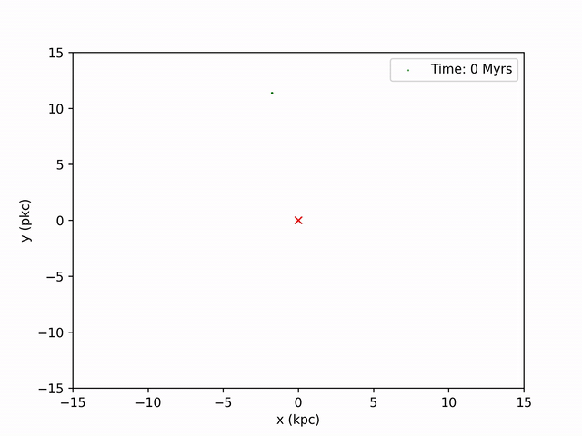
Create plot of the path in xy-plane
plt.figure()
plt.plot(x,y)
plt.plot(x[0],y[0],'bo') #starting point of GC center
plt.plot(0,0,'rx') #origin aka center of MW
plt.xlabel('x (kpc)')
plt.ylabel('y (kpc)')
plt.xticks(np.arange(round(min(x)),round(max(x)+2),2))
plt.yticks(np.arange(round(min(y)),round(max(y)+2),2))
The graph shows a curve that resembles a polar curve, which makes sense in the next graph as well.
Create plot of the distance with respect to time
I use the distance formula to calculate the radius of the GC center from the origin (center of MW), and plot this against time (625 Myrs).
r = np.sqrt(x**2+y**2+z**2)
plt.figure()
plt.plot(time,r,'teal')
plt.xlabel('Time (Myr)')
plt.ylabel('r (kpc)')
Evidently, the distance vs. time graph shows somewhat a sinusoidal curve, reaching pericenter (closest point) and apocenter (farthest point) multiple times throughout the simulated time. This is reflective of the restorative gravitational force of the Milky Way that pulls the globular cluster back towards the origin every time the stars are further away. The frequency of this cycle is also reflected in the graph I made in the next section.
Create a video of the GC path using ffmpeg
Perhaps the most exciting graph I made to observe was snapshots of the globular cluster's position in time intervals and combining them to make a video.
I use the same method I used to produce the density plot earlier for the first part: find the CoM at each timestamp, find the relative x and y coordinates. Then, to make the graph resemble that of the path curve above, I shift these coordinates by the coordinates produced from the ORBIT file. By iterating through every 20 years (in NBODY time) of snapshots, I'm able to produce 130 images of the stream. To combine these images, I use ffmpeg on command line. The result is this video below.
Color Map of Frequency of Globular Cluster Orbit
I also calculated the frequencies of each simulated globular cluster's orbit around the galaxy, and plotted a graph of them against halo and disk masses using Numpy's pseudocolor plot function.
I calculated the frequencies using the gradient of the GC radii and finding the number of times the cluster hit its local maximum points. For the sake of this notebook, I have made an array of frequencies that have already been calculated.
# 2d array of frequencies with the row being different disk masses and columns being different halo masses
freq = np.array([[0,3,5,7,8,9],
[1,4,6,7,9,10],
[2,5,6,8,9,10],
[3,5,7,8,9,10],
[4,6,7,8,9,11],
[4,6,7,9,10,11]])
# X-labels are the different disk masses and y-labels are the different halo masses
x_labels = ["5e9","1.04e11","2.03e11","3.02e11","4.01e11","5e11"]
y_labels = ["1.5e10","3.12e11","6.09e11","9.06e11","1.203e12","1.5e12"]
# Create colormap
fig, ax = plt.subplots()
c = ax.pcolor(freq,cmap=plt.get_cmap("magma"))
fig.colorbar(c,ax=ax)
ax.set_xticks(np.arange(freq.shape[1])+0.5,minor=False)
ax.set_xticklabels(x_labels)
ax.set_xlabel("Disk Mass ($M_\odot$)")
ax.set_yticks(np.arange(freq.shape[0])+0.5,minor=False)
ax.set_yticklabels(y_labels)
ax.set_ylabel("Halo Mass ($M_\odot$)")
ax.set_title("Frequency of Globular Cluster Orbit Cycles")
plt.tight_layout()
plt.show()
As we can see, the higher the masses, the higher the frequency. Another interesting observation is that the values of frequency increase more rapidly as the disk mass increases (while keeping halo mass constant) than when the halo mass increases. We can infer then that the gravitational force is more affected when the immediate properties of the galaxy itself changes.
Machine Learning to Predict the Halo Mass
I also used Python's Scikit-learn and used neural networks to make predictions based on inputs I had gathered from simulations. I ran 50 simulations with a constant disk mass of $5e10 M_\odot$, and varying masses of dark matter halo. My outputs were the globular cluster's apocenter, pericenter, frequency, and final speed (with respect to the Sun).
# Import necessary libraries
import csv
from sklearn.model_selection import train_test_split
from sklearn.neural_network import MLPClassifier
from sklearn.preprocessing import StandardScaler
Create a neural network
I use Scikit-learn's multi-layer Perceptron classifier for this algorithm.
classifier = MLPClassifier(max_iter=400, hidden_layer_sizes=(150,100,50), random_state=0)
Import data
with open("halos.csv") as f:
    reader = csv.reader(f)
    next(reader)

    data = []
    for row in reader:
        data.append({
            "inputs": [float(cell) for cell in row[1:]],
            "output": [float(cell) for cell in row[:1]]
        })
Create training and testing sets and train the model
I use the built-in function from Scikit-learn to separate data into training and testing sets.
# Split data into training and testing groups
inputs = np.array([row["inputs"] for row in data])
output = np.array([row["output"] for row in data])
# Train the model
X_training, X_testing, y_training, y_testing = train_test_split(inputs, output, test_size=0.4)
Scale data
Since the neural network in Python tends to have difficulty converging before the maximum number of iterations is reached, it is recommended that we scale the data to normalize it. However, I noticed that even with the feature scaling the neural network did not converge (no matter how large I made the maximum number of iterations), but the loss was indeed less than that of unscaled data.
scaler = StandardScaler()
scaler.fit(X_training)
X_training = scaler.transform(X_training)
X_testing = scaler.transform(X_testing)
Fit model
I then use the neural network I created earlier to fit the training data to our model.
classifier.fit(X_training, y_training.ravel())
Make predictions
Since our training size was 60% (see train_test_split above), the predictions will be made with the other 40% of our data.
# Make predictions on the testing set
predictions = classifier.predict(X_testing)
Plot the loss curve and accuracy
Finally, I visualize the loss (how much our neural network failed, for lack of a better word) and the ratios between the predictions it made and the actual outputs.
fig,(ax1,ax2) = plt.subplots(2)
plt.tight_layout()
ax1.plot(classifier.loss_curve_)
ax1.set_ylabel("loss")
ax1.set_xlabel("iterations")
ax2.plot(predictions/y_testing.ravel(),color="#c68bf0",marker=".")
ax2.set_ylim(0,2)
ax2.set_xlabel("simulation number")
ax2.set_ylabel("predictions : actual")
As shown above, the loss curve did approach 0 but not quite, and the optimization did not converge. However, the ratio hovered around 1 for most of the data, which I think is decent given that the outputs I fed the neural network had a very wide range. I only had 50 simulations, so if I were to do this again, I would definitely run more simulations to give the algorithm more data to train. Additionally, the parameters I used and MLPClassifier might not be the best neural network for this type of problem, but the results of the predictions were similar even when I changed to MLPRegressor or played around with different parameters.
Conclusion
The small margin of error in my machine learning algorithm indicates that one could possibly determine the dark matter halo mass of the Milky Way sufficiently by collecting information on many streams observationally, then applying the methods I used above.
Given the computational nature of the project, I gained a lot of expertise in coding, data analysis, data visualization, and of course, machine learning.
I am happy that I was able to create all of these graphs to visualize the data that were produced after running many, many simulations on the supercomputer Cannon while also running into many bizarre errors. All of my thanks go to my mentor for helping me with silly questions about Numpy and learning about neural networks with me. :)