Finding heavy traffic indicators on I-94
Introduction
The goal of our analysis in this notebook is to determine a few indicators of heavy traffic on I-94. These indicators can be weather type, time of the day, time of the week, etc. For instance, we may find out that the traffic is usually heavier in the summer or when it snows.
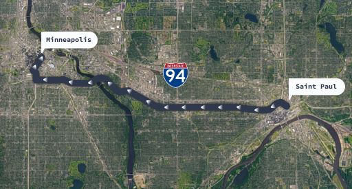
The dataset documentation mentions that a station located approximately midway between Minneapolis and Saint Paul recorded the traffic data. Also, the station only records westbound traffic (cars moving from east to west).
This means that the results of our analysis will be about the westbound traffic in the proximity of that station. In other words, we should avoid generalizing our results for the entire I-94 highway.
Gather
Our data is available for download at UCI Machine Learning Repository
import pandas as pd
import matplotlib.pyplot as plt
from celluloid import Camera
import numpy as np
from IPython.display import Image
%matplotlib inline
df = pd.read_csv('Metro_Interstate_Traffic_Volume.csv')
df.head()
| holiday | temp | rain_1h | snow_1h | clouds_all | weather_main | weather_description | date_time | traffic_volume | |
|---|---|---|---|---|---|---|---|---|---|
| 0 | None | 288.28 | 0.0 | 0.0 | 40 | Clouds | scattered clouds | 2012-10-02 09:00:00 | 5545 |
| 1 | None | 289.36 | 0.0 | 0.0 | 75 | Clouds | broken clouds | 2012-10-02 10:00:00 | 4516 |
| 2 | None | 289.58 | 0.0 | 0.0 | 90 | Clouds | overcast clouds | 2012-10-02 11:00:00 | 4767 |
| 3 | None | 290.13 | 0.0 | 0.0 | 90 | Clouds | overcast clouds | 2012-10-02 12:00:00 | 5026 |
| 4 | None | 291.14 | 0.0 | 0.0 | 75 | Clouds | broken clouds | 2012-10-02 13:00:00 | 4918 |
Explaining the column fields as per the documentation:
- holiday: Categorical US National holidays plus regional holiday, Minnesota State Fair
- temp: Numeric Average temp in kelvin
- rain_1h: Numeric Amount in mm of rain that occurred in the hour
- snow_1h: Numeric Amount in mm of snow that occurred in the hour
- clouds_all: Numeric Percentage of cloud cover
- weather_main: Categorical Short textual description of the current weather
- weather_description: Categorical Longer textual description of the current weather
- date_time: DateTime Hour of the data collected in local CST time
- traffic_volume: Numeric Hourly I-94 ATR 301 reported westbound traffic volume
df.tail()
| holiday | temp | rain_1h | snow_1h | clouds_all | weather_main | weather_description | date_time | traffic_volume | |
|---|---|---|---|---|---|---|---|---|---|
| 48199 | None | 283.45 | 0.0 | 0.0 | 75 | Clouds | broken clouds | 2018-09-30 19:00:00 | 3543 |
| 48200 | None | 282.76 | 0.0 | 0.0 | 90 | Clouds | overcast clouds | 2018-09-30 20:00:00 | 2781 |
| 48201 | None | 282.73 | 0.0 | 0.0 | 90 | Thunderstorm | proximity thunderstorm | 2018-09-30 21:00:00 | 2159 |
| 48202 | None | 282.09 | 0.0 | 0.0 | 90 | Clouds | overcast clouds | 2018-09-30 22:00:00 | 1450 |
| 48203 | None | 282.12 | 0.0 | 0.0 | 90 | Clouds | overcast clouds | 2018-09-30 23:00:00 | 954 |
df.info()
<class 'pandas.core.frame.DataFrame'>
RangeIndex: 48204 entries, 0 to 48203
Data columns (total 9 columns):
 #   Column               Non-Null Count  Dtype
---  ------               --------------  -----
 0   holiday              48204 non-null  object
 1   temp                 48204 non-null  float64
 2   rain_1h              48204 non-null  float64
 3   snow_1h              48204 non-null  float64
 4   clouds_all           48204 non-null  int64
 5   weather_main         48204 non-null  object
 6   weather_description  48204 non-null  object
 7   date_time            48204 non-null  object
 8   traffic_volume       48204 non-null  int64
dtypes: float64(3), int64(2), object(4)
memory usage: 3.3+ MB
We Usually start assessing and cleaning our data first before starting our EDA but we are sure that our dataset here is clear of any issues except for the date_time dtype so we are goin to fix this next
df.date_time = pd.to_datetime(df.date_time)
df.info()
<class 'pandas.core.frame.DataFrame'>
RangeIndex: 48204 entries, 0 to 48203
Data columns (total 9 columns):
 #   Column               Non-Null Count  Dtype
---  ------               --------------  -----
 0   holiday              48204 non-null  object
 1   temp                 48204 non-null  float64
 2   rain_1h              48204 non-null  float64
 3   snow_1h              48204 non-null  float64
 4   clouds_all           48204 non-null  int64
 5   weather_main         48204 non-null  object
 6   weather_description  48204 non-null  object
 7   date_time            48204 non-null  datetime64[ns]
 8   traffic_volume       48204 non-null  int64
dtypes: datetime64[ns](1), float64(3), int64(2), object(3)
memory usage: 3.3+ MB
df.traffic_volume.plot.hist()
plt.xlabel('Traffic Volume')
plt.title('Traffic Volume histogram')
Text(0.5, 1.0, 'Traffic Volume histogram')

df.traffic_volume.describe()
count    48204.000000
mean      3259.818355
std       1986.860670
min          0.000000
25%       1193.000000
50%       3380.000000
75%       4933.000000
max       7280.000000
Name: traffic_volume, dtype: float64
Distribution of traffic_volume isn't uniform and has peak values around [0-700] and [4500-5200]
2-Do you think daytime and nighttime influence the traffic volume?
First we add a new column hour which contains the time of the day in which the recordings were taken
df['hour'] = df.date_time.dt.hour
df.head()
| holiday | temp | rain_1h | snow_1h | clouds_all | weather_main | weather_description | date_time | traffic_volume | hour | |
|---|---|---|---|---|---|---|---|---|---|---|
| 0 | None | 288.28 | 0.0 | 0.0 | 40 | Clouds | scattered clouds | 2012-10-02 09:00:00 | 5545 | 9 |
| 1 | None | 289.36 | 0.0 | 0.0 | 75 | Clouds | broken clouds | 2012-10-02 10:00:00 | 4516 | 10 |
| 2 | None | 289.58 | 0.0 | 0.0 | 90 | Clouds | overcast clouds | 2012-10-02 11:00:00 | 4767 | 11 |
| 3 | None | 290.13 | 0.0 | 0.0 | 90 | Clouds | overcast clouds | 2012-10-02 12:00:00 | 5026 | 12 |
| 4 | None | 291.14 | 0.0 | 0.0 | 75 | Clouds | broken clouds | 2012-10-02 13:00:00 | 4918 | 13 |
hour_mean_tv = df.groupby('hour').traffic_volume.mean()
hour_mean_tv.plot.line()
plt.title('Hour of day vs Avg. Traffic volume')
plt.ylabel('Avg. Traffic volume')
Text(0, 0.5, 'Avg. Traffic volume')

From this figure we can deduce that the traffic volume starts increasing from 5am and then starts to decrease again starting from 4pm.
It's observable that daytimes has higher traffic volumes than nighttimes.
Another approach is to divide our dataframe into 2 dataframe:
day_df: for hours from 7am to 7pmnight_df: for hours from 7pm to 7am
day_df = df[df['hour'].between(7,18)].copy()
night_df = df[(df['hour']>=19) | (df['hour']<7)].copy()

#Test That our 2 new dataframes has all the recordings that are present in the original data set
day_df.shape[0] + night_df.shape[0] == df.shape[0]
True
Now that our 2 new dataframes are ready lets plot them next to each other to be able to compare
plt.figure(figsize=(14,4))

# Plotting daytime vs traffic volume
plt.subplot(1,2,1)
day_df.traffic_volume.plot.hist()
plt.xlabel('Traffic volume')
plt.title('Daytime')
plt.xlim(0,8000)
plt.ylim(0,8000)

# Plotting nighttime vs traffic volume
plt.subplot(1,2,2)
night_df.traffic_volume.plot.hist()
plt.xlabel('Traffic volume')
plt.title('Nighttime')
plt.xlim(0,8000)
plt.ylim(0,8000)
(0.0, 8000.0)

From the 2 previous figures we find that Daytime histogram is left skewed while the Nighttime histogram is right skewed which indicates that during daytime the traffic volume is much higher.
Since our goal is to find indicators of heavy traffic then we are only interested in day_df dataframe since the night_df has light traffic volumes.
3- Is time an indicator of heavy traffic?
One of the possible indicators of heavy traffic is time. There might be more people on the road in a certain month, on a certain day, or at a certain time of the day.
We're going to look at a few line plots showing how the traffic volume changed according to the following parameters:
- Month
- Day of the week
- Time of day
We already created a new column hour which has the time of day, Now lets add 2 more columns that has the month and the day of the week respectively.
# Adding a month column
day_df['month'] = day_df.date_time.dt.month

# Adding a Day of the week column
day_df['dow'] = day_df.date_time.dt.strftime('%A') #day of week
day_df.sample(5)
| holiday | temp | rain_1h | snow_1h | clouds_all | weather_main | weather_description | date_time | traffic_volume | hour | month | dow | |
|---|---|---|---|---|---|---|---|---|---|---|---|---|
| 3307 | None | 256.67 | 0.0 | 0.0 | 85 | Clouds | overcast clouds | 2013-02-02 18:00:00 | 4113 | 18 | 2 | Saturday |
| 23374 | None | 289.85 | 0.0 | 0.0 | 75 | Clouds | broken clouds | 2016-05-15 15:00:00 | 4442 | 15 | 5 | Sunday |
| 24297 | None | 294.74 | 0.0 | 0.0 | 0 | Clear | Sky is Clear | 2016-06-19 07:00:00 | 1727 | 7 | 6 | Sunday |
| 6289 | None | 286.93 | 0.0 | 0.0 | 90 | Mist | mist | 2013-05-22 16:00:00 | 6702 | 16 | 5 | Wednesday |
| 134 | None | 271.23 | 0.0 | 0.0 | 20 | Clouds | few clouds | 2012-10-08 08:00:00 | 5966 | 8 | 10 | Monday |
month_avg = day_df.groupby('month').traffic_volume.mean()
dow_avg = day_df.groupby('dow').traffic_volume.mean()

# Sorting the indexes
dow_avg = dow_avg.reindex(['Tuesday', 'Wednesday', 'Thursday', 'Friday', 'Saturday', 'Sunday', 'Monday'])
# Plotting month vs Avg. traffic volume
month_avg.plot.line()
plt.title('Avg. Traffic volume vs month')
plt.ylabel('Avg. Traffic volume')
plt.show()

# Plotting day of week vs Avg. traffic volume
dow_avg.plot.line()
plt.title('Avg. Traffic volume vs day of week')
plt.ylabel('Avg. Traffic volume')
plt.xticks(rotation=45)
plt.show()


We conclude that:
- From the perspective of months: The traffic is usually heavier during warm months (March–October) compared to cold months (November–February).
- From the perspective of Day of week: Saturday and Sunday (Weekends) has relatively light traffic volume compared to the rest of the days (Business days)
This leaves the time of day analysis. However, as a result of our findings that weekends has light traffic volumes compared to business days. We need to analyze the time of day for business days only to avoid the averages being dragged down by the weekends results. That's why next we are going to split our day_df into 2 new data frames:
day_weekend: has time from 7am to 7pm for weekends only (Saturday & Sunday)day_busdays: has time from 7am to 7pm for business days only
day_weekend = day_df[(day_df['dow']=='Saturday')|(day_df['dow']=='Sunday')].copy()
day_busdays = day_df.drop(index=day_weekend.index)

# Test that our 2 newly craeted dataframes has all recordings as in the day_df dataframe
day_weekend.shape[0]+day_busdays.shape[0] == day_df.shape[0]
True
Now we are ready to analyze the time of day vs Avg. traffic volume for weekends and business days seperately. Lets plot them on the same figure for comparison.
hour_avg_bus = day_busdays.groupby('hour').traffic_volume.mean()
hour_avg_wend = day_weekend.groupby('hour').traffic_volume.mean()
plt.figure(figsize=(14,4))

# Plotting Time of day vs Avg. traffic volume for weekends
plt.subplot(1,2,1)
hour_avg_wend.plot.line()
plt.title('Avg. Traffic volume vs Time of day on weekends')
plt.ylabel('Avg. Traffic volume')
plt.ylim(1500,6250)

# Plotting Time of day vs Avg. traffic volume for business days
plt.subplot(1,2,2)
hour_avg_bus.plot.line()
plt.title('Avg. Traffic volume vs Time of day on business days')
plt.ylabel('Avg. Traffic volume')
plt.ylim(1500,6250)
(1500.0, 6250.0)

Summary
It is concluded that:
- we have heavy traffic volumes at 7am and then at 4pm on business days only, this is probably because these are the times were citizens drive to and from work on business days.
Also our previous conclusions were:
- From the perspective of months: The traffic is usually heavier during warm months (March–October) compared to cold months (November–February).
- From the perspective of Day of week: Saturday and Sunday (Weekends) has relatively light traffic volume compared to the rest of the days (Business days)
4-Is weather an indicator of heavy traffic?
Next we are going to explore the relations between different weather metrics and the traffic volume. The dataset provides us with a few useful columns about weather: temp, rain_1h, snow_1h, clouds_all, weather_main, weather_description.
A few of these columns are numerical so let's start by looking up their correlation values with traffic_volume.
day_df.corr()
| temp | rain_1h | snow_1h | clouds_all | traffic_volume | hour | month | |
|---|---|---|---|---|---|---|---|
| temp | 1.000000 | 0.010815 | -0.019286 | -0.135519 | 0.128317 | 0.162691 | 0.222072 |
| rain_1h | 0.010815 | 1.000000 | -0.000091 | 0.004993 | 0.003697 | 0.008279 | 0.001176 |
| snow_1h | -0.019286 | -0.000091 | 1.000000 | 0.027721 | 0.001265 | 0.003923 | 0.026768 |
| clouds_all | -0.135519 | 0.004993 | 0.027721 | 1.000000 | -0.032932 | 0.023685 | 0.000595 |
| traffic_volume | 0.128317 | 0.003697 | 0.001265 | -0.032932 | 1.000000 | 0.172704 | -0.022337 |
| hour | 0.162691 | 0.008279 | 0.003923 | 0.023685 | 0.172704 | 1.000000 | 0.008145 |
| month | 0.222072 | 0.001176 | 0.026768 | 0.000595 | -0.022337 | 0.008145 | 1.000000 |
By inspecting the correlation coefficients between traffic_volume and the different weather fields we can find that:
rain_1h&snow_1hhas very weak correlation withtraffic_volumetemphas the highest correlation coefficient withtraffic_volumeof 0.128
Thus we will only visually explore the scatter plot between temp and traffic_volume
Correlation between temp and traffic_volume
day_df.plot.scatter(x='temp', y='traffic_volume')
plt.title('Traffic volume vs temp')
Text(0.5, 1.0, 'Traffic volume vs temp')

You can notice there are 2 outliers that are making the figure unobservable that's why we are going to set limit for x-axis
day_df.plot.scatter(x='temp', y='traffic_volume')
plt.xlim(230,320)
plt.title('Traffic volume vs temp')
Text(0.5, 1.0, 'Traffic volume vs temp')

The plot is so dense that we can't properly investigate the relation. That's why next we are going to use a fancy yet easy trick to produce an animated plot with different weights for alpha parameter.
This was inspired by Deena Gergis's kaggle notebook.
# Initialize plot and animation camera
fig, (ax1,ax2) = plt.subplots(1,2, figsize=(14,4))
camera = Camera(fig)

# Creating sequence of alpha values
alpha_range = np.linspace(0.5,0.01,30) ** 3

# Loop over alpha values
for alpha_value in alpha_range:
    # plot still figure for reference
    ax1.scatter(day_df['temp'], day_df['traffic_volume'], color='black')
    ax1.set_xlim(220,320)
    ax1.set_xlabel('temp')
    ax1.set_ylabel('Traffic Volume')
    ax1.set_title('Traffic volume vs temp')

    # Plot the scatter plot with varying alpha values
    ax2.scatter(day_df['temp'], day_df['traffic_volume'], alpha=alpha_value, color='black')
    ax2.set_xlim(220,320)
    ax2.set_xlabel('temp')
    ax2.set_ylabel('Traffic Volume')
    ax2.set_title('Traffic volume vs temp')
    # Take a snap for the animation
    camera.snap()

# Compile & save animation
animation = camera.animate()
animation.save('trafficVStemp.gif')

# Clear figure
plt.clf()

# Uncomment the following line if you are running this notebook locally to load the saved GIF
#Image(url='trafficVStemp.gif')

# This line is to load the GIF that I created and hosted on imgur in order to render the GIF online
# You can comment the following line if you are running this notebook locally
Image(url='https://i.imgur.com/Db8AuBN.gif')
MovieWriter ffmpeg unavailable; using Pillow instead.

<Figure size 1008x288 with 0 Axes>
There is no reliable indicator that shows that the temp is causing heavy traffic. However, we explored the numerical weather columns but what about the categorical ones? weather_main & weather_description
by_w_main = day_df.groupby('weather_main').traffic_volume.mean()
by_w_desc = day_df.groupby('weather_description').traffic_volume.mean()
by_w_main.plot.barh()
plt.title('Avg. traffic volume vs Weather main')
plt.xlabel('Traffic Volume')
Text(0.5, 0, 'Traffic Volume')

by_w_desc.plot.bar(figsize=(14,4))
plt.title('Avg. traffic volume vs Weather description')
plt.ylabel('Traffic Volume')
Text(0, 0.5, 'Traffic Volume')

Notice that in both figures the distribution is approximately uniform meaning that there is no strong indicator that weather is causing heavy traffic.
Conclusion
- Traffic is heavy during daytime while at night time the traffic volume is light.
- From the perspective of months: The traffic is usually heavier during warm months (March–October) compared to cold months (November–February).
- From the perspective of Day of week: Saturday and Sunday (Weekends) has relatively light traffic volume compared to the rest of the days (Business days).
- From the perspective of Time of day: We have heavy traffic volume peaks at 7am and then at 4pm on business days only, this is probably because these are the times were citizens drive to and from work on business days.
- The weather conditions has no effect on traffic volume.