Bokeh 5-minute Overview
Bokeh is an interactive web visualization library for Python (and other languages). It provides d3-like novel graphics, over large datasets, all without requiring any knowledge of Javascript. It has a Matplotlib compatibility layer, and it works great with the IPython Notebook, but can also be used to generate standalone HTML.
Simple Example
Here is a simple first example. First we'll import the bokeh.plotting
module, which defines the graphical functions and primitives.
from bokeh.plotting import figure, output_notebook, show
Next, we'll tell Bokeh to display its plots directly into the notebook. This will cause all of the Javascript and data to be embedded directly into the HTML of the notebook itself. (Bokeh can output straight to HTML files, or use a server, which we'll look at later.)
Next, we'll import NumPy and create some simple data.
from numpy import cos, linspace
x = linspace(-6, 6, 100)
y = cos(x)
Now we'll call Bokeh's circle() function to render a red circle at
each of the points in x and y.
We can immediately interact with the plot:
- click-drag will pan the plot around.
- mousewheel will zoom in and out
(The toolbar is simply a default one that is available for all plots;
this can be configured dynamically via the tools keyword argument.)
p = figure(width=500, height=500)
p.circle(x, y, size=7, color="firebrick", alpha=0.5)
show(p)
<Bokeh Notebook handle for In[4]>
Bar Plot Example
Bokeh's core display model relies on composing graphical primitives which are bound to data series. This is similar in spirit to Protovis and D3, and different than most other Python plotting libraries (except for perhaps Vincent and other, newer libraries).
A slightly more sophisticated example demonstrates this idea.
Bokeh ships with a small set of interesting "sample data" in the bokeh.sampledata
package. We'll load up some historical automobile mileage data, which is returned
as a Pandas DataFrame.
from bokeh.sampledata.autompg import autompg
from numpy import array

grouped = autompg.groupby("yr")
mpg = grouped["mpg"]
avg = mpg.mean()
std = mpg.std()
years = array(list(grouped.groups.keys()))
american = autompg[autompg["origin"]==1]
japanese = autompg[autompg["origin"]==3]
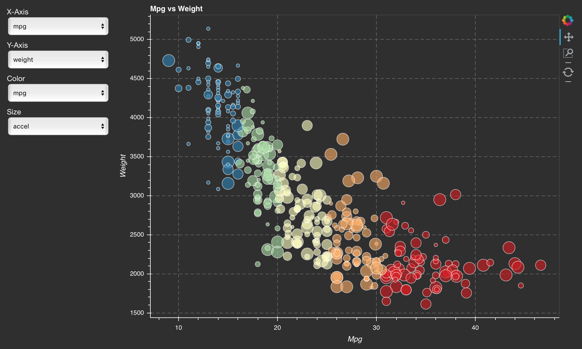
For each year, we want to plot the distribution of MPG within that year.
p = figure()

p.quad(left=years-0.4, right=years+0.4, bottom=avg-std, top=avg+std, fill_alpha=0.4)

p.circle(x=japanese["yr"], y=japanese["mpg"], size=8,
         alpha=0.4, line_color="red", fill_color=None, line_width=2)

p.triangle(x=american["yr"], y=american["mpg"], size=8,
           alpha=0.4, line_color="blue", fill_color=None, line_width=2)

show(p)
<Bokeh Notebook handle for In[6]>
This kind of approach can be used to generate other kinds of interesting plots, like some of the following which are available on the Bokeh web page.
(Click on any of the thumbnails to open the interactive version.)
 |
 |
 |
 |
 |
 |
Linked Brushing
To link plots together at a data level, we can explicitly wrap the data in a ColumnDataSource. This allows us to reference columns by name.
We can use the "select" tool to select points on one plot, and the linked points on the other plots will highlight.
from bokeh.models import ColumnDataSource
from bokeh.layouts import gridplot

source = ColumnDataSource(autompg.to_dict("list"))
source.add(autompg["yr"], name="yr")

plot_config = dict(plot_width=300, plot_height=300,
                   tools="pan,wheel_zoom,box_zoom,box_select,lasso_select")

p1 = figure(title="MPG by Year", **plot_config)
p1.circle("yr", "mpg", color="blue", source=source)

p2 = figure(title="HP vs. Displacement", **plot_config)
p2.circle("hp", "displ", color="green", source=source)

p3 = figure(title="MPG vs. Displacement", **plot_config)
p3.circle("mpg", "displ", size="cyl", line_color="red", fill_color=None, source=source)

p = gridplot([[ p1, p2, p3]], toolbar_location="right")

show(p)
<Bokeh Notebook handle for In[7]>
Standalone HTML
In addition to working well with the Notebook, Bokeh can also save plots out into their own HTML files. Here is the bar plot example from above, but saving into its own standalone file.
Note that when we call show(), a new browser tab is opened.
(If we just wanted to save the file, we would use save() instead.)
from bokeh.plotting import output_file

output_file("barplot.html")

p = figure()

p.quad(left=years-0.4, right=years+0.4, bottom=avg-std, top=avg+std, fill_alpha=0.4)

p.circle(x=japanese["yr"], y=japanese["mpg"], size=8,
         alpha=0.4, line_color="red", fill_color=None, line_width=2)

p.triangle(x=american["yr"], y=american["mpg"], size=8,
           alpha=0.4, line_color="blue", fill_color=None, line_width=2)

show(p)
<Bokeh Notebook handle for In[8]>
Bokeh Apps
When the linked brushing and server-based operation are combined, you can build graphical "applets", which resemble things like what Crossfilter and others do. However, Bokeh provides the reactive object model across client and server, so these sorts of selections and interactions can trigger server-side code, which is implemented in Python.
(Click to launch the live app.)
BokehJS
At its core, Bokeh consists of a Javascript library, BokehJS, and a Python binding which provides classes and objects that ultimately generate a JSON representation of the plot structure.
You can read more about design and usage in the Developing with JavaScript section of the Bokeh User's Guide.
More Information
Full documentation and live examples: http://bokeh.pydata.org/en/latest
GitHub: https://github.com/bokeh/bokeh
Mailing list: bokeh@continuum.io
Gitter: https://gitter.im/bokeh/bokeh
Be sure to follow us on Twitter @bokehplots, as well as on Youtube and Vine!